Introduction to Bi-histograms
Last Updated :
22 Jan, 2021
Histogram:
Histograms are like bar charts that display the frequency (count) of the data using bins. Below is an example of a Histogram plot [Fig 1], showing the count of employees with a monthly salary lying in a particular range. (or in a particular bin)
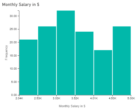
Fig 1: Histogram Plot
Bi-Histogram:
Bi-Histograms are essentially a bi (=2) histogram or a pair of histograms, one above the x-axis and one-below the x-axis, i.e. in opposite direction. [As shown in Fig 2]
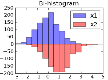
Fig 2 : Bi-Histograms Plot
It is used to observe any changes occurring in the two subgroups of data in terms of:
- Location (observed when performing t-test)
- Variation (observed when performing f-test)
- Distribution (observed when performing Kolmogorov-Smirnov test)
Purpose of the adjoining histograms:
Bi-histograms serve as a great alternative to two-sample t-test as it is a graphical way of representing a variety of features of the subgroups simultaneously on a single plot such as:
- Skewness — shows how distorted the normal distribution of the two subgroups is.
- Location — shows at which point on the x-axis the data of the two subgroups is centred.
- Scale — shows if the plot of the two subgroups is stretched or squeezed.
- Outliers — shows the abnormalities lying in the two subgroups.
Working of Bi-Histograms:
There are two adjoining histograms present, one above and one below the x-axis.
- Above x-axis: Represents a plot of the variable for 1st condition/factor.
- Below x-axis: Represents a plot of the variable for 2nd condition/factor.
Interpreting a Bi-Histogram:
Bi-Histogram graph tells if the histograms of the two sub-groups have significant overlap or not. In order to facilitate the comparison of multiple histograms, they are plotted in a matrix format. [As shown in Fig. 3] The rows and columns of this matrix define the variety of classes that gives a different insight into the data (subgroups).
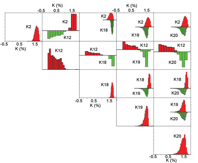
Image Source: https://pubs.usgs.gov/of/2005/1231/InterpHist.htm
The following details can be observed in the image shown in Fig 3. In the matrix,
- Along Diagonal — The histogram plots here belong to a particular single class.
- Off Diagonal — The histogram here plots are bi-histogram plots
In the off-diagonal parts of the matrix,
- Red coloured histogram plots (above x-axis) — represents the row classes (factors or conditions) of the matrix.
- Green coloured histogram plots (below x-axis) — represents the column classes (factors or conditions) of the matrix.
Bi-Histogram is a powerful statistical tool that serves as a great alternative to a variety of statistical test. It gives a plethora of information related to the location, variation and distribution of the sub-groups, that to in a graphical manner, makes it easier to analyze and interpret. It can be built using Dataplot software.
Like Article
Suggest improvement
Share your thoughts in the comments
Please Login to comment...