Interactive Charts using Pywedge package
Last Updated :
29 Jun, 2021
In Machine Learning and Data Science, one of the toughest jobs is to understand the raw data and make it fit for applying different models over it to make predictions. For understanding purpose, we make use of different processes like checking statistical figures such as mean, median, mode, finding the relation between features, looking at the distribution of certain features, etc. This all things are often clubbed under the term Exploratory Data Analysis (EDA). According to experienced ML and DS practitioners, EDA is one of the most valuable tasks and its importance cannot be overlooked when it comes to analyzing the dataset. It helps the practitioners to choose the appropriate data pre-processing techniques.
Checking the statistical figures is well and good but what’s better than visualizing these stats pictorially, it often said that pictures are a more powerful tool for understanding rather than just numerical figures. We can come up with the clearer understanding of the data visually by making different charts. In machine learning and data science, we use different types of charts/plots in order to visualize different patterns among the features some of which are: Histogram, Bar plots, Box plots, Pair plots, Pie charts, Violin plots, etc. But writing codes manually for all these plots/graphs can seem to be a tiring process and also we are more prone to inaccuracies and errors/bugs in the code. So, here comes our lifesaver, a python package that does the tasks of plotting these graphs easily and efficiently without any such bugs in the code.
In this article, we will be reading about making interactive plots/charts using pywedge python package. Pywedge is an open-source python package that can be used for automating most of the machine learning problem-solving task. It also offers us features to plot interactive graphs using just a few lines of code.
Pywedge library has a make_charts method that offers us to make 8 different types of charts which are named as follows:
- Scatter plot
- Pie chart
- Bar Plot
- Violin plot
- Box plot
- Distribution plot
- Histogram
- Correlation plot
Let’s see an example of how can we use pywedge library to draw interactive plots:
Importing libraries and loading the dataset:
Python
import pandas as pd
import numpy as np
import matplotlib.pyplot as plt
import seaborn as sns
import warnings
warnings.filterwarnings("ignore")
|
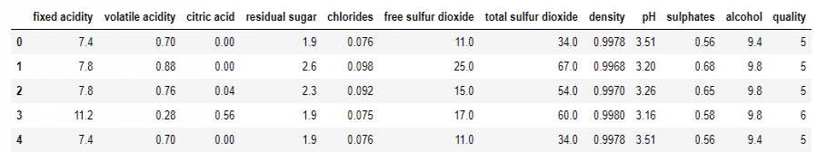
After loading the dataset, we will look at how the dataset looks like, this can be seen using the head method to print the top 5 rows in the dataset:
Python
print("Shape of our dataframe is: ",df.shape)
|
Shape of our dataframe is: (1599, 12)
So, as we can notice we have in total 1599 rows and 11 features in the dataset along with one target feature named ‘quality’.
It is always better to check out some stats about our dataset and we can do it using the describe() method as:
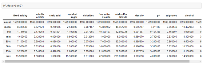
Statistics about the dataset
By looking just at the stats, we can infer
- The mean value is greater than the median value in each of the columns, for example, mean value of pH is 3.311113 whereas median value is 3.310000. Similarly, the mean of alcohol is 10.422 as compared to median which is 10.20.
- We can notice a large difference between 75th percentile value and max values of predictors “residual sugar”, “free sulfur dioxide”, “total sulfur dioxide”. This indicates that some values of these 3 variables lie much farther from the general range of values( up to 75th %tile). Thus, we can conclude that there are extreme values i.e., Outliers in our dataset.
Renaming of column and splitting of the dataset:
Python
df.rename(columns={'ficxed acidity':'fixed_acidity','citric acid':'citric_acid',
'volatile acidity':'volatile_acidity','residual sugar':'residual_sugar',
'free sulphur dioxide':'free_sulphur_dioxide',
'total sulphur dioxide': 'total_sulphur_dioxide'},inplace=True)
X = df.iloc[:,:11]
y = df.iloc[:,-1]
|
Using Pywedge library for making charts:
Python
import pywedge as pw
charts = pw.Pywedge_Charts(df, c=None, y = 'quality')
plots = charts.make_charts()
|
The ‘make_charts’ method on execution yields out a window giving us 8 different types of chart options and we can select our required features to plot the graph and visualize the results.
Making a scatter plot:
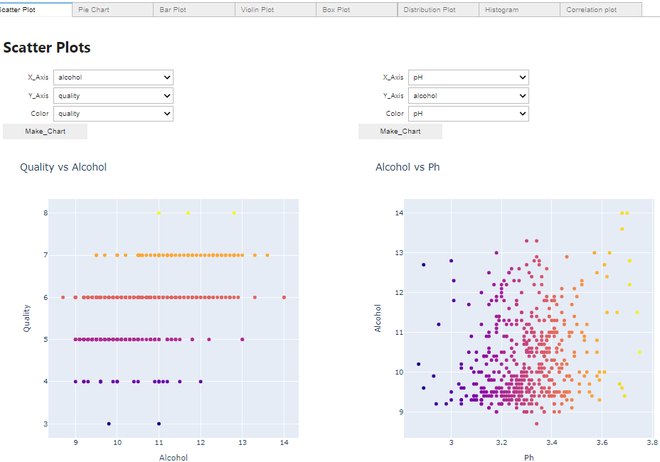
Scatter Plot
Making a Violin plot:
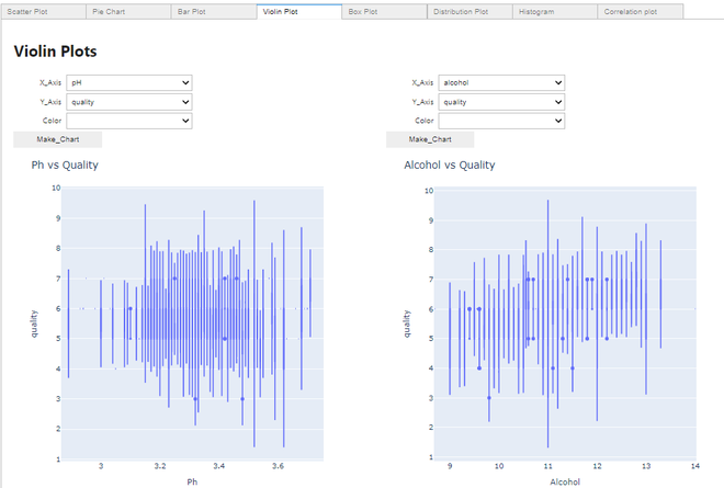
Violin plot
Making a Distribution plot:
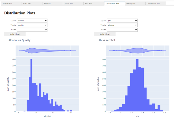
Distribution plot
Making a Histogram:
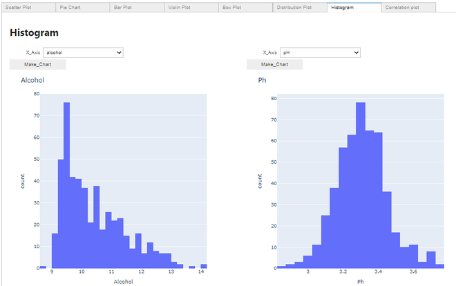
Histogram
Making a Correlation plot:
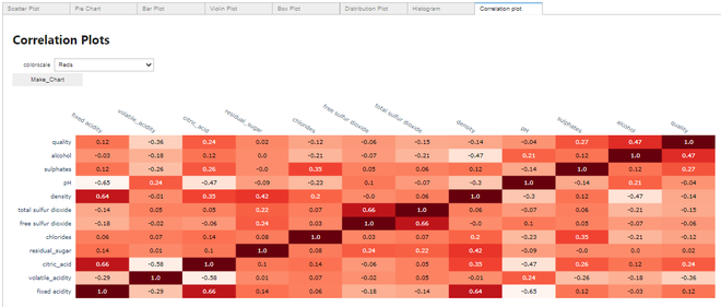
Correlation plot
Thus, we can see how efficiently we can plot these several graphs using just a few lines of code using the pywedge package without explicitly writing codes for all these graphs.
Share your thoughts in the comments
Please Login to comment...