Implementing PCA in Python with scikit-learn
Last Updated :
23 Sep, 2021
In this article, we will learn about PCA (Principal Component Analysis) in Python with scikit-learn. Let’s start our learning step by step.
WHY PCA?
- When there are many input attributes, it is difficult to visualize the data. There is a very famous term ‘Curse of dimensionality in the machine learning domain.
- Basically, it refers to the fact that a higher number of attributes in a dataset adversely affects the accuracy and training time of the machine learning model.
- Principal Component Analysis (PCA) is a way to address this issue and is used for better data visualization and improving accuracy.
How does PCA work?
- PCA is an unsupervised pre-processing task that is carried out before applying any ML algorithm. PCA is based on “orthogonal linear transformation” which is a mathematical technique to project the attributes of a data set onto a new coordinate system. The attribute which describes the most variance is called the first principal component and is placed at the first coordinate.
- Similarly, the attribute which stands second in describing variance is called a second principal component and so on. In short, the complete dataset can be expressed in terms of principal components. Usually, more than 90% of the variance is explained by two/three principal components.
- Principal component analysis, or PCA, thus converts data from high dimensional space to low dimensional space by selecting the most important attributes that capture maximum information about the dataset.
Python Implementation:
- To implement PCA in Scikit learn, it is essential to standardize/normalize the data before applying PCA.
- PCA is imported from sklearn.decomposition. We need to select the required number of principal components.
- Usually, n_components is chosen to be 2 for better visualization but it matters and depends on data.
- By the fit and transform method, the attributes are passed.
- The values of principal components can be checked using components_ while the variance explained by each principal component can be calculated using explained_variance_ratio.
1. Import all the libraries
Python3
import pandas as pd
import numpy as np
import matplotlib.pyplot as plt
%matplotlib inline
from sklearn.decomposition import PCA
from sklearn.preprocessing import StandardScaler
|
2. Loading Data
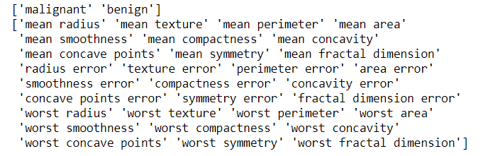
Load the breast_cancer dataset from sklearn.datasets. It is clear that the dataset has 569 data items with 30 input attributes. There are two output classes-benign and malignant. Due to 30 input features, it is impossible to visualize this data
Python3
from sklearn.datasets import load_breast_cancer
data=load_breast_cancer()
data.keys()
print(data['target_names'])
print(data['feature_names'])
|
Output:
3. Apply PCA
- Standardize the dataset prior to PCA.
- Import PCA from sklearn.decomposition.
- Choose the number of principal components.
Let us select it to 3. After executing this code, we get to know that the dimensions of x are (569,3) while the dimension of actual data is (569,30). Thus, it is clear that with PCA, the number of dimensions has reduced to 3 from 30. If we choose n_components=2, the dimensions would be reduced to 2.
Python3
df1=pd.DataFrame(data['data'],columns=data['feature_names'])
scaling=StandardScaler()
scaling.fit(df1)
Scaled_data=scaling.transform(df1)
principal=PCA(n_components=3)
principal.fit(Scaled_data)
x=principal.transform(Scaled_data)
print(x.shape)
|
Output:
(569,3)
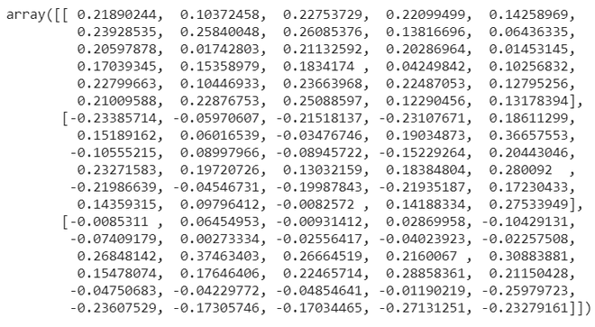
4. Check Components
The principal.components_ provide an array in which the number of rows tells the number of principal components while the number of columns is equal to the number of features in actual data. We can easily see that there are three rows as n_components was chosen to be 3. However, each row has 30 columns as in actual data.
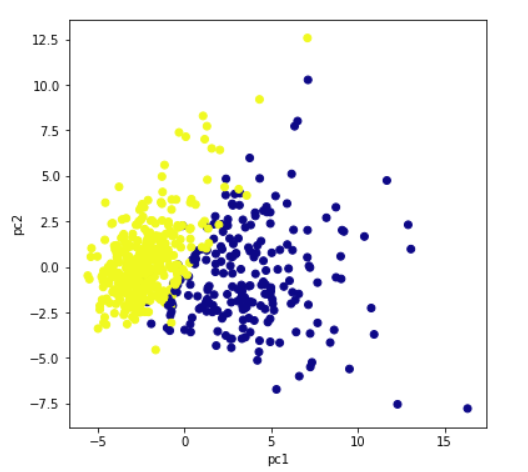
5. Plot the components (Visualization)
Plot the principal components for better data visualization. Though we had taken n_components =3, here we are plotting a 2d graph as well as 3d using first two principal components and 3 principal components respectively. For three principal components, we need to plot a 3d graph. The colors show the 2 output classes of the original dataset-benign and malignant. It is clear that principal components show clear separation between two output classes.
Python3
plt.figure(figsize=(10,10))
plt.scatter(x[:,0],x[:,1],c=data['target'],cmap='plasma')
plt.xlabel('pc1')
plt.ylabel('pc2')
|
Output:
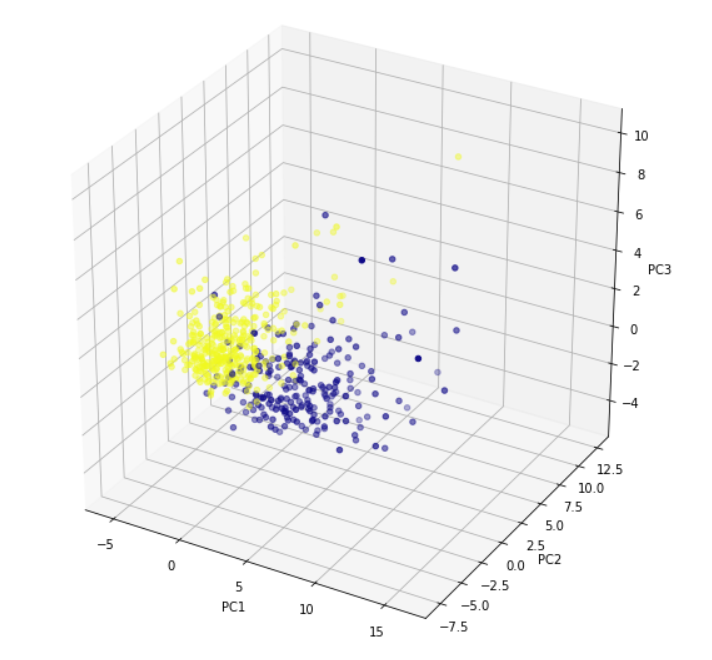
For three principal components, we need to plot a 3d graph. x[:,0] signifies the first principal component. Similarly, x[:,1] and x[:,2] represent the second and the third principal component.
Python3
from mpl_toolkits.mplot3d import Axes3D
fig = plt.figure(figsize=(10,10))
axis = fig.add_subplot(111, projection='3d')
axis.scatter(x[:,0],x[:,1],x[:,2], c=data['target'],cmap='plasma')
axis.set_xlabel("PC1", fontsize=10)
axis.set_ylabel("PC2", fontsize=10)
axis.set_zlabel("PC3", fontsize=10)
|
Output:
6. Calculate variance ratio
Explained_variance_ratio provides an idea of how much variation is explained by principal components.
Python3
print(principal.explained_variance_ratio_)
|
Output:
array([0.44272026, 0.18971182, 0.09393163])
Like Article
Suggest improvement
Share your thoughts in the comments
Please Login to comment...