HTML media attribute
Last Updated :
07 Mar, 2024
The HTML media attribute is employed to specify the media or device the coupled document is optimized for. This attribute specifies that the target URL is designed for special devices like iPhones, speech, or print media.
syntax
<element media="value">
Supported Tags
| Element |
Description |
<a> |
Represents a hyperlink, linking to another resource. |
<area> |
Defines a clickable area inside an image map. |
<link> |
Specifies the relationship between a document and an external resource. |
<source> |
Specifies multiple media resources for media elements like <audio> and <video>. |
<style> |
Contains CSS rules to style HTML elements. |
HTML media attribute Examples
Example1: In this example we demonstrates the use of the media attribute, which is incorrect for anchor elements. Instead, it uses the target attribute to specify whether links open in the same or a different tab.
html
<!DOCTYPE html>
<html>
<head>
<title>HTML media Attribute</title>
</head>
<body>
<h2>HTML media Attribute</h2>
<a
target="_self"
>
Click to open in the same tab
</a>
<br />
<a
target="_blank"
>
Click to open in a different tab
</a>
</body>
</html>
|
Output:
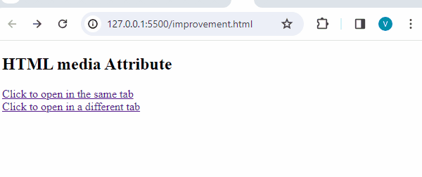
HTML media attribute example output
Example2: In this example the media attribute specifies conditions (such as screen width) under which different image sources defined in the <source> element are applied for responsive design.
html
<!DOCTYPE html>
<html>
<head>
<meta
name="viewport"
content="width=device-width,
initial-scale=1.0"
/>
</head>
<body>
<picture>
<source
media="(min-width: 900px)"
srcset=
/>
<source
media="(min-width: 600px)"
srcset=
/>
<img
src=
style="width: auto"
/>
</picture>
</body>
</html>
|
Output: Change the browser size.

Supported Browsers: The browsers supported by HTML media attribute are listed below:
Like Article
Suggest improvement
Share your thoughts in the comments
Please Login to comment...