How to specify what media/device the target URL is optimized for ?
Last Updated :
23 Aug, 2021
The media attribute of HTML is used to specify the browser ,for what devices the linked document is optimized for. This attribute generally is used with the CSS style sheets but can be used in simple HTML built webpage too. The attribute allows the user to choose from a great variety of devices and can accept several values. This attribute is used to specify that the target URL is designed for special devices (like iPhone, Android, etc), speech or print media, projectors, tv, and so on.
Note: This attribute can only be used if the href attribute is used as the href specifies the linked document and hence media attribute is used to specify how and in which devices the linked document would appear and be compatible.
Various devices values we can specify are as:
| Sl.No. |
VALUES |
DESCRIPTION |
| 1. |
all |
It is Default, if not specified.
It is most suited for all media type devices.
Syntax- <a href=”#” media=”all target=”_blank”> Click here</a>
|
| 2. |
screen |
It is used for the computer screens, smart-phones etc.
Syntax- <a href=”#” media=”screen” target=”_blank”> Click here</a>
|
| 3. |
speech |
It is used for the screen-readers that do “reads” the page out loud.
Syntax- <a href=”#” media=”speech” target=”_blank”> Click here</a>
|
| 4. |
print |
It is used for the Print preview mode/printed page’s mode.
Syntax- <a href=”#” media=”print” target=” _blank”> Click here</a>
|
| 5. |
tv |
It is used for Television type devices (low resolution, or the one with limited scroll ability).
Syntax- <a href=”#” media=”tv” target=”_blank”> Click here</a>
|
We can also add a few more additional specific information while specifying the type of media device to show how would the linked document is optimized for.
| Sl.No. |
VALUE |
DESCRIPTION |
| 1. |
width |
It is used to specify the width of the targeted media display area.
Syntax- <a href=”#” media=”screen and (min-width:100px)” target=”_blank”> Click here</a>
|
| 2. |
height |
It is used to specify the height of the targeted media display area.
Syntax- <a href=”#” media=”screen and (max-height:700px)” target=”_blank”> Click here</a>
|
| 3. |
device-width |
It is used to specify the width of the targeted media display area. .
Syntax- <a href=”#” media=”screen and (device-width:100px)” target=”_blank”> Click here</a>
|
| 4. |
aspect-ratio |
It is used to specify the width/height ratio of the targeted media display area.
Syntax- <a href=”#” media=”screen and (aspect-ratio:4/3)” target=”_blank”> Click here</a>
|
| 5. |
device-height |
It is used to specify the height of the target media display/paper.
Syntax- <a href=”#” media=”screen and (device-height:400px)” target=”_blank”> Click here</a>
|
| 6. |
orientation |
It is used to specify the orientation of the media device display/paper.
Syntax- <a href=”#” media=”all and (orientation: landscape)” target=”_blank”> Click here</a>
|
| 7. |
device-aspect-ratio |
It is used to specify the device-width/device-height ratio of the media device display/paper.
Syntax- <a href=”#” media=”screen and (aspect-ratio:4/3)” target=”_blank”> Click here</a>
|
| 8. |
color |
It is used to specify the bits per color of media device display.
Syntax- <a href=”#” media=”screen and (color:1)” target=”_blank”> Click here</a>
|
| 9. |
color-index |
It is used to specify the number of colors that media device display can support.
Syntax- <a href=”#” media=”screen and (min-color-index:250)” target=”_blank”> Click here</a>
|
| 10. |
resolution |
It is used to specify the pixel density of the media device display/paper.
Syntax- <a href=”#” media=”print and (resolution:400dpi)” target=”_blank”> Click here</a>
|
Syntax:
<a href="#" media="all" target="_blank"></a>
Below is the code that illustrates how to specify media attributes.
Example:
HTML
<!DOCTYPE html>
<html>
<body>
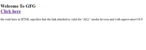
<h2>Welcome To GFG</h2><br>
media="all and (aspect-ratio:16/9)"
target="_blank">
Click here
</a>
<p>
the code here in HTML specifies that the
link attached is valid for "ALL" media
devices and with aspect-ratio=16:9
</p>
</body>
</html>
|
Sample output on Microsoft edge.
Like Article
Suggest improvement
Share your thoughts in the comments
Please Login to comment...