How to Show Values on Seaborn Barplot?
Last Updated :
13 Jan, 2022
In this article, we are going to see how to show Values on Seaborn Barplot using Python.
Seaborn is a data visualization package that is built on top of matplotlib that enables seaborn with multiple customization functionalities across different charts. In general, a bar plot summarizes the categorical data as rectangular bars whose height is proportional to the values of the corresponding bars. Seaborn library provides a method called Barplot() which is loaded with 10+ parameters that enable to plot a bar plot that satisfies most of the requirements. In this blog let us discuss how to show bar values on top of the seaborn barplot.
Syntax: seaborn.barplot(data, x=None, y=None, hue=None, data=None, order=None, orient=None, color=None, palette=None, saturation=0.75,errwidth)
Parameters:
- data – specifies the dataframe to be used to bar plot
- x, y – specifies the data to be used along the x-axis and y- axis. (long form data)
- order – specifies the order in which the categorical values has to be plotted
- orient – ‘v’ specifies vertical orientation and ‘h’ specifies horizontal orientation
- color – specifies the color gradient of all elements
- palette – list of colors that has to be used for different levels
- errwidth – specifies the error bar width
Example 1:
Used dataset: tips
In seaborn barplot with bar, values can be plotted using sns.barplot() function and the sub-method containers returned by sns.barplot(). Import pandas, numpy, and seaborn packages. Read the dataset using the pandas read_csv function. Now, create a barplot between two columns, here, let’s choose the x-axis is time and the y-axis as a tip. This will return a conventional bar plot. This plot object is stored in a variable. The plot object has a method called containers that would list the properties of each bar. Iterate through the list items of the container object and pass each item to the bar_label function. This will extract and display the bar value in the bar plot.
Python3
import pandas as pd
import seaborn as sns
import numpy as np
data = pd.read_csv(r"path to \tips.csv")
data.head()
ax = sns.barplot(x='time', y='tip',
hue='sex', data=data,
errwidth=0)
for i in ax.containers:
ax.bar_label(i,)
|
Output:
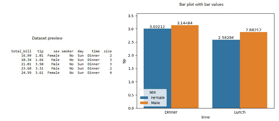
Bar plot with values of bars
Example 2:
Unlike the above method, seaborn barplot with bar values can be plotted for grouped bar plots using sns.barplot() function and the same sub-method containers returned by sns.barplot(). Import pandas, NumPy, and seaborn packages. Read the dataset using the pandas read_csv function. Now, create a barplot from a grouped dataframe here, lets choose the x-axis as day and the y-axis as a total bill. This will again return a conventional bar plot. This plot object is stored in a variable. The plot object has a method called containers that would list the properties of each bar. Now, pass the container object to the bar_label function. This will extract and display the bar value in the bar plot.
Python3
import pandas as pd
import seaborn as sns
import numpy as np
data = pd.read_csv(r"path to\tips.csv")
groupedvalues = data.groupby('day').sum().reset_index()
ax = sns.barplot(x='day', y='tip',
data=groupedvalues,
errwidth=0)
ax.bar_label(ax.containers[0])
|
Output:
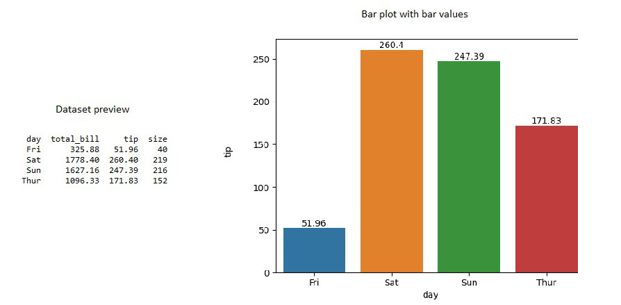
Bar plot with values of bars – grouped dataframe
Example 3:
Like explained above import the necessary packages and read the data using the pandas read_csv() function. Sum aggregate the data based on the day column. Now, define a list of color palettes with the color of your wish. The length of this color palette list must correspond to the length of the grouped dataframe. Here, we are interested in plotting a bar plot between the day and total_bill column. So, argsort() the total bill column which will sort the column and return the index of the sorted column. Now, pass the x, y columns, the data that has to be used to the barplot function. Along with this, convert the color palette object to a numpy array and rearrange the array based on the argsort() values. Passing all these parameters will return a box plot. object. Now iterate through each row of the grouped dataframe using iterrows() and use the text function of the barplot object to assign the required value of the row as bar value.
Python3
import pandas as pd
import seaborn as sns
import numpy as np
data = pd.read_csv(r"path to\tips.csv")
groupedvalues = data.groupby('day').sum().reset_index()
pal = sns.color_palette("Greens_d", len(groupedvalues))
rank = groupedvalues["total_bill"].argsort()
ax = sns.barplot(x='day', y='total_bill',
data=groupedvalues,
palette=np.array(pal[::-1])[rank])
for index, row in groupedvalues.iterrows():
ax.text(row.name, row.tip, round(row.total_bill, 2),
color='white', ha='center')
|
Output:
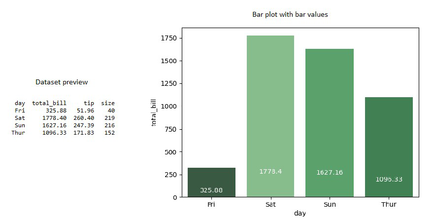
Bar plot with values of bars – grouped dataframe
Like Article
Suggest improvement
Share your thoughts in the comments
Please Login to comment...