How to set the perspective from where an element is viewed in CSS ?
Last Updated :
28 Jun, 2021
In this article we will see, how the CSS perspective works. The CSS perspective is a new CSS property that has to provide to manage the distance between the z-axis. We all know that we work with a 2D surface. So if we rotate our objects, then this completeness is not displayed. The solution to this problem is the CSS perspective which we see even with the z-axis.
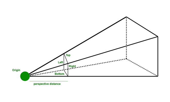
They work like a projector if the source is far from the object so making a big image on the wall. They are used very simply by applying the perspective property to the parent element and make any transformation in the child element that looks like a 3D element.
Syntax:
/* parent div */
perspective: perspective_distance;

/* child div */
transform: value;
If the parent div applied perspective so any property of transform in the child apply so they behave as a 3D object
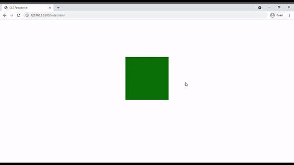
Example 1: Below example is illustrated without using Perspective.
HTML
<!DOCTYPE html>
<html lang="en">
<head>
<style>
body {
display: flex;
justify-content: center;
align-items: center;
height: 80vh;
}
/* parent div */
.main{
width: 200px;
height: 200px;
background-color: gray;
}
/* child div */
.box {
width: 200px;
height: 200px;
background-color: #0B7008;
/* transform the child object. */
transform: rotateX(60deg);
}
</style>
</head>
<body>
<div class="main">
<div class="box"></div>
</div>
</body>
</html>
|
Output:
Example 2: Below is the example that illustrates the use of Perspective.
HTML
<!DOCTYPE html>
<html lang="en">
<head>
<style>
body {
display: flex;
justify-content: center;
align-items: center;
height: 80vh;
}
/* parent div */
.main{
width: 200px;
height: 200px;
background-color: gray;
/* Create perspective */
perspective: 800px;
}
/* child div */
.box {
width: 200px;
height: 200px;
background-color: #0B7008;
/* transform the child object. */
transform: rotateX(60deg);
}
</style>
</head>
<body>
<div class="main">
<div class="box"></div>
</div>
</body>
</html>
|
Output:
Supported Browser:
- Google Chrome 36.0
- Internet Explorer 10.0
- Firefox 16.0
- Opera 23.0
- Safari 9.0
Like Article
Suggest improvement
Share your thoughts in the comments
Please Login to comment...