How to Set Axis Limits bokeh?
Last Updated :
03 Mar, 2021
In this article, we will be learning about how to set axis limits to a plot in bokeh. When we are plotting a graph with a set of values, then X-limits and Y-limits for the points are automatically created. But bokeh allows us to set those axis limits according to our choice.
So, at first, we need to know that in order to set Axis limits to both X and Y axis, we need to import a package from our bokeh.models module which is known as range1d. Range1d enables us to set axis limits to the plot of our choice.
We can either use google colab or we can use any text editor in our local device to do the above implementation. In order to use a text-editor on our local device, we need to open the command prompt at first and write the following code.
pip install bokeh
After installation, now we are ready to proceed to the main implementation.
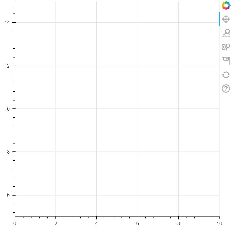
In the code below, we are creating an empty plot with the limits of X-axis and Y-Axis according to our choice.
Code:
Python3
from bokeh.plotting import figure, show
from bokeh.models import Range1d
fig = figure(plot_width=500, plot_height=500)
fig.x_range = Range1d(0, 10)
fig.y_range = Range1d(5, 15)
show(fig)
|
Output:
Explanation:
As we can clearly see from the code, that we have set X-Axis limits from 0-10 and Y-Axis Limits from 5-15. The thing has been implemented in the graph shown above.
Example 2:
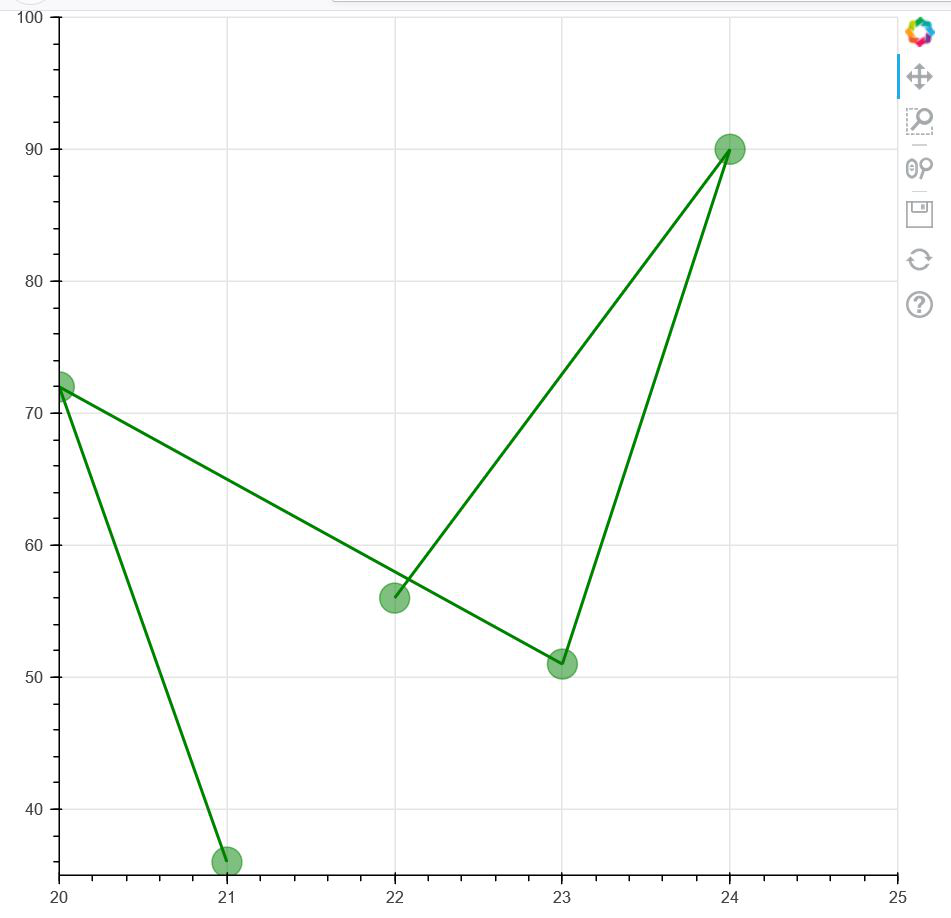
In the second example, we are setting the X and Y Axis limits of our own, and then we are pointing a set of points in that range in the graph. The below code shows the above implementation.
Python3
from bokeh.plotting import figure, show
from bokeh.models import Range1d
fig = figure(plot_width=620,
plot_height=600)
fig.x_range = Range1d(20, 25)
fig.y_range = Range1d(35, 100)
fig.line([21, 20, 23, 24, 22],
[36, 72, 51, 90, 56],
line_width=2, color="green")
fig.circle([21, 20, 23, 24, 22],
[36, 72, 51, 90, 56],
size=20, color="green",
alpha=0.5)
show(fig)
|
Output:
Explanation:
Since this is a customized axis made by us, the size of the graph will be totally dependent on the axis limits. For example: if the axis limits for both the axis is larger, then the graph plotted above will be smaller than the one shown now.
Like Article
Suggest improvement
Share your thoughts in the comments
Please Login to comment...