How To Remove facet_wrap Title Box in ggplot2 in R ?
Last Updated :
20 Dec, 2023
In this article, we will discuss how facet_wrap works in R Programming Language. we will discuss all the types and methods.
facet_wrap in R
In R Programming Language facet_wrap() is a function from the ggplot2 package that allows you to create multiple plots, or facets, based on a categorical variable. It is commonly used to create a grid of plots where each subplot corresponds to a unique level of the specified categorical variable.
Here, is a basic facet plot made using the diamonds data frame which is provided by R Language natively. We have used the facet_wrap() function with ~clarity to divide the plot into facets according to their clarity.
Syntax:
plot + facet_wrap( ~facet-variable)
Where:
facet-variable: determines the variable around which plots have to be divided.
Let us first start with a regular plot, without making any changes so that the difference is apparent.
R
library(ggplot2)
facet_data <- data.frame(
Category = rep(c("A", "B", "C"), each = 30),
Value = rnorm(90),
Region = rep(c("North", "South"), each = 45),
Month = rep(c("Jan", "Feb", "Mar", "Apr", "May", "Jun"), times = 15)
)
head(facet_data)
|
Output:
  Category       Value Region Month
1        A  0.21444531  North   Jan
2        A -0.32468591  North   Feb
3        A  0.09458353  North   Mar
4        A -0.89536336  North   Apr
5        A -1.31080153  North   May
6        A  1.99721338  North   Jun
Facet plots, where one subsets the data based on a categorical variable and makes a series of similar plots with the same scale.
Facetting helps us to show the relationship between more than two categories of data. When you have multiple variables, with faceting it can be plotted in a single plot into smaller plots.
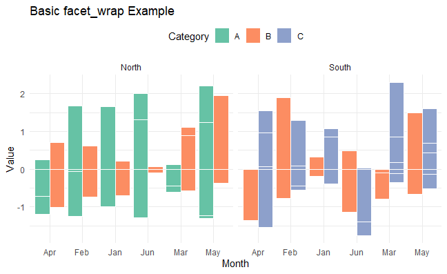
Basic Bar Plot with facet_wrap in R
R
ggplot(facet_data, aes(x = Month, y = Value, fill = Category)) +
geom_bar(stat = "identity", position = "dodge", color = "white") +
facet_wrap(~Region) +
ggtitle("Basic facet_wrap Example") +
scale_fill_brewer(palette = "Set2") +
theme_minimal() +
theme(legend.position = "top")
|
Output:
facet_wrap in R
the ggplot2 library to create a bar plot from the ‘facet_data’ dataset. It visualizes the relationship between the ‘Month’ variable on the x-axis, ‘Value’ on the y-axis, and different ‘Categories’ represented by fill colors.
- The ‘facet_wrap(~Region)’ function splits the plot into separate panels for each unique ‘Region’.
- The plot is styled with a minimal theme, a title is added, and a color palette from the Brewer set is applied to differentiate categories. The legend is positioned at the top for clarity.
Customizing Labels and Titles in facet_wrap in R
R
ggplot(facet_data, aes(x = Month, y = Value, fill = Category)) +
geom_bar(stat = "identity", position = "dodge", color = "white") +
facet_wrap(~Region, labeller = labeller(Region = c(North = "Northern",
South = "Southern"))) +
ggtitle("Customized Labels and Titles") +
scale_fill_brewer(palette = "Set3") +
theme_minimal() +
theme(legend.position = "top")
|
Output:

facet_wrap in R
The plot is styled with a minimal theme, a title is added, and a color palette from the Brewer set is applied to differentiate categories. The legend is positioned at the top for clarity. and customizing labels and titles.
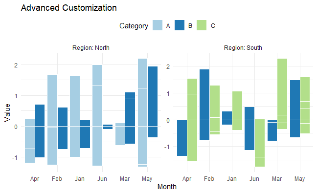
Advanced Customization in facet_wrap in R
R
ggplot(facet_data, aes(x = Month, y = Value, fill = Category)) +
geom_bar(stat = "identity", position = "dodge", color = "white") +
facet_wrap(~Region, scales = "free", ncol = 2, labeller = label_both) +
ggtitle("Advanced Customization") +
scale_fill_brewer(palette = "Paired") +
theme_minimal() +
theme(legend.position = "top")
|
Output:
facet_wrap in R
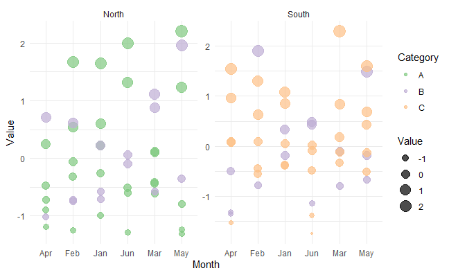
Bubble Charts with Size Aesthetics in facet_wrap in R
R
ggplot(facet_data, aes(x = Month, y = Value, size = Value, color = Category)) +
geom_point(alpha = 0.7) +
facet_wrap(~ Region, scales = "free", ncol = 2) +
theme_minimal() +
scale_color_brewer(palette = "Accent")
|
Output:
facet_wrap in R
We create bubble chart using the facet_wrap function in ggplot2. The x-axis represents months, the y-axis represents values, and the size and color of the bubbles are determined by the “Value” column, with each category differentiated by color. The chart is faceted by the “Region” variable into multiple subplots arranged in two columns.
Remove facet_wrap in R
We can customize various aspects of a ggplot2 using the theme() function. To remove the facet_wrap() title box, we need to use “strip.background” argument inside the theme() layer with argument ‘element_blank()’.
Syntax:
plot + theme( strip.background = element_blank() )
R
ggplot(facet_data, aes(x = Month, y = Value, size = Value, color = Category)) +
geom_point(alpha = 0.7) +
theme_minimal() +
scale_color_brewer(palette = "Accent")
|
Output:

facet_wrap in R
In this we removes the facet_wrap function, resulting in a single, unified plot instead of multiple subplots.
Like Article
Suggest improvement
Share your thoughts in the comments
Please Login to comment...