A series of data points collected over the course of a time period, and that are time-indexed is known as Time Series data. These observations are recorded at successive equally spaced points in time. For Example, the ECG Signal, EEG Signal, Stock Market, Weather Data, etc., all are time-indexed and recorded over a period of time. Analyzing these data, and predicting future observations has a wider scope of research.
In this article, we will see how to implement EDA — Exploratory Data Analysis using Pandas Library in Python. We will try to infer the nature of the data over a specific period of time by plotting various graphs with matplotlib.pyplot, seaborn, statsmodels, and more packages.
For easy understanding of the plots and other functions, we will be creating a sample dataset with 16 rows and 5 columns which includes Date, A, B, C, D, and E columns.
Python3
import pandas as pd
sample_timeseries_data = {
'Date': ['2020-01-25', '2020-02-25',
'2020-03-25', '2020-04-25',
'2020-05-25', '2020-06-25',
'2020-07-25', '2020-08-25',
'2020-09-25', '2020-10-25',
'2020-11-25', '2020-12-25',
'2021-01-25', '2021-02-25',
'2021-03-25', '2021-04-25'],
'A': [102, 114, 703, 547,
641, 669, 897, 994,
1002, 974, 899, 954,
1105, 1189, 1100, 934],
'B': [1029, 1178, 723, 558,
649, 669, 899, 1000,
1012, 984, 918, 959,
1125, 1199, 1109, 954],
'C': [634, 422,152, 23,
294, 1452, 891, 990,
924, 960, 874, 548,
174, 49, 655, 914],
'D': [1296, 7074, 3853, 4151,
2061, 1478, 2061, 3853,
6379, 2751, 1064, 6263,
2210, 6566, 3918, 1121],
'E': [10, 17, 98, 96,
85, 89, 90, 92,
86, 84, 78, 73,
71, 65, 70, 60]
}
dataframe = pd.DataFrame(
sample_timeseries_data,columns=[
'Date', 'A', 'B', 'C', 'D', 'E'])
dataframe["Date"] = dataframe["Date"].astype("datetime64")
dataframe = dataframe.set_index("Date")
dataframe
|
Output:
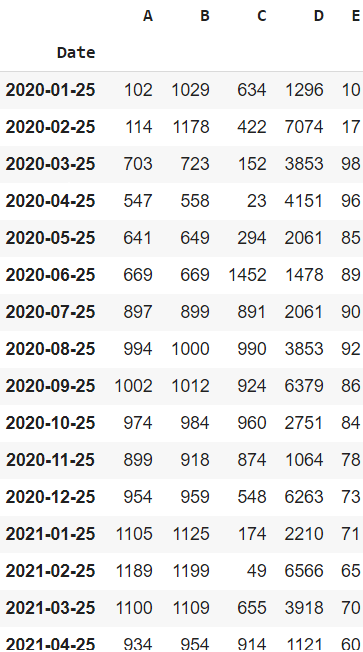
Sample Time Series data frame
Plotting the Time-Series Data
Plotting Timeseries based Line Chart:
Line charts are used to represent the relation between two data X and Y on a different axis.
Syntax: plt.plot(x)
Example 1: This plot shows the variation of Column A values from Jan 2020 till April 2020. Note that the values have a positive trend overall, but there are ups and downs over the course.
Python3
import matplotlib.pyplot as plt
plt.style.use("fivethirtyeight")
plt.figure(figsize=(12, 10))
plt.xlabel("Date")
plt.ylabel("Values")
plt.title("Sample Time Series Plot")
plt.plot(dataframe["A"])
|
Output:
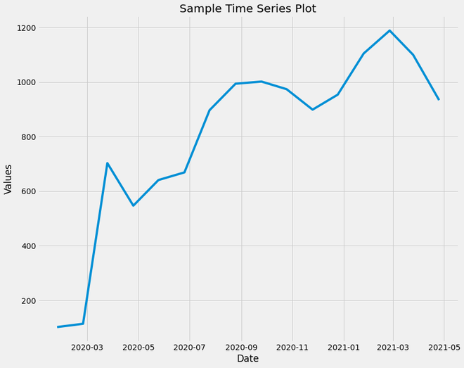
Sample Time Series Plot
Example 2: Plotting with all variables.
Python3
plt.style.use("fivethirtyeight")
dataframe.plot(subplots=True, figsize=(12, 15))
|
Output:
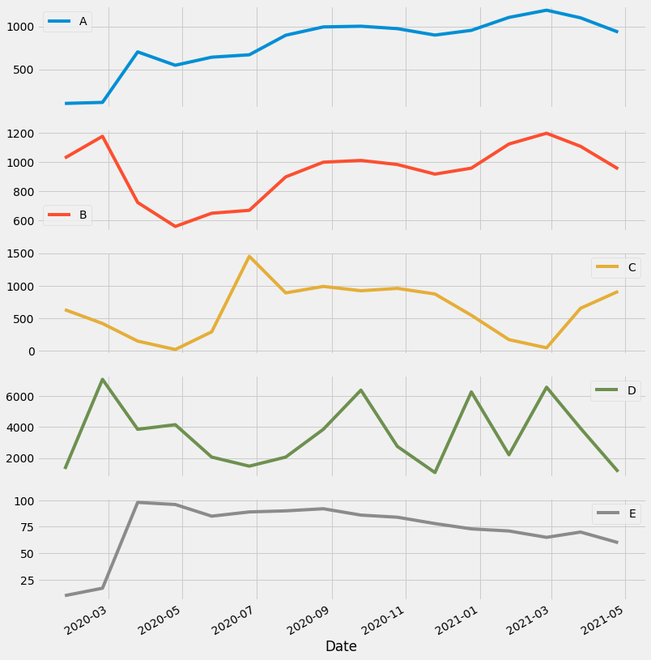
Plotting all Time-series data columns
Plotting Timeseries based Bar Plot:
A bar plot or bar chart is a graph that represents the category of data with rectangular bars with lengths and heights that is proportional to the values which they represent. The bar plots can be plotted horizontally or vertically. A bar chart describes the comparisons between the discrete categories. One of the axis of the plot represents the specific categories being compared, while the other axis represents the measured values corresponding to those categories.
Syntax: plt.bar(x, height, width, bottom, align)
This bar plot represents the variation of the ‘A’ column values. This can be used to compare the future and the fast values.
Python3
import matplotlib.pyplot as plt
plt.style.use("fivethirtyeight")
plt.figure(figsize=(15, 10))
plt.xlabel("Date")
plt.ylabel("Values")
plt.title("Bar Plot of 'A'")
plt.bar(dataframe.index, dataframe["A"], width=5)
|
Output:

Bar Plot for ‘A’ column
Plotting Timeseries based Rolling Mean Plots:
The mean of an n-sized window sliding from the beginning to the end of the data frame is known as Rolling Mean. If the window doesn’t have n observations, then NaN is returned.
Syntax: pandas.DataFrame.rolling(n).mean()
Example:
Python3
dataframe.rolling(window = 5).mean()
|
Output:
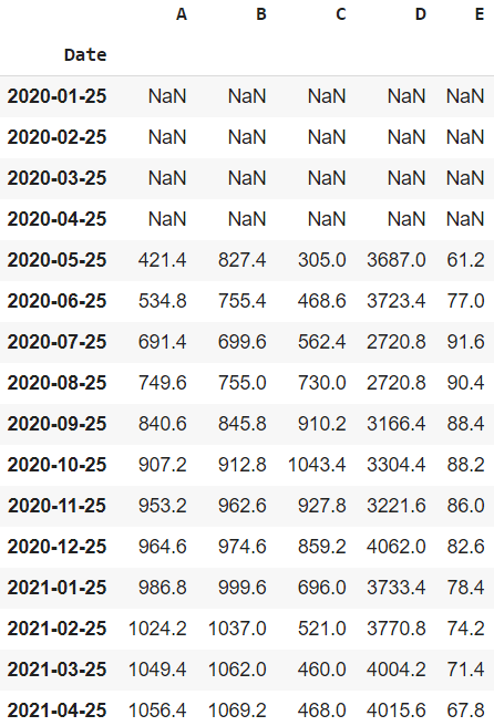
The rolling mean of dataframe
Here, we will plot the time series with a rolling means plot:
Python3
import matplotlib.pyplot as plt
plt.style.use("fivethirtyeight")
plt.figure(figsize=(12, 10))
plt.xlabel("Date")
plt.ylabel("Values")
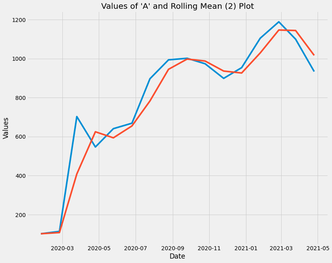
plt.title("Values of 'A' and Rolling Mean (2) Plot")
plt.plot(dataframe["A"])
plt.plot(dataframe.rolling(
window=2, min_periods=1).mean()["A"])
|
Output:
Rolling mean plot
Explanation:
- The Blue Plot Line represents the original ‘A’ column values while the Red Plot Line represents the Rolling mean of ‘A’ column values of window size = 2
- Through this plot, we infer that the rolling mean of a time-series data returns values with fewer fluctuations. The trend of the plot is retained but unwanted ups and downs which are of less significance are discarded.
- For plotting the decomposition of time-series data, box plot analysis, etc., it is a good practice to use a rolling mean data frame so that the fluctuations don’t affect the analysis, especially in forecasting the trend.
Time Series Decomposition:
It shows the observations and these four elements in the same plot:
- Trend Component: It shows the pattern of the data that spans across the various seasonal periods. It represents the variation of ‘A’ values over the period of 2 years with no fluctuations.
- Seasonal Component: This plot shows the ups and downs of the ‘A’ values i.e. the recurring normal variations.
- Residual Component: This is the leftover component after decomposing the ‘A’ values data into Trend and Seasonal Component.
- Observed Component: This trend and a seasonal component can be used to study the data for various purposes.
Example:
Python3
import statsmodels.api as sm
from pylab import rcParams
import pandas as pd
import matplotlib.pyplot as plt
import seaborn as sns
dataframe['Date'] = dataframe.index
dataframe['Year'] = dataframe['Date'].dt.year
dataframe['Month'] = dataframe['Date'].dt.month
plt.style.use("fivethirtyeight")
decomposition_dataframe = dataframe[['Date', 'A']].copy()
decomposition_dataframe.set_index('Date', inplace=True)
decomposition_dataframe.index = pd.to_datetime(decomposition_dataframe.index)
decomposition = sm.tsa.seasonal_decompose(decomposition_dataframe,
model='multiplicative', freq=5)
decomp = decomposition.plot()
decomp.suptitle('"A" Value Decomposition')
rcParams['figure.figsize'] = 12, 10
rcParams['axes.labelsize'] = 12
rcParams['ytick.labelsize'] = 12
rcParams['xtick.labelsize'] = 12
|
Output:
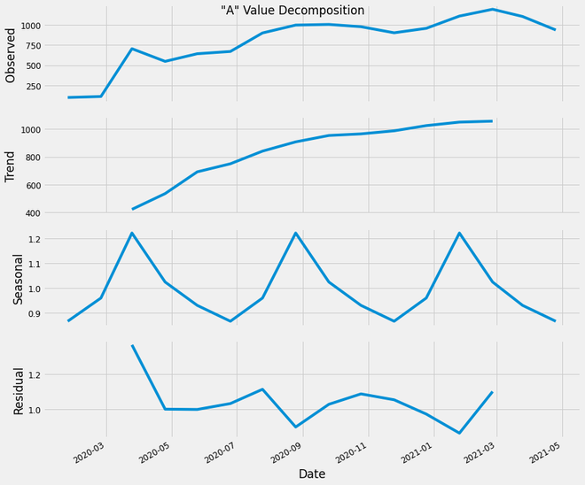
‘A’ value decomposition
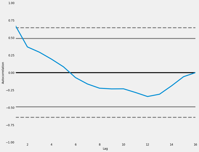
Plotting Timeseries based Autocorrelation Plot:
It is a commonly used tool for checking randomness in a data set. This randomness is ascertained by computing autocorrelation for data values at varying time lags. It shows the properties of a type of data known as a time series. These plots are available in most general-purpose statistical software programs. It can be plotted using the pandas.plotting.autocorrelation_plot().
Syntax: pandas.plotting.autocorrelation_plot(series, ax=None, **kwargs)
Parameters:
- series: This parameter is the Time series to be used to plot.
- ax: This parameter is a matplotlib axes object. Its default value is None.
Returns: This function returns an object of class matplotlib.axis.Axes
Considering the trend, seasonality, cyclic and residual, this plot shows the current value of the time-series data is related to the previous values. We can see that a significant proportion of the line shows an effective correlation with time, and we can use such correlation plots to study the internal dependence of time-series data.
Code:
Python3
from pandas.plotting import autocorrelation_plot
autocorrelation_plot(dataframe['A'])
|
Output:
Autocorrelation plot
Plotting Timeseries based Box Plot:
Box Plot is the visual representation of the depicting groups of numerical data through their quartiles. Boxplot is also used for detecting the outlier in data set. It captures the summary of the data efficiently with a simple box and whiskers and allows us to compare easily across groups. Boxplot summarizes a sample data using 25th, 50th and 75th percentiles.
Syntax: seaborn.boxplot(x=None, y=None, hue=None, data=None, order=None, hue_order=None, orient=None, color=None, palette=None, saturation=0.75, width=0.8, dodge=True, fliersize=5, linewidth=None, whis=1.5, ax=None, **kwargs)
Parameters:
x, y, hue: Inputs for plotting long-form data.
data: Dataset for plotting. If x and y are absent, this is interpreted as wide-form.
color: Color for all of the elements.
Returns: It returns the Axes object with the plot drawn onto it.
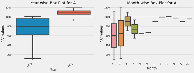
Here, through these plots, we will be able to obtain an intuition of the ‘A’ value ranges of each year (Year-wise Box Plot) as well as each month (Month-wise Box Plot). Also, through the Month-wise Box Plot, we can observe that the value range is slightly higher in Jan and Feb, compared to other months.
Python3
fig, ax = plt.subplots(nrows=1, ncols=2,
figsize=(15, 6))
sns.boxplot(dataframe['Year'],
dataframe["A"], ax=ax[0])
ax[0].set_title('Year-wise Box Plot for A',
fontsize=20, loc='center')
ax[0].set_xlabel('Year')
ax[0].set_ylabel('"A" values')
sns.boxplot(dataframe['Month'],
dataframe["A"], ax=ax[1])
ax[1].set_title('Month-wise Box Plot for A',
fontsize=20, loc='center')
ax[1].set_xlabel('Month')
ax[1].set_ylabel('"A" values')
fig.autofmt_xdate()
|
Output:
box plot analysis of ‘A’ column values
Shift Analysis:
This plot the achieved by dividing the current value of the ‘A’ column by the shifted value of the ‘A’ column. Default Shift is by one value. This plot is used to analyze the value stability on a daily basis.
Python3
dataframe['Change'] = dataframe.A.div(dataframe.A.shift())
dataframe['Change'].plot(figsize=(15, 10),
xlabel = "Date",
ylabel = "Value Difference",
title = "Shift Plot")
|
Output:
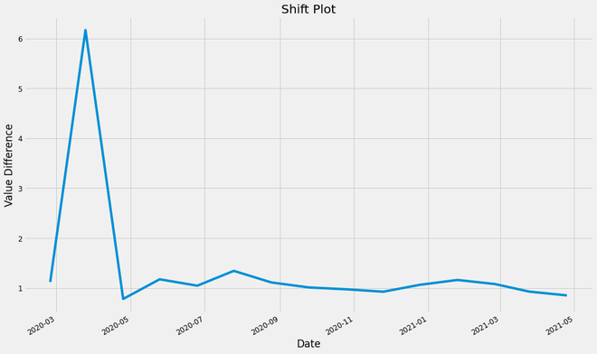
shift plot of the ‘A’ values
Plotting Timeseries based Heatmap:
We can interpret the trend of the “A” column values across the years sampled over 12 months, variation of values across different years, etc. We can also infer how the values have changed from the average value. This heatmap is a really useful visualization. This Heatmap shows the variation of temperature across Years as well as Months, differentiated using a Colormap.
Python3
import calendar
import seaborn as sns
import pandas as pd
dataframe['Date'] = dataframe.index
dataframe['Year'] = dataframe['Date'].dt.year
dataframe['Month'] = dataframe['Date'].dt.month
table_df = pd.pivot_table(dataframe, values=["A"],
index=["Month"],
columns=["Year"],
fill_value=0,
margins=True)
mon_name = [['Jan', 'Feb', 'Mar', 'Apr',
'May', 'Jun', 'Jul', 'Aug',
'Sep','Oct', 'Nov', 'Dec', 'All']]
table_df = table_df.set_index(mon_name)
ax = sns.heatmap(table_df, cmap='RdYlGn_r',
robust=True, fmt='.2f',
annot=True, linewidths=.6,
annot_kws={'size':10},
cbar_kws={'shrink':.5,
'label':'"A" values'})
ax.set_yticklabels(ax.get_yticklabels())
ax.set_xticklabels(ax.get_xticklabels())
plt.title('"A" Value Analysis', pad=14)
plt.xlabel('Year')
plt.ylabel('Months')
|
Output:
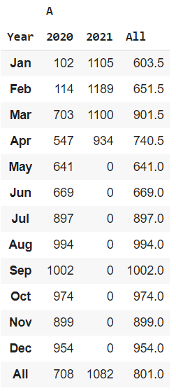
heatmap table for “A” column
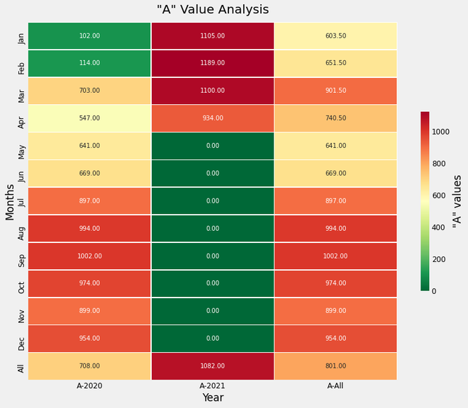
Heatmap Plot for the “A” column values
Like Article
Suggest improvement
Share your thoughts in the comments
Please Login to comment...