How to Plot Normal Distribution over Histogram in Python?
Last Updated :
28 Jan, 2024
In this article, we will discuss how to Plot Normal Distribution over Histogram using Python. First, we will discuss Histogram and Normal Distribution graphs separately, and then we will merge both graphs together.
Histogram
A histogram is a graphical representation of a set of data points arranged in a user-defined range. Similar to a bar chart, a bar chart compresses a series of data into easy-to-interpret visual objects by grouping multiple data points into logical areas or containers.
To draw this we will use:
- random.normal() method for finding the normal distribution of the data. It has three parameters:
- loc – (average) where the top of the bell is located.
- Scale – (standard deviation) how uniform you want the graph to be distributed.
- size – Shape of the returning Array
- The function hist() in the Pyplot module of the Matplotlib library is used to draw histograms. It has parameters like:
- data: This parameter is a data sequence.
- bin: This parameter is optional and contains integers, sequences or strings.
- Density: This parameter is optional and contains a Boolean value.
- Alpha: Value is an integer between 0 and 1, which represents the transparency of each histogram. The smaller the value of n, the more transparent the histogram.
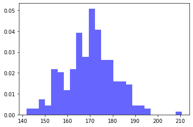
Python3
import numpy as np
import matplotlib.pyplot as plt
data = np.random.normal(170, 10, 250)
plt.hist(data, bins=25, density=True, alpha=0.6, color='b')
plt.show()
|
Output:
Normal Distribution
The normal distribution chart is characterized by two parameters:
- The average value, which represents the maximum value of the chart, and the chart is always symmetrical.
- And the standard deviation, which determines the amount of change beyond the mean. Smaller standard deviations (compared to the mean) appear steeper, while larger standard deviations (compared to the mean) appear flat.
Plotting the Normal Distribution
- NumPy arange() is used to create and return a reference to a uniformly distributed ndarray instance.
- With the help of mean() and stdev() method, we calculated the mean and standard deviation and initialized to mean and sd variable.
- Inside the plot() method, we used one method pdf() for displaying the probability density function. This pdf() method present inside the scipy.stats.norm.
Example:
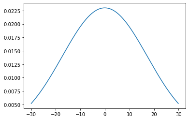
Python3
import numpy as np
import matplotlib.pyplot as plt
from scipy.stats import norm
import statistics
x_axis = np.arange(-30, 30, 0.1)
mean = statistics.mean(x_axis)
sd = statistics.stdev(x_axis)
plt.plot(x_axis, norm.pdf(x_axis, mean, sd))
plt.show()
|
Output:
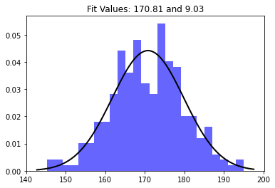
Normal Distribution over Histogram
Now, we are done separated the histogram and the normal distribution plot discussion, but it would be great if we can visualize them in a graph with the same scale. This can be easily achieved by accessing two charts in the same cell and then using plt.show(). Now, Let’s discuss about Plotting Normal Distribution over Histogram using Python.
We believe that the histogram of some data follows a normal distribution. SciPy has a variety of methods that can be used to estimate the best distribution of random variables, as well as parameters that can best simulate this adaptability. For example, for the data in this problem, the mean and standard deviation of the best-fitting normal distribution can be found as follows:
# Make the normal distribution fit the data:
mu, std = norm.fit (data) # mean and standard deviation
The function xlim() within the Pyplot module of the Matplotlib library is used to obtain or set the x limit of this axis.
Syntax: matplotlib.pyplot.xlim (*args, **kwargs)
Parameters: This method uses the following parameters, as described below:
- left: Use this parameter to set xlim to the left.
- Right: Use this parameter to set xlim on the right.
- ** kwargs: This parameter is a text attribute that controls the appearance of the label.
Return value:
- left, right: return a tuple of the new limit value of the x-axis.
Python3
import numpy as np
from scipy.stats import norm
import matplotlib.pyplot as plt
data = np.random.normal(170, 10, 250)
mu, std = norm.fit(data)
plt.hist(data, bins=25, density=True, alpha=0.6, color='b')
xmin, xmax = plt.xlim()
x = np.linspace(xmin, xmax, 100)
p = norm.pdf(x, mu, std)
plt.plot(x, p, 'k', linewidth=2)
title = "Fit Values: {:.2f} and {:.2f}".format(mu, std)
plt.title(title)
plt.show()
|
Output:
Like Article
Suggest improvement
Share your thoughts in the comments
Please Login to comment...