How to plot multiple data columns in a DataFrame?
Last Updated :
01 Dec, 2023
Python comes with a lot of useful packages such as pandas, matplotlib, numpy, etc. To use DataFrame, we need a Pandas library and to plot columns of a DataFrame, we require matplotlib. Pandas has a tight integration with Matplotlib. You can plot data directly from your DataFrame using the plot() method. To plot multiple data columns in the single frame we simply have to pass the list of columns to the y argument of the plot function.
In this article, we will see how we can plot multiple data columns in a DataFrame.
Plot Columns of Pandas DataFrame
Below are the ways by which we can plot multiple data columns in a Pandas DataFrame in Python:
- Unstacked Multiple Columns of Bar Plots
- Stacked Multiple Columns of Bar Plots
- Multiple Columns of Line Plots
Plot Unstacked Multiple Data Columns of Bar Plots
In this example, a pandas DataFrame is created from a list of city data, and a bar plot is generated using Matplotlib to visualize both the population and the year 2020 for each city. The resulting plot displays unstacked bars with city names on the x-axis and population, and the year on the y-axis.
Python3
import pandas as pd
import matplotlib.pyplot as plt
data = [["New York", 8.6, 20],
["Chicago", 2.7, 20],
["Los Angeles", 3.9, 20],
["Philadelphia", 1.5, 20],
["Houston", 2.1, 20]]
df = pd.DataFrame(data, columns=["City", "Population(million)", "Year(2020)"])
df.plot(x="City", y=["Population(million)", "Year(2020)"],
kind="bar", figsize=(10, 10))
plt.show()
|
Output:

Stacked Multiple Columns of Bar Plots
In this example, a pandas DataFrame is created from city data, and a stacked bar plot is generated using Matplotlib to visually compare the population and the year 2020 for each city. The ‘stacked=True’ parameter combines the bars for population and year in a stacked manner.
Python3
import pandas as pd
import matplotlib.pyplot as plt
data = [["New York", 8.6, 20],
["Chicago", 2.7, 20],
["Los Angeles", 3.9, 20],
["Philadelphia", 1.5, 20],
["Houston", 2.1, 20]]
df = pd.DataFrame(data, columns=["City", "Population(million)", "Year(2020)"])
df.plot(x="City", y=["Population(million)", "Year(2020)"],
kind="bar", figsize=(10, 10), stacked=True)
plt.show()
|
Output:
-660.png)
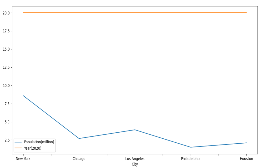
Plot Multiple Columns of Line Plots in a Pandas DataFrame
In this example, a pandas DataFrame is created from city data, and a line plot is generated using Matplotlib to visualize trends in both population and the year 2020 for each city. The resulting plot displays lines connecting data points for each city along the specified columns. The ‘kind=”line”‘ parameter specifies the type of plot, and ‘mp.show()’ displays the plot.
Python3
import pandas as pd
import matplotlib.pyplot as mp
data = [["New York", 8.6, 20],
["Chicago", 2.7, 20],
["Los Angeles", 3.9, 20],
["Philadelphia", 1.5, 20],
["Houston", 2.1, 20]]
df = pd.DataFrame(data, columns=["City", "Population(million)", "Year(2020)"])
df.plot(x="City", y=["Population(million)", "Year(2020)"],
kind="line", figsize=(10, 10))
mp.show()
|
Output:
Like Article
Suggest improvement
Share your thoughts in the comments
Please Login to comment...