How to plot means inside boxplot using ggplot2 in R?
Last Updated :
02 Nov, 2022
In this article, we are going to see how to plot means inside boxplot using ggplot in R programming language.
A box plot in base R is used to summarise the distribution of a continuous variable. It can also be used to display the mean of each group. Means or medians can also be computed using a boxplot by labeling points.
Method 1: Using stat_summary method
The ggplot method in R is used to do graph visualizations using the specified data frame. It is used to instantiate a ggplot object. Aesthetic mappings can be created to the plot object to determine the relationship between the x and y-axis respectively. Additional components can be added to the created ggplot object.
Syntax: ggplot(data = NULL, mapping = aes(), fill = )
Arguments :
- data – Default dataset to use for plot.
- mapping – List of aesthetic mappings to use for plot.
Geoms can be added to the plot using various methods. The geom_boxplot() method in R can be used to add box plots in the plots made. It is added as a component to the existing plot. Aesthetic mappings can also contain color attributes which is assigned differently based on different data frames.
geom_boxplot(alpha = )
The method stat_summary() can be used to add mean points to a box plot. It is used to add components to the made plot. This method saves the calculation of mean before plotting the data.
sSyntax: tat_summary(fun=mean, geom=)
Arguments :
- geom – The geometric object to use display the data
- position – The position adjustment to use for overlapping points on this layer
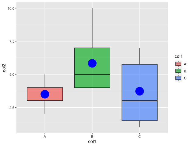
Example:
R
library(ggplot2)
data_frame <- data.frame(col1=c(rep("A", 10) ,
rep("B", 12) ,
rep("C", 18)),
col2=c( sample(2:5, 10 ,
replace=T) ,
sample(4:10, 12 ,
replace=T),
sample(1:7, 18 ,
replace=T))
)
graph <- ggplot(data_frame,
aes(x=col1, y=col2, fill=col1)) +
geom_boxplot(alpha=0.7) +
stat_summary(fun=mean, geom="point",
shape=20, color="blue",
fill="blue")
print(graph)
|
Output
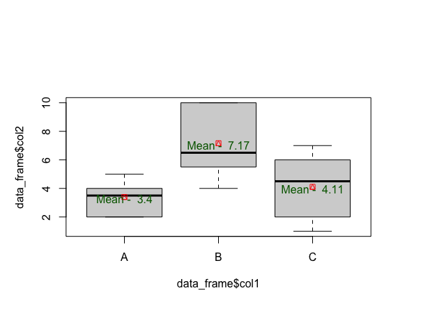
Method 2: Using the aggregate method
Aggregate() method in base R is used to split the data into subsets. It can also be used to compute summary statistics for each of the computed subsets and then return the result in a group by form.
Syntax: aggregate(x, by, FUN)
Arguments :
- x – A list or data frame
- by – The list of the column of the data frame to group by
- FUN – The function to apply to x
The boxplot method in R is used to produce box-and-whisker plot(s) of the specified grouped set of values. The boxplot method in R has the following syntax :
Syntax: boxplot( formula)
Arguments :
- formula – formula, such as y ~ grp, where y is a numeric vector of data values
The boxplot can be customised further to add points and text on the plot.
Syntax: points (x , y , col, pch)
Arguments :
- x ,y – The coordinates of the points to mark
- col – The colour to plot the points with
R
data_frame <- data.frame(col1=c(rep("A", 10) ,
rep("B", 12) ,
rep("C", 18)),
col2=c( sample(2:5, 10 ,
replace=T) ,
sample(4:10, 12 ,
replace=T),
sample(1:7, 18 ,
replace=T))
df_col1 <- list(data_frame$col1)
data_mod <- aggregate(data_frame$col2,
df_col1,
mean)
boxplot(data_frame$col2 ~ data_frame$col1)
row <- nrow(data_mod)
points(x = 1:row,
y = data_mod$x,
col = "red",
pch = 14
)
text(x = 1:row,
y = data_mod$x - 0.15,
labels = paste("Mean - ", round(data_mod$x,2)),
col = "dark green")
|
Output:
Share your thoughts in the comments
Please Login to comment...