How to plot Bar Graph in Python using CSV file?
Last Updated :
25 Feb, 2021
CSV stands for “comma separated values”, that means the values are distinguished by putting commas and newline characters. A CSV file provides a table like format that can be read by almost every spreadsheet reader like Microsoft Excel and Google Spreadsheet.
A Bar Graph uses labels and values where label is the name of a particular bar and value represent the height of the bar. A Bar Graph is commonly used in data analytics where we want to compare the data and extract the most common or highest groups.
In this post, we will learn how to plot a bar graph using a CSV file. There are plenty of modules available to read a .csv file like csv, pandas, etc. But in this post we will manually read the .csv file to get an idea of how things work.
Functions Used
- Pandas read_csv() function is used to read a csv file.
Syntax:
read_csv(“file path”)
- Matplotlib’s bar() function is used to create a bar graph
Syntax:
plt.bar(x, height, width, bottom, align)
Method 1: Using pandas
Approach
- Import module
- Read file using read_csv() function
- Plot bar graph
- Display graph
Example:
Dataset in use: Click here
Python3
import matplotlib.pyplot as plt
import pandas as pd
data = pd.read_csv('C:\\Users\\Vanshi\\Desktop\\data.csv')
df = pd.DataFrame(data)
X = list(df.iloc[:, 0])
Y = list(df.iloc[:, 1])
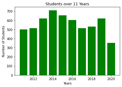
plt.bar(X, Y, color='g')
plt.title("Students over 11 Years")
plt.xlabel("Years")
plt.ylabel("Number of Students")
plt.show()
|
Output:
Method 2: Using Matplotlib
Approach
- Import module
- Open file
- Read data
- Plot bar graph
- Display graph
Program:
Dataset in use: Click here to download this file.
Python3
import matplotlib.pyplot as plt
data = dict()
with open('electronics.csv', 'r') as f:
for line in f.readlines():
month, item, quantity = line.split(',')
if month not in data:
data[month] = []
data[month].append((item, int(quantity)))
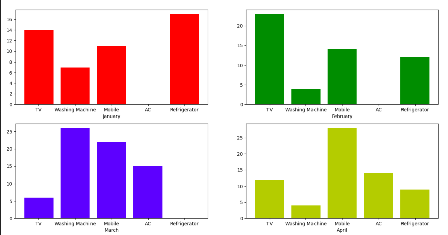
positions = [221, 222, 223, 224]
colors = ['r', 'g', 'b', 'y']
for i, l in enumerate(data.keys()):
plt.subplot(positions[i])
data_i = dict(data[l])
plt.bar(data_i.keys(), data_i.values(), color=colors[i])
plt.xlabel(l)
plt.show()
|
Output:
Share your thoughts in the comments
Please Login to comment...