How to plot all the columns of a dataframe in R ?
Last Updated :
15 Feb, 2023
In this article, we will learn how to plot all columns of the DataFrame in R programming language.
Dataset in use:
 x         y1        y2 y3
1   1 0.08475635 0.4543649  0
2   2 0.22646034 0.6492529  1
3   3 0.43255650 0.1537271  0
4   4 0.55806524 0.6492887  3
5   5 0.05975527 0.3832137  1
6   6 0.08475635 0.4543649  0
7   7 0.22646034 0.6492529  1
8   8 0.43255650 0.1537271  0
9   9 0.55806524 0.6492887  3
10 10 0.05975527 0.3832137  1
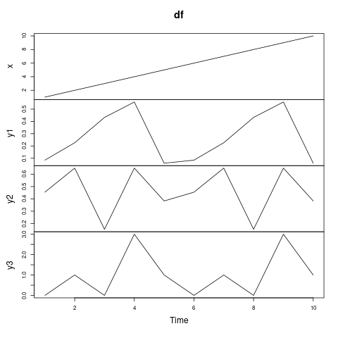
Method 1: using plot.ts() function
We just have to pass our dataframe in the plot.ts() function, and it will plot all the dataframe columns in a time series plot. In the Y-axis we can see the names of the columns of our dataframe.
Syntax: plot.ts(df)
Parameters:
df: DataFrame object
Example:
R
set.seed(200)
df <- data.frame(x = 1:10,
y1 = rnorm(5),
y2 = runif(5),
y3 = rpois(5, 1))
plot.ts(df)
|
Output:
Method 2: using zoo() function
The zoo() function is present in the zoo package, so it has to be imported by placing require(zoo) function on the first line of the code. This function converts the dataframe in such a format(“zoo” series) that it can be plotted easily in a form of a time series plot.
Since y is NULL in our case, a time series plot of x is produced. But if both x and y were a uni-variate “zoo” series then a scatter plot of y vs x would’ve been produced.
Syntax: plot(zoo(df))
Parameters:
df: DataFrame object
Example:
R
require(zoo)
set.seed(200)
df <- data.frame(x = 1:10,
y1 = rnorm(5),
y2 = runif(5),
y3 = rpois(5, 1))
df <- zoo(df)
plot(df)
|
Output:
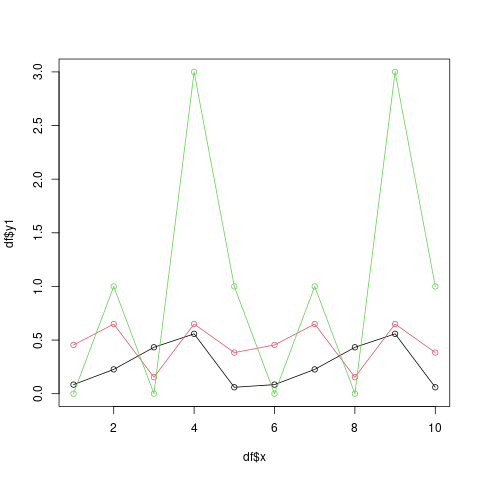
Method 3: using plot() function
In this approach, we will plot a line chart showing multiple columns of a data frame using the basic plot() function. The plot() function is defined as a generic function for plotting in R Language. It can be used to create basic plots of a different type.
Syntax: plot(X, Y, type = “l”, col = 1, ylim = c(0, 3))
Parameters:
X: X-axis. ->
Y: Y-axis ->
type: specifies the type of plot
col: specifies colour
ylim: specifies limit for y-axis
In the code below first dataframe column is X-axis, and the rest columns are y-axis, and they are plotted against the first column in form of a line chart. The value of col should be different for different lines such that different line has a different color, and finally we have specified ylim which limits the value of y-axis.
We can also plot different types of plots by specifying different values for type parameters. For example, type=”h”, would have plotted a histogram.
Example:
R
require(zoo)
set.seed(200)
df <- data.frame(x = 1:10,
y1 = rnorm(5),
y2 = runif(5),
y3 = rpois(5, 1))
plot(df$x, df$y1, type = "o", col = 1, ylim = c(0, 3))
lines(df$x, df$y2, type = "o", col = 2)
lines(df$x, df$y3, type = "o", col = 3)
|
Output:
For this the data has to be reshaped to be in the form where it can be plotted.
Example:
R
library(ggplot2)
set.seed(200)
df <- data.frame(x = 1:10,
y1 = rnorm(5),
y2 = runif(5),
y3 = rpois(5, 1))
df_reshaped <- data.frame(x = df$x,
y = c(df$y1, df$y2, df$y3),
group = c(rep("y1", nrow(df)),
rep("y2", nrow(df)),
rep("y3", nrow(df))))
head(df_reshaped,10)
|
Output:
  x          y group
1   1 0.08475635    y1
2   2 0.22646034    y1
3   3 0.43255650    y1
4   4 0.55806524    y1
5   5 0.05975527    y1
6   6 0.08475635    y1
7   7 0.22646034    y1
8   8 0.43255650    y1
9   9 0.55806524    y1
10 10 0.05975527    y1
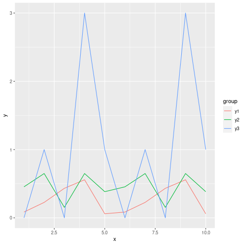
Plotting multiple variables in the same panel
In this method, we plot a line graph for each column of the dataframe in the same panel. This can be useful when comparing columns that store same type of data but differ in some nature. After reshaping the data, let us see how line plots of the various column will appear.
Syntax:
ggplot(df_reshaped, aes(x, y, col = group)) + geom_line()
Example:
R
library(ggplot2)
set.seed(200)
df <- data.frame(x = 1:10,
y1 = rnorm(5),
y2 = runif(5),
y3 = rpois(5, 1))
df_reshaped <- data.frame(x = df$x,
y = c(df$y1, df$y2, df$y3),
group = c(rep("y1", nrow(df)),
rep("y2", nrow(df)),
rep("y3", nrow(df))))
ggplot(df_reshaped, aes(x, y, col = group)) + geom_line()
|
Output:
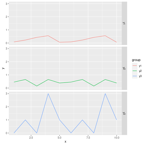
Plotting multiple variables in the different panels
In this method, we plot a line graph for each column of the dataframe in the different panel of a same plot. We can achieve this task by adding facet_grid() function. facet_grid() function produces a layout panel defined by rows and columns.
Syntax:
ggplot(df_reshaped, aes(x, y, col = group)) + geom_line()+ facet_grid(group ~ .)
Example:
R
library(ggplot2)
set.seed(200)
df <- data.frame(x = 1:10,
y1 = rnorm(5),
y2 = runif(5),
y3 = rpois(5, 1))
df_reshaped <- data.frame(x = df$x,
y = c(df$y1, df$y2, df$y3),
group = c(rep("y1", nrow(df)),
rep("y2", nrow(df)),
rep("y3", nrow(df))))
ggplot(df_reshaped, aes(x, y, col = group)) + geom_line()+ facet_grid(group ~ .)
|
Output:
Like Article
Suggest improvement
Share your thoughts in the comments
Please Login to comment...