How to plot a Pandas Dataframe with Matplotlib?
Last Updated :
24 Jan, 2021
Prerequisites:
Data visualization is the most important part of any analysis. Matplotlib is an amazing python library which can be used to plot pandas dataframe. There are various ways in which a plot can be generated depending upon the requirement.
Comparison between categorical data
Bar Plot is one such example. To plot a bar graph using plot() function will be used.
Syntax:
matplotlib.pyplot.plot(\*args, scalex=True, scaley=True, data=None, \*\*kwargs)
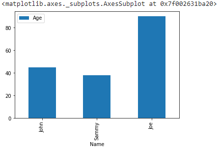
Example:
Python3
import pandas as pd
import matplotlib.pyplot as plt
df = pd.DataFrame({
'Name': ['John', 'Sammy', 'Joe'],
'Age': [45, 38, 90]
})
df.plot(x="Name", y="Age", kind="bar")
|
Output:
Visualizing continuous data
Histogram is an example of representing data as which is divided into closely related intervals. For this hist() function will be employed.
Syntax:
matplotlib.pyplot.hist(x, bins=None, range=None, density=False, weights=None, cumulative=False, bottom=None, histtype=’bar’, align=’mid’, orientation=’vertical’, rwidth=None, log=False, color=None, label=None, stacked=False, \*, data=None, \*\*kwargs)
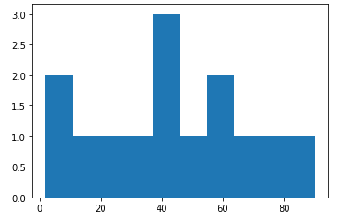
Example:
Python3
import pandas as pd
import matplotlib.pyplot as plt
df = pd.DataFrame({
'Age': [45, 38, 90, 60, 40, 50, 2, 32, 8, 15, 27, 69, 73, 55]
})
plt.hist(df["Age"])
plt.show()
|
Output:
For data distribution
Pie Chart is a great way of representing data which is a part of a whole. To plot a pie chart pie() function will be used.
Syntax:
matplotlib.pyplot.pie(data, explode=None, labels=None, colors=None, autopct=None, shadow=False)
Example:
Python3
import pandas as pd
import matplotlib.pyplot as plt
df = pd.DataFrame({
'Object': ['Bulb', 'Lamp', 'Table', 'Pen', 'Notebook'],
'Price': [45, 38, 90, 60, 40]
})
plt.pie(df["Price"], labels=df["Object"])
plt.show()
|
Output:

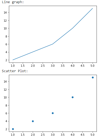
Dependency of data
In situations, where data is to be interpreted depending on dependent and non-dependent parameters, graphs like Line chart or Scatter plot, are used. To plot a line graph plot() function is sufficient but to visualize a scatter plot scatter() is used.
Syntax:
matplotlib.pyplot.scatter(x_axis_data, y_axis_data, s=None, c=None, marker=None, cmap=None, vmin=None, vmax=None, alpha=None, linewidths=None, edgecolors=None)
Example:
Python3
import pandas as pd
import matplotlib.pyplot as plt
df = pd.DataFrame({
'X': [1, 2, 3, 4, 5],
'Y': [2, 4, 6, 10, 15]
})
print("Line graph: ")
plt.plot(df["X"], df["Y"])
plt.show()
print("Scatter Plot: ")
plt.scatter(df["X"], df["Y"])
plt.show()
|
Output:
Like Article
Suggest improvement
Share your thoughts in the comments
Please Login to comment...