How to overlap two Barplots in Seaborn?
Last Updated :
25 Jan, 2022
Seaborn is an amazing visualization library for statistical graphics plotting in Python. It provides beautiful default styles and colour palettes to make statistical plots more attractive. It is built on the top of matplotlib library and also closely integrated to the data structures from pandas.
Bar Plot is used to represent categories of data using rectangular bars. We can overlap two barplots in seaborn by creating subplots.
Steps required to overlap two barplots in seaborn:
- Importing seaborn and matplotlib library, seaborn for plotting graph and matplotlib for using subplot().
- Creating dataframe.
- Creating two subplots on the same axes.
- Displaying the plot.
Below are some examples based on the above approach:
Example 1:
Python3
import pandas as pd
import seaborn as sns
import matplotlib.pyplot as plt
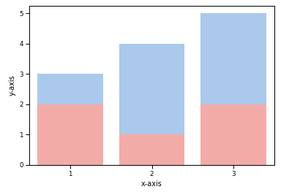
df = pd.DataFrame({
'X': [1, 2, 3],
'Y': [3, 4, 5],
'Z': [2, 1, 2]
})
ax = plt.subplots()
ax = sns.barplot(x=df["X"], y=df["Y"], color='b')
ax = sns.barplot(x=df["X"], y=df["Z"], color='r')
ax.set(xlabel="x-axis", ylabel="y-axis")
plt.show()
|
Output:
Example 2:
Python3
import pandas as pd
import seaborn as sns
import matplotlib.pyplot as plt
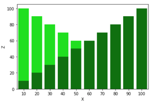
df=pd.DataFrame({
'X':[i for i in range(10,110,10)],
'Y':[i for i in range(100,0,-10)],
'Z':[i for i in range(10,110,10)]
})
ax=plt.subplots()
ax=sns.barplot(x=df["X"],y=df["Y"],color = 'lime')
ax=sns.barplot(x=df["X"],y=df["Z"],color = 'green')
ax.set(xlabel="x-axis", ylabel="y-axis")
plt.show()
|
Output:
Like Article
Suggest improvement
Share your thoughts in the comments
Please Login to comment...