How To Manually Specify Colors for Barplot in ggplot2 in R?
Last Updated :
21 Dec, 2021
In this article, we will discuss how to manually specify colors for Barplot in ggplot2 in R Programming Language.
To specify colors of the bar in Barplot in ggplot2, we use the scale_fill_manual function of the ggplot2 package. Within this function, we need to specify a color for each of the bars as a vector. We can use colors using names as well as hex codes.
Syntax: plot+ scale_fill_manual(values=<color-vector>)
Example 1:
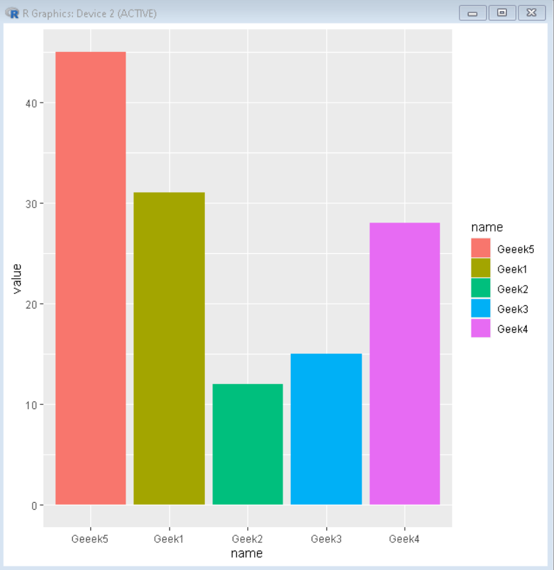
Here, is a basic ggplot2 bar plot with the default colors:
R
set.seed(5642)
sample_data <- data.frame(name = c("Geek1","Geek2",
"Geek3","Geek4",
"Geeek5") ,
value = c(31,12,15,28,45))
library("ggplot2")
plot<-ggplot(sample_data,
aes(name,value, fill=name))
+ geom_bar(stat = "identity")
plot
|
Output:
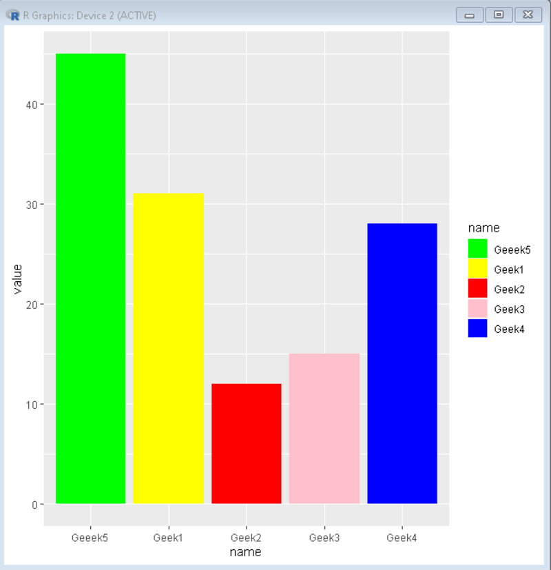
To manually specify colors just add scale_fill_manual() function to plot:
R
set.seed(5642)
sample_data <- data.frame(name = c("Geek1","Geek2",
"Geek3","Geek4",
"Geeek5") ,
value = c(31,12,15,28,45))
library("ggplot2")
plot<-ggplot(sample_data,
aes(name,value, fill=name))
+ geom_bar(stat = "identity")
plot + scale_fill_manual(values = c("green","yellow",
"red","pink","blue"))
|
Output:
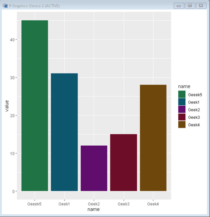
We can even use hex codes of color instead of names:
R
set.seed(5642)
sample_data <- data.frame(name = c("Geek1","Geek2",
"Geek3","Geek4",
"Geeek5") ,
value = c(31,12,15,28,45))
library("ggplot2")
plot<-ggplot(sample_data, aes(name,value, fill=name)) +
geom_bar(stat = "identity")
plot + scale_fill_manual(values = c("#207345","#0d576e",
"#610d6e","#6e0d27",
"#6e470d"))
|
Output:
Like Article
Suggest improvement
Share your thoughts in the comments
Please Login to comment...