How To Make World Map with ggplot2 in R?
Last Updated :
18 Feb, 2022
In this article, we will discuss how to create a world map and plot data on it using the R Programming Language.
To create a world map using it we will use the geom_map() function of the ggplot2 package of the R Language. This function returns a ggplot object so all the functions that work on other ggplot plots will be working in geom_map() too.
Syntax:
ggplot() + geom_map( data, map, aes() )
where,
- data: determines the data be displayed in this layer.
- map: determines the data frame that contains the map coordinates
- aes(): determines the aesthetics that is coordinate system variable and other aesthetical aspects.
Example:
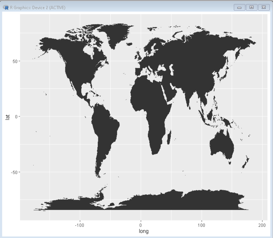
Here, is a basic world map plot made using the geom_map() function. Data frame for map coordinates is taken using the map_data() function. This creates a world map as a ggplot object that can be formatted, modified, and plotted over as a layer just like every other ggplot2 plot.
R
library(tidyverse)
world_coordinates <- map_data("world")
ggplot() +
geom_map(
data = world_coordinates, map = world_coordinates,
aes(long, lat, map_id = region)
)
|
Output:
This is a basic map with default color scheme of ggplot2 package plots.
Color Customization
We can customize the visual look and feel of the plot using the color, fill, and size parameter of the geom_map() function.
Syntax:
ggplot() + geom_map( data, map, aes(), size, color, fill )
where,
- size: determines the thickness of the border of the map
- color: determines the color of the border of the map
- fill: determines the color of the fill background of the map
Example:
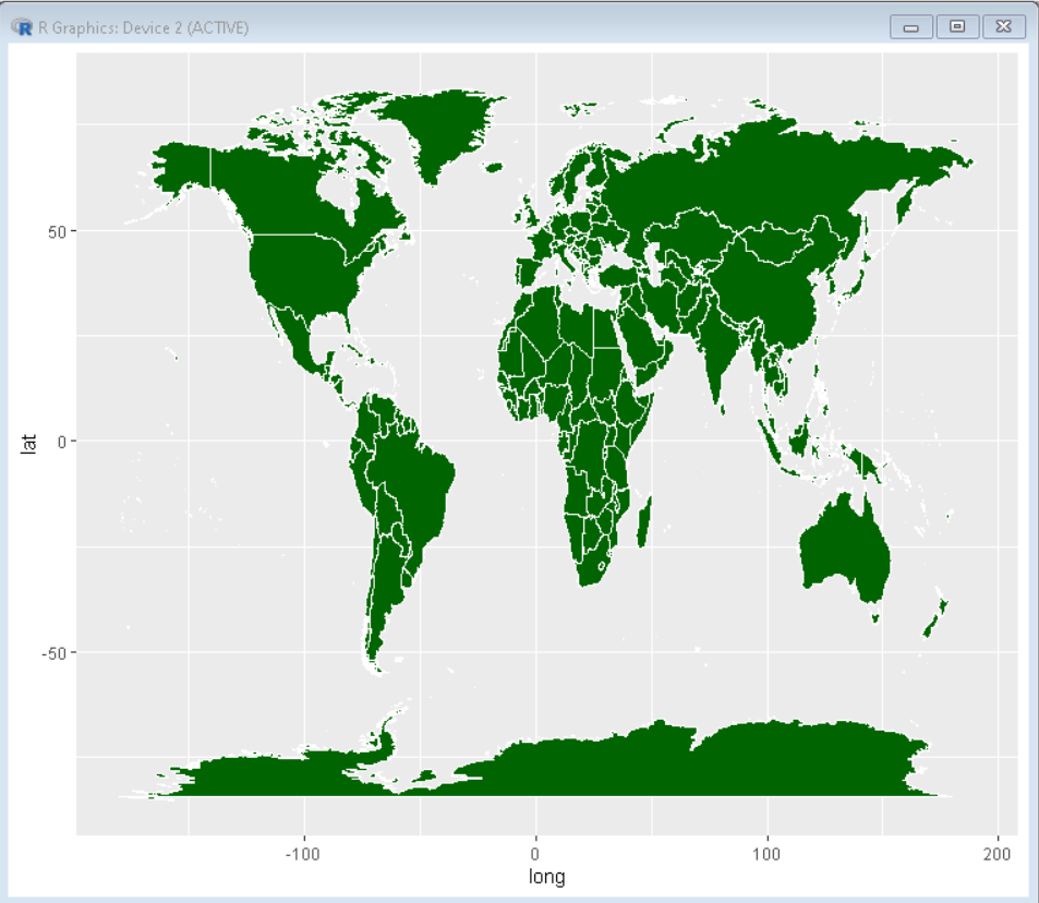
Here, is a world map with green fill and thick white border made using the fill, color, and size property of the geom_map() function. This makes the map more visually appealing and helps us differentiate different countries due to the contrast of white boundaries.
R
library(tidyverse)
world_coordinates <- map_data("world")
ggplot() +
geom_map(
data = world_coordinates, map = world_coordinates,
aes(long, lat, map_id = region)
color = "white", fill = "darkgreen", size = 0.2
)
|
Output:
Plotting data over the world map
Since the geom_map() function returns the ggplot() object we can plot data over it just like on any other ggplot plot. To do so we just need latitude and longitude data in our dataset to plot the data on the map. We can plot a line plot, scatter plot, boxplot or any other desired plot over the world map plot using the desired ggplot2 function.
Syntax:
ggplot()+ geom_map()+ geom_plot()
where,
- geom_plot(): determines any plot function from ggplot2 package
Example:
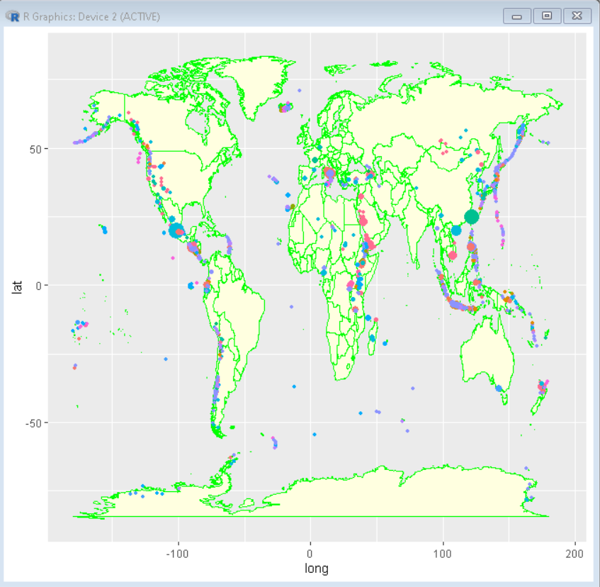
Int his example we have plotted a volcanic eruption dataset on top of geom_map() function using geom_point() function. Here we can show the variation of the intensity of volcanic eruptions around the world. this helps us in understanding the critical zone for volcanic eruption.
Dataset Used: volcano
R
library(tidyverse)
world_coordinates <- map_data("world")
volcano_eruption <- readr::read_csv("volcano.csv")
ggplot() +
ion takes world coordinates as input
geom_map(
data = world, map = world,
aes(long, lat, map_id = region),
color = "green", fill= "lightyellow"
)+
geom_point(
data = volcano_eruption,
aes(longitude, latitude, color = primary_volcano_type,
size=population_within_10_km),
alpha = 1
) +
theme(legend.position="none")
|
Output:
Like Article
Suggest improvement
Share your thoughts in the comments
Please Login to comment...