How To Make Violinplot with Data Points in R?
Last Updated :
13 Jun, 2023
In this article, we will discuss how to make violinplot with data points in the R programming language.
A violin plot is a compact display of a continuous distribution. The geom_violin() method in R is used to construct a violin plot in the working space which understands various aesthetic mappings, like alpha, color or fill.
Syntax:
geom_violin()
To construct a regular violin plot simply call the geom_violin() function after the visualization.
Example: A regular violin plot.
R
library("ggplot2")
data_frame <- data.frame(col1=c(rep("A", 10) , rep("B", 12) , rep("C", 18)),
col2=c( sample(2:5, 10 , replace=T) ,
sample(4:10, 12 , replace=T),
sample(1:7, 18 , replace=T))
)
ggplot(data_frame, aes(x = col1, y = col2, fill = col1)) +
geom_violin()
|
Output:
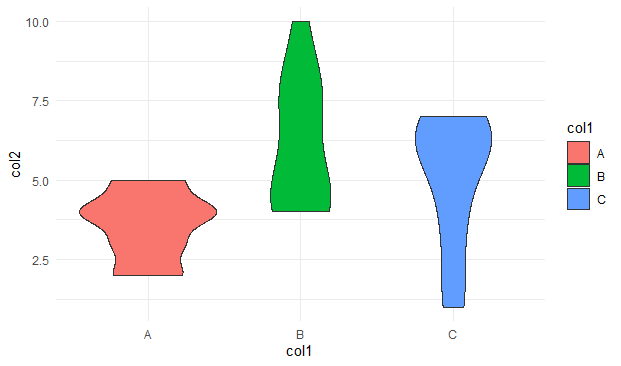
Violinplot with Data Points in R
Adding data points to the violin plot
The width of a dot corresponds to the bin width in the case of a dot plot. This is followed by the case where the dots are stacked, where each of the dots represents one observation. To add data points we use geom_dotplot() after creating a violinplot.
Syntax:
geom_dotplot(mapping = NULL,data = NULL,binwidth = NULL,binaxis = “x”,stackdir = “up”)
Parameter :
- mapping – Set of aesthetic mappings created by aes()
- data – The data to be displayed
- binaxis – The axis to bin along, “x” or “y”
- stackdir – Defines the direction in which the dots should be stacked
- dotsize – The diameter of the dots relative to binwidth
Example: Adding data points to violin plot.
R
data_frame <- data.frame(col1=c(rep("A", 10) , rep("B", 12) , rep("C", 18)),
col2=c( sample(2:5, 10 , replace=T) ,
sample(4:10, 12 , replace=T),
sample(1:7, 18 , replace=T))
)
ggplot(data_frame, aes(x = col1, y = col2, fill = col1)) +
geom_violin(alpha = 0.5) +
geom_dotplot(binaxis = "y",
stackdir = "center",
dotsize = 0.5)
|
Output:

Violinplot with Data Points in R
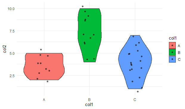
Adding jitters to the violin plot
The geom_plot() can be improved by plotting the violin plot with data points using random noise to the actual data points on the x-axis. These data points are referred to as the “jitters”. The geom_jitter() method in R is used to add a small amount of random variation to the location of each point.
Example: Adding jitters to the violin plot
R
library("ggplot2")
data_frame <- data.frame(col1=c(rep("A", 10) , rep("B", 12) , rep("C", 18)),
col2=c( sample(2:5, 10 , replace=T) ,
sample(4:10, 12 , replace=T),
sample(1:7, 18 , replace=T))
)
ggplot(data_frame, aes(x = col1, y = col2, fill = col1)) +
geom_violin() +
geom_jitter()
|
Output:

Violinplot with Data Points in R
Specifying jitter width in the violin plot
The transparency, as well as the width of the data points in the violin plot, can be improvised by specifying the arguments, width, and alpha in the geom_jitter method in R.
Syntax:
geom_jitter(alpha, width)
Parameter:
- alpha: fixes the transparency
- width: used to specify the width of the jitter points
Example: Specifying jitter width in the violin plot
R
library("ggplot2")
data_frame <- data.frame(col1=c(rep("A", 10) , rep("B", 12) , rep("C", 18)),
col2=c( sample(2:5, 10 , replace=T) ,
sample(4:10, 12 , replace=T),
sample(1:7, 18 , replace=T))
)
ggplot(data_frame, aes(x = col1, y = col2, fill = col1)) +
geom_violin() +
geom_jitter(width=0.15, alpha=0.5)
|
Output:
Violinplot with Data Points in R
Like Article
Suggest improvement
Share your thoughts in the comments
Please Login to comment...