How To Make Violin Plots with ggplot2 in R?
Last Updated :
13 Jun, 2023
Violin plots help us to visualize numerical variables from one or more categories. They are similar to box plots in the way they show a numerical distribution using five summary-level statistics. But violin plots also have the density information of the numerical variables. It allows visualizing the distribution of several categories by displaying their densities.
In this article, we will discuss how to plot a violin plot with the help of the ggplot2 library in R Programming Language. To plot a violin plot using the ggplot2 package we use the geom_violin() function.
Syntax: ggplot( dataframe, aes( x, y, fill, color)) + geom_violin()
Parameters:
- dataframe: determines the dataset used in the plot.
- fill: determines the color of background of interior of the plot.
- color: determines the color of boundary of plot.
Creating basic Violin Plots
Here, is a basic violin plot made using the geom_violin() function. We have used the diamonds data frame in this plot which is provided by the R language natively.
R
library(ggplot2)
ggplot(diamonds, aes(x=cut, y=price)) +
geom_violin()
|
Output:
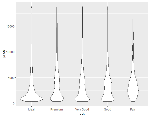
Violin Plots with ggplot2 in R
Color Customization
We can change the color of the violin plot using the color parameter of aes() function of ggplot2. This changes the color of the boundary of the violin plot according to the category of data. Here, plots are colored according to the category of their cut by putting cut as a parameter color.
R
library(ggplot2)
ggplot(diamonds, aes(x=cut, y=price, color=cut)) +
geom_violin()
|
Output:
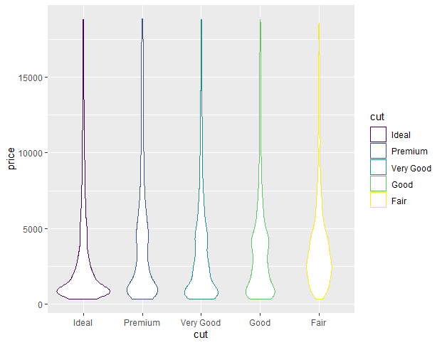
Violin Plots with ggplot2 in R
We can change the background color of the violin plot using the fill parameter of aes() function of ggplot2. This changes the color of the background of the interior of the violin plot according to the category of data.
Here, plots are colored according to the category of their cut by putting cut as parameter fill.
R
library(ggplot2)
ggplot(diamonds, aes(x=cut, y=price, fill=cut)) +
geom_violin()
|
Output:
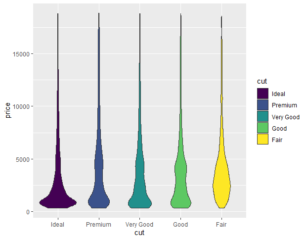
Violin Plots with ggplot2 in R
Horizontal Violin Plot
To convert a normal violin plot to a horizontal violin plot we add the coord_flip() function to the ggplot() function. This flips the coordinate axis of the plot and converts any ggplot2 plot into a horizontal plot.
Syntax: plot+ coord_flip()
Here, is a horizontal violin plot made using the coord_flip() function.
R
library(ggplot2)
ggplot(diamonds, aes(x=cut, y=price)) +
geom_violin()+
coord_flip()
|
Output:
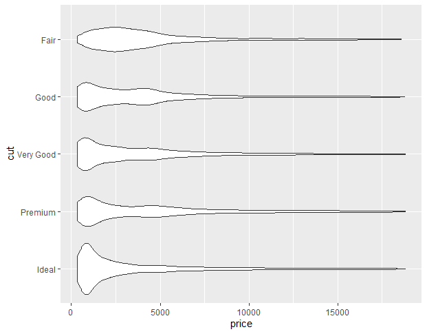
Violin Plots with ggplot2 in R
Mean marker customization
In ggplot2, we use the stat_summary() function to compute new summary statistics and add them to the plot. We use the stat_summary() function with ggplot() function.
Syntax:
plot+ stat_summary(fun.y, geom, size, color)
Here,
- fun.y: determines the function according to which marker has to be placed i.e. mean, median, etc.
- geom: determines the shape of marker
- size: determines size of marker
- color: determines the color of marker
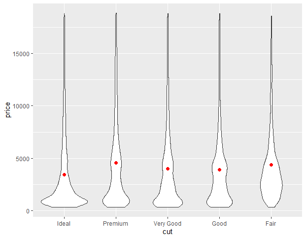
Example:
In this example, we will compute the mean value of the y-axis variable using fun.y argument in the stat_summary() function.
R
library(ggplot2)
ggplot(diamonds, aes(x=cut, y=price)) +
geom_violin()+
stat_summary(fun.y="mean", geom="point", size=2, color="red")
|
Output:
Violin Plots with ggplot2 in R
Here, the point in the center of the violin shows the variation of the mean of the y-axis for each category of data on the x-axis.
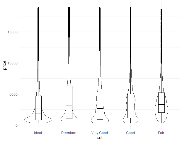
Adding box plot in violin plot:
Adding a box plot in the violin plot we will use the geom_boxplot function which helps to make a box plot.
R
library(ggplot2)
ggplot(diamonds, aes(x = cut, y = price)) +
geom_violin() +
geom_boxplot(width = 0.2, fill = "white", color = "black")
|
Output:
Violin Plots with ggplot2 in R
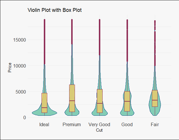
Customization of the box plot:
Add some color and other features in the box plot we use several inbuilt functions.
R
library(ggplot2)
theme_set(theme_minimal())
ggplot(diamonds, aes(x = cut, y = price)) +
geom_violin(fill = "#66C2A5", color = "#084B83", alpha = 0.8) +
geom_boxplot(width = 0.2, fill = "#EFCB68", color = "#8F2D56", alpha = 0.8) +
labs(x = "Cut", y = "Price", title = "Violin Plot with Box Plot") +
theme(axis.text = element_text(size = 12, color = "#333333")) +
theme(plot.background = element_rect(fill = "#F7F7F7")) +
theme(legend.background = element_rect(fill = "#F7F7F7"),
legend.position = "bottom") +
theme(plot.margin = margin(20, 20, 20, 20))
|
Output:
Violin Plots with ggplot2 in R
Like Article
Suggest improvement
Share your thoughts in the comments
Please Login to comment...