How to make rounded corner using CSS ?
Last Updated :
14 Sep, 2021
To create a rounded corner, we use the CSS border-radius property. This property is used to set the border-radius of element.
Syntax:
/* It sets the radius value to all 4 corners */
border-radius: value;
Example 1: This example describes the border-radius to make the rounded corners.
HTML
<!DOCTYPE html>
<html lang="en">
<head>
<meta charset="UTF-8">
<meta http-equiv="X-UA-Compatible" content="IE=edge">
<meta name="viewport" content=
"width=device-width, initial-scale=1.0">
<style>
.container {
border: 1px solid black;
width: 300px;
height: 200px;
background-color: aqua;
/* This set radius to all 4 corners */
border-radius: 10px;
}
</style>
</head>
<body>
<h2 style="color:green">GeeksforGeeks</h2>
<div class="container">
<p text-align="center"> Rounded corner</p>
</div>
</body>
</html>
|
Output:
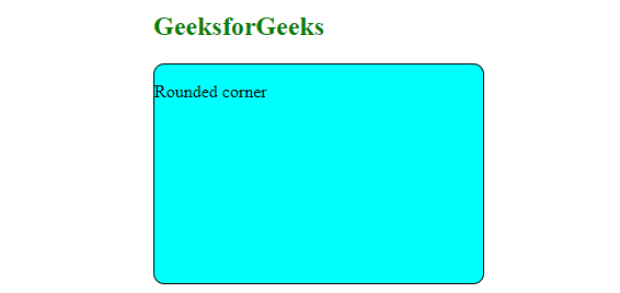
rounded corner
Example 2: This example describes the use of border-bottom-left-radius property to make a rounded corner at the bottom left.
HTML
<!DOCTYPE html>
<html lang="en">
<head>
<meta charset="UTF-8">
<meta http-equiv="X-UA-Compatible" content="IE=edge">
<meta name="viewport"
content="width=device-width, initial-scale=1.0">
<style>
.container {
border: 1px solid black;
width: 300px;
height: 200px;
background-color: aqua;
border-bottom-left-radius: 30px;
}
</style>
</head>
<body>
<h2>GeeksforGeeks</h2>
<div class="container">
<p text-align="center">
This is Rounded corner at <b>bottom left</b>
</p>
</div>
</body>
</html>
|
Output:

Example 3: This example describes the use of border-top-right-radius property to make a rounded corner at the top-right corner.
HTML
<!DOCTYPE html>
<html lang="en">
<head>
<meta charset="UTF-8">
<meta http-equiv="X-UA-Compatible" content="IE=edge">
<meta name="viewport"
content="width=device-width, initial-scale=1.0">
<style>
.container {
border: 1px solid black;
width: 300px;
height: 200px;
background-color: aqua;
border-top-right-radius: 30px;
}
</style>
</head>
<body>
<h2>GeeksforGeeks</h2>
<div class="container">
<p text-align="center">
This is Rounded corner at <b>top right</b>
</p>
</div>
</body>
</html>
|
Output:

Example 4: This example describes the use of border-bottom-right-radius property to make the rounded corner at the bottom right.
HTML
<!DOCTYPE html>
<html lang="en">
<head>
<meta charset="UTF-8">
<meta http-equiv="X-UA-Compatible" content="IE=edge">
<meta name="viewport"
content="width=device-width, initial-scale=1.0">
<style>
.container {
border: 1px solid black;
width: 300px;
height: 200px;
background-color: aqua;
border-bottom-right-radius: 30px;
}
</style>
</head>
<body>
<h2>GeeksforGeeks</h2>
<div class="container">
<p text-align="center">
This is Rounded corner at <b>bottom right</b>
</p>
</div>
</body>
</html>
|
Output:

Example 5:This example describes the use of border-top-left-radius property to make the corner at the top-left.
HTML
<!DOCTYPE html>
<html lang="en">
<head>
<meta charset="UTF-8">
<meta http-equiv="X-UA-Compatible" content="IE=edge">
<meta name="viewport"
content="width=device-width, initial-scale=1.0">
<style>
.container {
border: 1px solid black;
width: 300px;
height: 200px;
background-color: aqua;
border-top-left-radius: 30px;
}
</style>
</head>
<body>
<h2>GeeksforGeeks</h2>
<div class="container">
<p text-align="center">
This is Rounded corner at <b>top left</b>
</p>
</div>
</body>
</html>
|
Output:
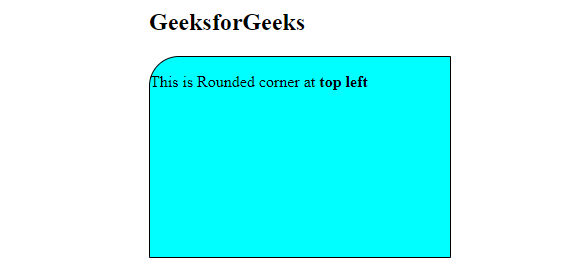
top left
Shorthands:
Apply Radius value to all four corners:
border-radius: value;
Apply value1 to top-left and bottom-right corners and value2 to top-right and bottom-left corners.
border-radius: value1 value2;
Apply value1 to top-left corner, value2 to top-right and bottom-left corners and value3 to bottom-right corner.
border-radius: value1 value2 value3;
Apply value1 to top-left corner, value2 to top-right corner , value3 to bottom-right corner and value4 to bottom-left corner.
border-radius: value1 value2 value3 value4;
Like Article
Suggest improvement
Share your thoughts in the comments
Please Login to comment...