How To Make Ridgeline Plot with ggridges in R?
Last Updated :
05 Oct, 2021
The ridgeline plot allows the visualization of the distribution of a numeric variable for several categories together in a single plot. The ggridges package offers two types of ridgeline plot geoms:
- geom_ridgeline() uses the height values directly to draw ridgelines.
- geom_density_ridges() estimates densities and then makes ridgeline plot.
In this article, we will discuss how to plot the ridgeline plot using ggridges and ggplot2 library of R Programming language.
Syntax: ggplot(dataframe, aes(x , y , fill)) + geom_density_ridges()
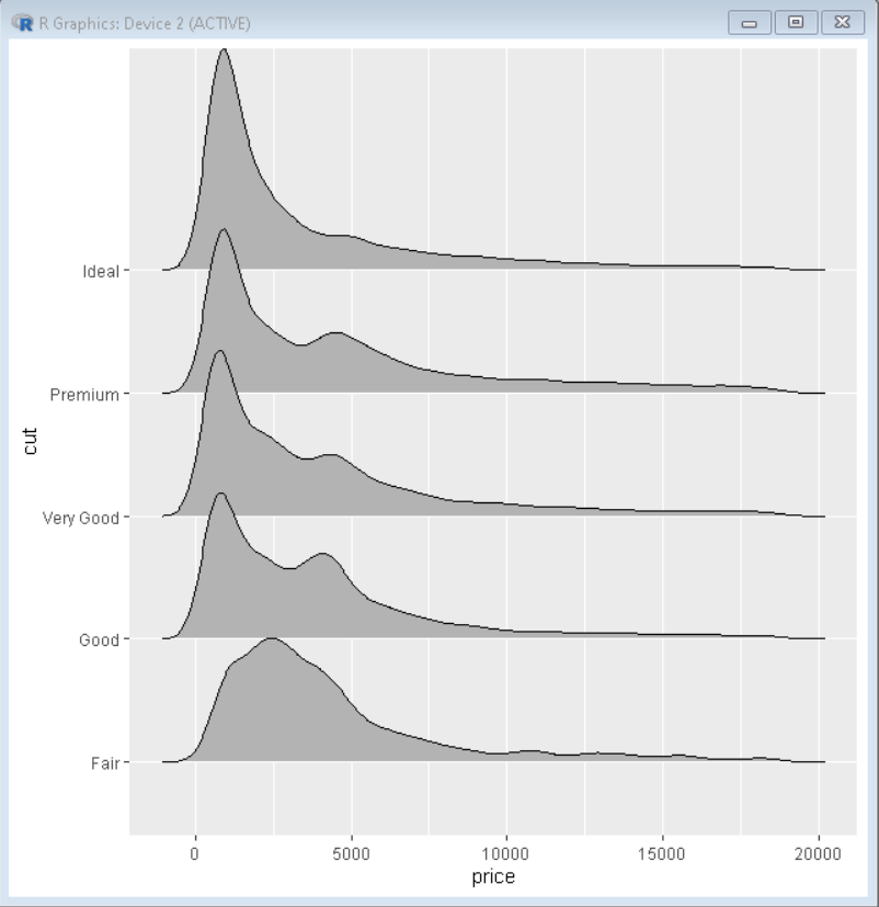
Example 1: Creating basic Ridgeline Plot
Here is a basic ridgeline plot. To draw a ridgeline plot we first take a data frame, which in the following example is diamonds data frame which is provided by R Language natively. Then We have used the geom_density_ridges() function to draw a ridgeline plot.
R
library(ggridges)
library(ggplot2)
ggplot(diamonds, aes(x = price, y = cut)) +
geom_density_ridges()
|
Output:
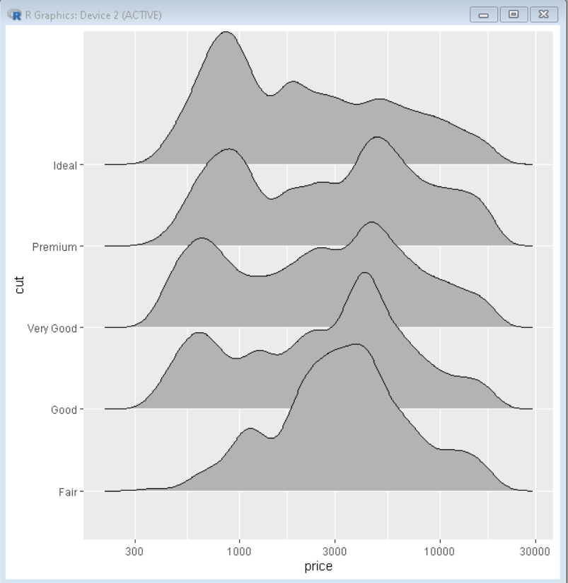
Example 3: Log Scale customization
We can plot ridgeline plot with log-scale on x-axis using scale_x_continuous() function. To specify the type of transformation, we use “trans” parameter.
Syntax:
plot+ scale_x_continuous( trans )
R
library(ggridges)
library(ggplot2)
ggplot(diamonds, aes(x = price, y = cut)) +
geom_density_ridges()+
scale_x_continuous(trans="log10")
|
Output:
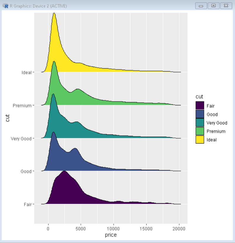
Example 3: Color customization
We can change the color of the plot with the help of the fill property of ggplot() function. We pass the variable as a parameter to fill according to which we want to color the plot.
R
library(ggridges)
library(ggplot2)
ggplot(diamonds, aes(x = price, y = cut, fill=cut)) +
geom_density_ridges()
|
Output:
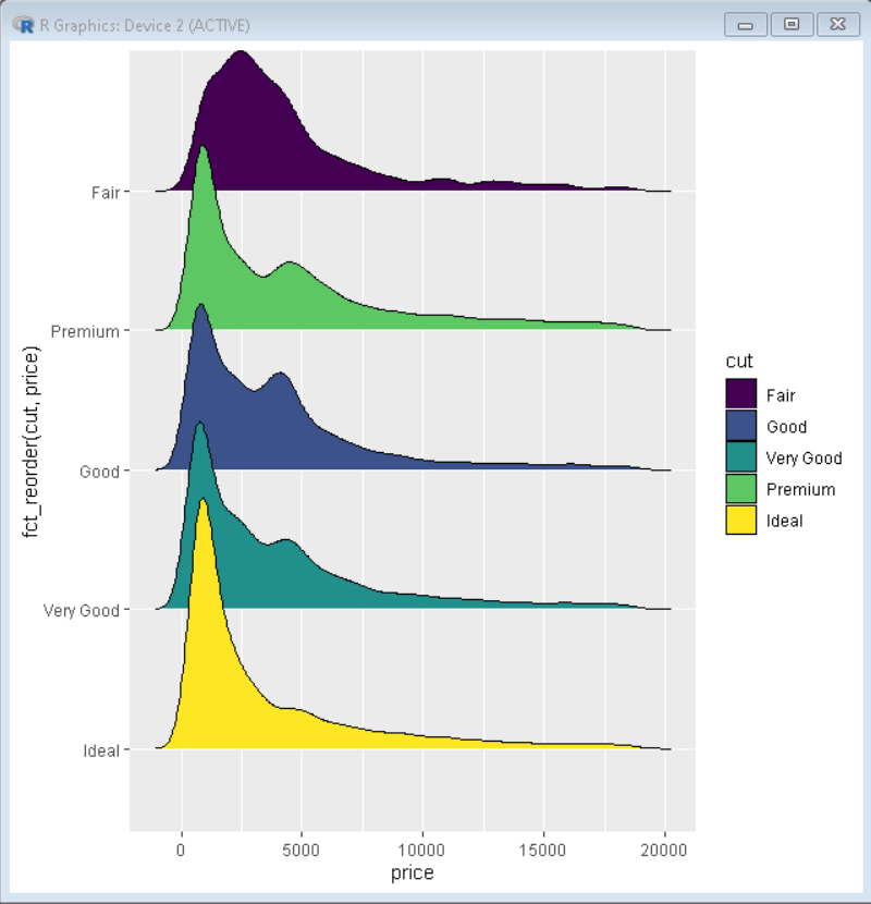
Example 4: Reordering of ridgeline plots
To reorder the ridgeline plot we use reorder() function of ggplot2. This reorders the plot according to the increasing order of mean of the parameter passed to reorder function. To reorder the plot in decreasing order, we pass the variable with -ve sign.
Syntax: ggplot(sample_data, aes(x=reorder(name,value),y=value))
R
library(ggridges)
library(tidyverse)
ggplot(diamonds, aes(x = price, y = fct_reorder(cut,price), fill=cut)) +
geom_density_ridges()
|
Output:
Like Article
Suggest improvement
Share your thoughts in the comments
Please Login to comment...