How to Make Grouped Boxplot with Jittered Data Points in ggplot2 in R
Last Updated :
05 Nov, 2021
In this article, we will see how to make use of ggplot2 package in R Programming Language to plot grouped boxplots with jittered data points.
Grouped Boxplots help us visualize two or more features/variables in a single plot using the grouping variable in ggplot2. The jittered points are data points that belong to another variable and are plotted on top of the grouped boxplot for a better comparison of the spread of data points of the considered variables.
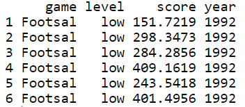
Creating a DataFrame
Here we can use any in-built datasets in R (the list of datasets can be viewed using data( ) command) or even create one. Let’s create a data frame and visualize it.
R
game = rep(c('Footsal', 'Slamdunk', 'VolleyBall'), each=50)
level = rep(c('low', 'high'), each=25)
score = runif(150, min=1, max=500)
year = rep(c(1992,1993,1994),each=50)
data = data.frame(game, level, score,year)
head(data)
|
Output:
Plotting Grouped Boxplots
Here we are going to plot boxplots using geom_boxplot() methods.
Syntax of geom_boxplot(): geom_boxplot(mapping = NULL, data = NULL, outlier.shape = 19, na.rm = FALSE … )
Arguments:
- mapping: Set of aesthetic mappings
- data: data to be displayed in this layer
- outlier.shape: Displaying the outliers, NA – hides the outliers
- na.rm: dealing with missing values, TRUE – removes any missing values in data
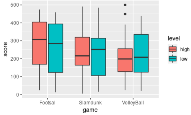
Plotting a Grouped Boxplot using the dataframe created
Using ggplot2 let’s plot a grouped box plot using the data frame created. Let’s visualize a boxplot between score and game, filled by level. Here we can compare each level with respect to games.
R
library(ggplot2)
ggplot(data, aes(x = game, y = score, fill = level)) +
geom_boxplot()
|
Output:
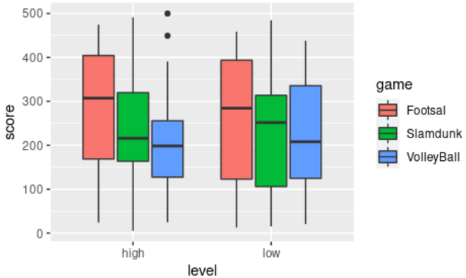
Plotting another boxplot using the dataframe created
Let’s visualize another boxplot between game and score, filled by level. This is the same as the above plot but with a changed axis which gives a clear comparison between each game with respect to the levels.
R
ggplot(data, aes(x = level, y = score, fill = game)) +
geom_boxplot()
|
Output:
Adding Jittered Data Points to the Grouped Boxplot
Here we are adding jitter data points into the grouped boxplot using geom_point() method.
Syntax of geom_point(): geom_point(mapping = NULL, data = NULL, position = “identity”, … )
Arguments:
- mapping – Set of aesthetic mappings
- data = dataset
- position – Position adjustment of points
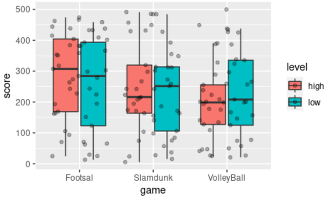
Adding jittered data points using geom_point( ) function and position_jitterdodge( ) argument
Let’s add jittered data points on the boxplot to visualize the spread of the data with respect to each game.
R
ggplot(data, aes(x = game, y = score, fill = level)) +
geom_boxplot(outlier.shape = NA)+
geom_point(position = position_jitterdodge(), alpha=0.3)
|
Output:
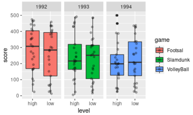
Plotting a Grouped Boxplot with jittered points with respect to performance in each game in each year
Let’s add jittered data points on the boxplot using geom_point( ) and facet_wrap( ) functions to compare the performance of scores in each game per year in different facets.
R
ggplot(data, aes(x = level, y = score, fill = game)) +
geom_boxplot()+
geom_jitter(width = 0.1,alpha = 0.3) +
facet_wrap(~year)
|
Output:
Like Article
Suggest improvement
Share your thoughts in the comments
Please Login to comment...