How To Make Density Plots with ggplot2 in R?
Last Updated :
13 Jun, 2023
In this article, we are going to see how to make Density plots with ggtplot2 in R Programming language.
The probability density function of a continuous variable is estimated using a data visualization approach called a density plot, sometimes referred to as a kernel density plot or kernel density estimation plot. It offers a rounded picture of the data’s underlying distribution.
The probability density function (PDF) is estimated using the observed data points in the theory underlying a density plot. Each data point is the center of a kernel function, usually a Gaussian (normal) kernel. The density estimate’s shape and width are determined by the kernel function.
To create a density plot in R using ggplot2, we use the geom_density() function of the ggplot2 package.
Syntax: ggplot( aes(x)) + geom_density( fill, color, alpha)
Parameters:
- fill: background color below the plot
- color: the color of the plotline
- alpha: transparency of graph
Creating a basic Density Plot with ggplot2
Here we are going to create a density plot.
R
set.seed(1234)
df <- data.frame(value =round(c(rnorm(200,
mean=100,
sd=7))))
library(ggplot2)
ggplot(df, aes(x=value)) + geom_density()
|
Output:

Density Plots with ggplot2 in R
Color and line type Customization
To change color, we use the color property of the geom_density() function.
R
set.seed(1234)
df <- data.frame(value =round(c(rnorm(900,
mean=60,
sd=21))))
library(ggplot2)
ggplot(df, aes(x=value)) + geom_density(color="green",linetype="dashed")
|
Output:
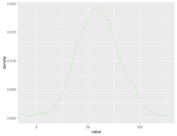
Density Plots with ggplot2 in R
To change the background color, we use the fill property of the geom_density() function.
R
set.seed(1234)
df <- data.frame(value =round(c(rnorm(900,
mean=60,
sd=21))))
library(ggplot2)
ggplot(df, aes(x=value)) + geom_density(fill="#77bd89",
color="#1f6e34",
alpha=0.8)
|
Output:

Density Plots with ggplot2 in R
Kernel selection:
With kernel parameters, the kernel that is being utilized can also be modified. There are other alternatives that can be selected, including “Gaussian” (the default), “rectangular,” “triangular,” “epanechnikov,” “biweight,” “cosine,” and “optcosine.”.
R
set.seed(1234)
df <- data.frame(value = round(c(rnorm(900, mean = 60, sd = 21))))
library(ggplot2)
ggplot(df, aes(x = value, y = ..density..)) +
geom_density(aes(fill = "Density"), alpha = 0.5,
kernel = "rectangular") +
scale_fill_manual(values = "lightgreen",
guide = guide_legend(override.aes = list(color = NA))) +
labs(title = "Density Plot with Kernel Selection",
x = "Value",
y = "Density") +
theme_minimal()
|
Output:

Density Plots with ggplot2 in R
Combine histogram and density plots:
R
set.seed(1234)
df <- data.frame(value = round(c(rnorm(900, mean = 60, sd = 21))))
library(ggplot2)
ggplot(df, aes(x = value)) +
geom_histogram(aes(y = ..density..),
bins = 30,
fill = "lightblue",
color = "black") +
geom_density(alpha = 0.5, fill = "lightgreen") +
labs(title = "Combined Histogram and Density Plot",
x = "Value",
y = "Density") +
theme_minimal()
|
Output:

Density Plots with ggplot2 in R
Like Article
Suggest improvement
Share your thoughts in the comments
Please Login to comment...