How to make an svg scale with its parent container ?
Last Updated :
03 Nov, 2020
SVG is the abbreviation for Scalable Vector Graphics. It is an Extensible Markup Language (XML) based vector image format for two-dimensional graphics. It supports interactivity and animation. This means that every attribute and every element present in the SVG file can be animated. SVG image behaviors are defined in XML text files. They can be searched, indexed, scripted, compressed, and can be created or edited using any text editor, as well as using drawing software such as Inkscape. Almost every modern web browser support SVG.
The reason why it is tricky to scale SVG is that it does not scale like the other image formats. SVG images have a clearly defined aspect ratio: the ratio of width to the height which makes it difficult to scale with the changing parent container. Other images scale easily because the browser determines the height, width, and aspect ratio of the image, and it adjusts everything accordingly. So giving these properties to SVG should be the first step to our requirement. Although setting height and width barely sets an aspect ratio but what we aim for is scaling which is beyond the aspect ratio. A viewbox can serve our purpose rightly. The viewBox is an attribute of the <svg> element which takes four parameters x, y, width, and height. x and y signify the origin of the SVG coordinate system and width and height signify the number of pixels or coordinates that should be scaled to fill the width and height respectively. Let us take a look at the following example:
First approach:
- At first, we create a container that occupies 30% of the total width of the screen and 20% of the total height of the screen.
- Next, we create an SVG image(rectangle) using the <rect> tag and specifying the height, width, and fill attributes.
- The <svg> element wraps the rectangle image. The SVG element occupies 100% width of the parent container and its height is auto-adjusted depending on screen size. We use viewBox to make the SVG image scalable.
- viewBox = “0 0 100 100”: defines a coordinate system having x=0, y=0, width=100 units and height=100 units.
- Thus, the SVG containing a rectangle having width=50px and height=50px will fill up the height and width of the SVG image, and all the dimensions get scaled equally. Changing the x and y coordinates can yield different results, but we will keep ourselves restricted to the stated values.
Example:
HTML
<!DOCTYPE html>
<html>
<body>
<div class="container" style=
"width:30%; height: 20%;
border:1px dashed black;">
<svg width="100%" height="auto"
viewBox="0 0 100 100">
<rect width="50" height="50"
style="fill:rgb(0,170,0);
stroke-width:1;
stroke:rgb(0,0,0)" />
</svg>
</div>
</body>
</html>
|
Output:
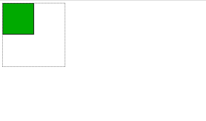
Full Screen
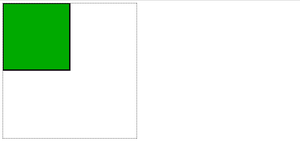
Minimized Screen
Second approach:
- The second approach demonstrates scaling of an svg image which is present within the <img> tag.
- In this case, browsers automatically adjust the image aspect ratio based on the current screen size.
- It is important to mention either height or width as an attribute in the img tag else there is possibility that Internet Explorer may change width = ”auto” and height =”auto” to some value which is acceptable to it.
Example:
HTML
<!DOCTYPE html>
<html>
<body>
<div class="container" style=
"width:80%; height:80%;
border:1px dashed black;">
<img src="E:\method-draw-image.svg"
style="width:50%">
</div>
</body>
</html>
|
Output:
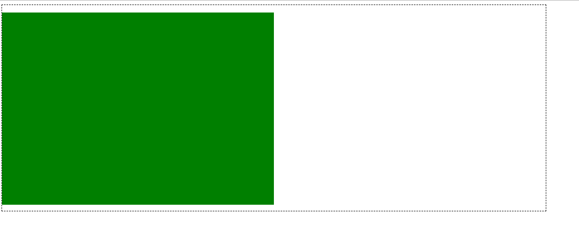
Full Screen
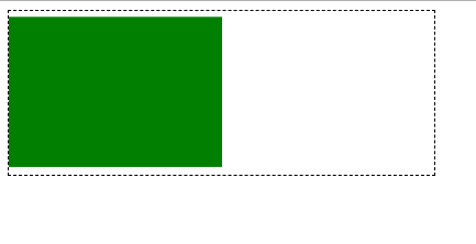
Minimized Screen
Like Article
Suggest improvement
Share your thoughts in the comments
Please Login to comment...