How to Make a Bell Curve in Python?
Last Updated :
24 Feb, 2021
A bell-shaped curve in statistics corresponds to a normal distribution or a Gaussian distribution which has been named after German mathematician Carl Friedrich Gauss. In a normal distribution, the points are concentrated on the mean values and most of the points lie near the mean. The orientation of the bell-curve depends on the mean and standard deviation values of a given set of input points. By changing the value of the mean we can shift the location of the curve on the axis and the shape of the curve can be manipulated by changing the standard deviation values. In this article, we will learn to plot a bell curve in Python.
In a normal distribution, mean, median, and mode are all equal and the bell-shaped curve is symmetric about the mean i.e., the y-axis. The probability density function for a normal distribution is calculated using the formula:

Where:
x = input points,
 = mean
 = standard deviation of the set of input values
Example 1: Creating simple bell curve.
Approach: We will make a list of points on the x-axis and passed these points inside our custom pdf function to generate a probability distribution function to produce y-values corresponding to each point in x. Now we plot the curve using plot() and scatter() methods that are available in the matplotlib library. plot() method is used to make line plot and scatter() method is used to create dotted points inside the graph.
Code:
Python
import numpy as np
import matplotlib.pyplot as plt
def pdf(x):
mean = np.mean(x)
std = np.std(x)
y_out = 1/(std * np.sqrt(2 * np.pi)) * np.exp( - (x - mean)**2 / (2 * std**2))
return y_out
x = np.arange(-2, 2, 0.1)
y = pdf(x)
plt.style.use('seaborn')
plt.figure(figsize = (6, 6))
plt.plot(x, y, color = 'black',
linestyle = 'dashed')
plt.scatter( x, y, marker = 'o', s = 25, color = 'red')
plt.show()
|
Output:
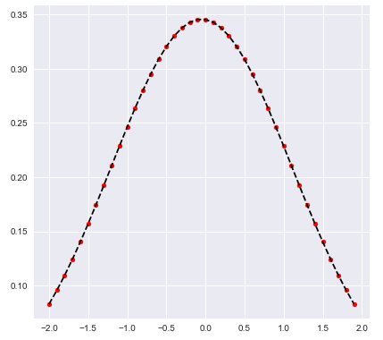
Bell-shaped curve
Example 2: Fill the area under the bell curve.
We can also fill in the area under the bell-curve, for that we are going to use the fill_between() function present in the matplotlib library to colorize the area in-between two curves.
The fill_between() function accepts multiple parameters such as x-values, y-values which are coordinates of points and lines on the graph. Also, it supports some graph-specific parameters such as ‘alpha’ which decides the opacity of color and the ‘color’ attribute accepts the name of the color to filled under the curve.
Approach: We took a list of points on the x-axis and passed these points inside our custom pdf function to generate a probability distribution function to produce y-values corresponding to each point in x. Similarly, to fill in the area under the curve, we select a range of x_fill values and generate probability distribution too. Now we plot the curve first using plot() and scatter() method and fill the area under the curve with the fill_between() method.
Code:
Python
import numpy as np
import matplotlib.pyplot as plt
def pdf(x):
mean = np.mean(x)
std = np.std(x)
y_out = 1/(std * np.sqrt(2 * np.pi)) * np.exp( - (x - mean)**2 / (2 * std**2))
return y_out
x = np.arange(-2, 2, 0.1)
y = pdf(x)
x_fill = np.arange(-2, 2, 0.1)
y_fill = pdf(x_fill)
plt.style.use('seaborn')
plt.figure(figsize = (6, 6))
plt.plot(x, y, color = 'black',
linestyle = 'dashed')
plt.scatter(x, y, marker = 'o',
s = 25, color = 'red')
plt.fill_between(x_fill, y_fill, 0,
alpha = 0.2, color = 'blue')
plt.show()
|
Output:
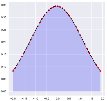
Plot displaying the filled area under the bell-curve
Like Article
Suggest improvement
Share your thoughts in the comments
Please Login to comment...