How to Make a Bar Graph in Excel?
Last Updated :
24 May, 2022
A Bar Graph is a graph that represents the categorical data with rectangular bars with respect to the height and lengths of the bar, which are proportional to the data values. The bars on graphs are plotted vertically or horizontally. Sometimes bars that are plotted vertically are also referred to as Column charts. The bar graph usually shows the comparisons between the various categories of the data points in the dataset. On one axis, it shows the categories that are getting compared, and on another axis, it shows the corresponding values of those categories. In this example, we will be using random sales data as the dataset and represent it in bar graphs for visualization.
Making a Bar Graph in Excel
Step 1: Create a dataset
In this step, we will be inserting random financial sales data into our excel sheet. Below is the screenshot of the random data that we will use for our bar graph.
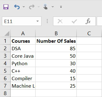
Fig 1 – Dataset
Step 2: Insert Bar graph
Once we have created our dataset, we will insert a bar graph for our data values. We need to drag & select data and then go to the insert tab and then the chart section and insert the bar chart.
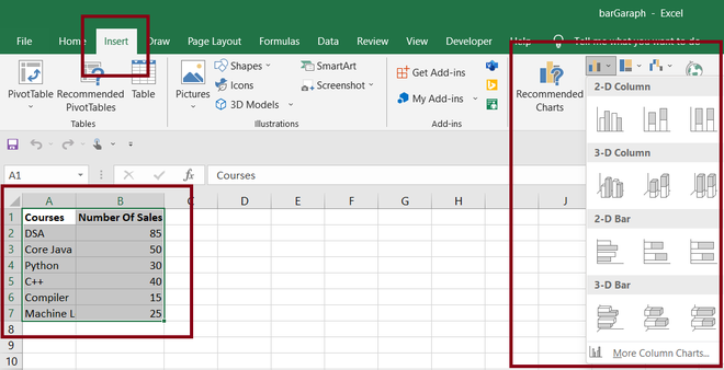
Fig 2 – Inserting the bar chart
Once we select our desired bar chart. Excel will automatically plot a graph for our dataset. Below is the screenshot attached for it.
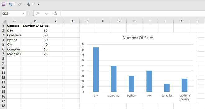
Fig 3 – Graph
In the above graph, we can easily visualize the different courses that are sold. In the next step, we will try to format our graph.
Step 3: Formatting graph
We will try to format our graph according to our needs in this step.
Changing the graph title
In order to change the graph title, we need to double-click on the title and edit it. In our case, we will change it to Courses Sales.
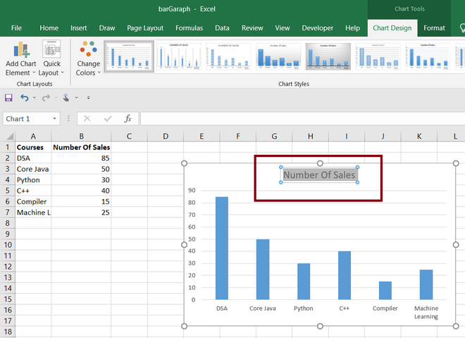
Fig 4 – Changing title
Once we select the chart title by double-clicking it, we need just to edit it to Courses Sales.

Fig 5 – Title changed
Adding or Removing the chart elements
We can also add or remove the chart elements. For this, we need to select our chart and then click the plus(+) icon. This will open various chart elements, which we can add or remove by checking or unchecking the check-box option.
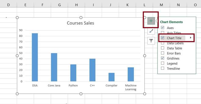
Fig 6 – Removing chart title
Adding Axis titles and Legend
In this step, we will add the axis title and the legend for our bar chart. For this, we need to perform the same previous step and add the chart titles and the legend. For axis titles, we will use No. Of Sales for Y-axis and Course Names for X-axis and we will position the legend at the top.
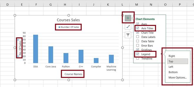
Fig 7 – Adding Axis titles and Legend
Changing the style of the graph
In this step, we will try to change the style of the graph. For this, we need to select our graph and click on the chart style option. It will show various inbuilt styles for the graph. We can use whatever style we want.
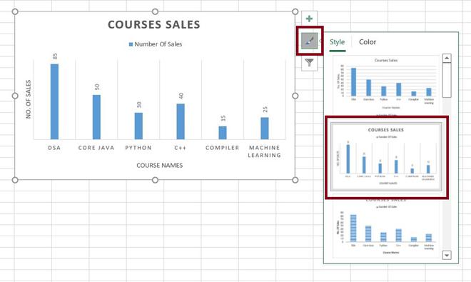
Fig 8 – Changing the style of the graph
In the above picture, we can see our chart style has been changed for the default one.
Changing the color of the graph
In this step, we will try to change the color of the graph. For this, we need to follow the same step as the previous one select the Color tab beside the Style tab and choose the color pattern according to our own requirements.
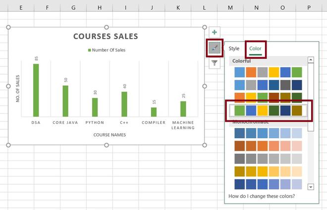
Fig 9 – Changing the color of graph
Like Article
Suggest improvement
Share your thoughts in the comments
Please Login to comment...