How to Make a 3D Pie Chart in Excel?
Last Updated :
27 Apr, 2021
A Pie Chart is a type of chart used to represent the given data in a circular representation. The given numerical data is illustrated in the form of slices of an actual pie. Now, it’s really easy to create a 3D Pie Chart in Excel.

Steps for making a 3D Pie Chart:
Note: This article has been written based on Microsoft Excel 2010, but all steps are applicable for all later versions.
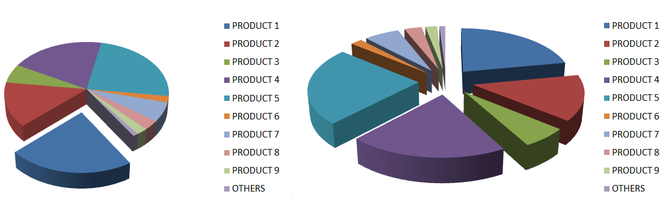
Step 1: Start writing your data in a table with appropriate information in each column. For this article, we’ll see a market share comparison table for multiple products.

Data Table
It is not necessary to enter these data items in a percentage format. You simply keep your data the way it is and Excel will convert it into suitable slices for you
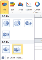
Step 2: Select all the elements of the table. Now, go to the Insert section. Locate Pie Charts under the Charts sub-section.

The positioning of ‘Pie Charts’ may be different for different versions of Excel
Then, from the available 3D charts, select the one most suitable for your purpose of work.
Now, wait for the Pie Chart to show up.
Like Article
Suggest improvement
Share your thoughts in the comments
Please Login to comment...