How to Format Chart Axis to Percentage in Excel?
Last Updated :
28 Jul, 2021
By default, in Excel, the data points in the axis are in the form of integers or numeric representations. Sometimes we need to express these numeric data points in terms of percentages. So, Excel provides us an option to format from number representation to percentage.
In this article, we are going to discuss how to format a chart axis to percentage in Excel using an example.
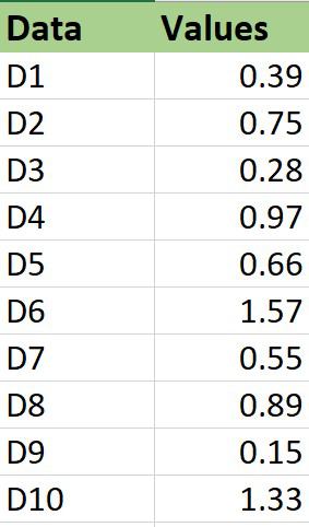
Example: Consider the dataset shown below :
Plotting a chart
The steps are :
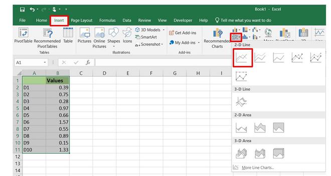
1. Insert the dataset in the worksheet.
2. Select the entire dataset and then click on the Insert menu from the top of the Excel window.
3. Click on Insert Line Chart set and select the 2-D line chart. You can also use other charts accordingly.
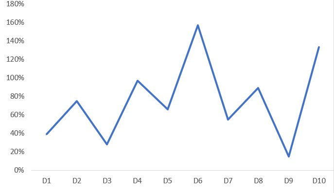
4. The Line chart will now be displayed.
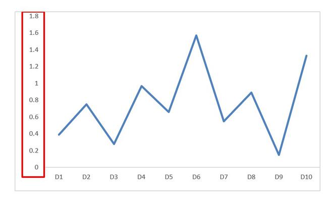
We can observe that the values in the Y-axis are in numeric labels and our goal is to get them in percentage labels.
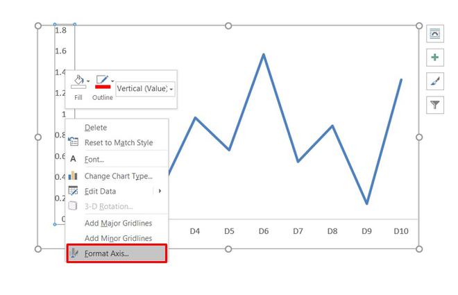
In order to format the axis points from numeric data to percentage data the steps are :
1. Select the axis by left-clicking on it.
2. Right-click on the axis.
3. Select the Format Axis option.
4. The Format Axis dialog box appears. In this go to the Number tab and expand it. Change the Category to Percentage and on doing so the axis data points will now be shown in the form of percentages.
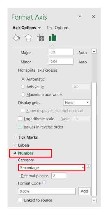
By default, the Decimal places will be of 2 digits in the percentage representation. You can change it accordingly. In our case, we made it 0 decimal places.
5. Close the Format Axis dialog box.
And finally, the chart has data in the form of percentage representation on the Y-axis.
Like Article
Suggest improvement
Share your thoughts in the comments
Please Login to comment...