How To Find Probability Distribution in Python
Last Updated :
30 May, 2022
A probability Distribution represents the predicted outcomes of various values for a given data. Probability distributions occur in a variety of forms and sizes, each with its own set of characteristics such as mean, median, mode, skewness, standard deviation, kurtosis, etc. Probability distributions are of various types let’s demonstrate how to find them in this article.
Normal Distribution
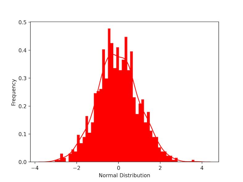
The normal distribution is a symmetric probability distribution centered on the mean, indicating that data around the mean occur more frequently than data far from it. the normal distribution is also called Gaussian distribution. The normal distribution curve resembles a bell curve. In the below example we create normally distributed data using the function stats.norm() which generates continuous random data. the parameter scale refers to standard deviation and loc refers to mean. plt.distplot() is used to visualize the data. KDE refers to kernel density estimate, other parameters are for the customization of the plot. A bell-shaped curve can be seen as we visualize the plot.
Python3
import scipy.stats as stats
import seaborn as sns
import matplotlib.pyplot as plt
data =stats.norm(scale=1, loc=0).rvs(1000)
ax = sns.distplot(data,
bins=50,
kde=True,
color='red',
hist_kws={"linewidth": 15,'alpha':1})
ax.set(xlabel='Normal Distribution', ylabel='Frequency')
plt.show()
|
Output:
Binomial Distribution
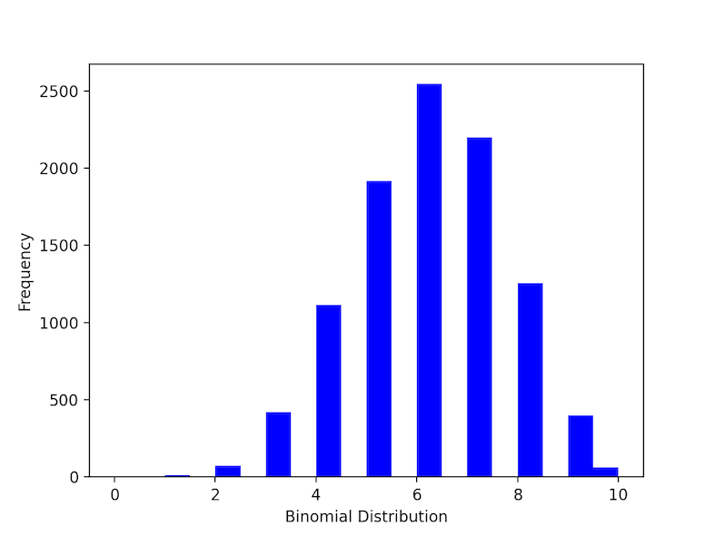
Under a given set of factors or assumptions, the binomial distribution expresses the likelihood that a variable will take one of two outcomes or independent values. ex: if an experiment is successful or a failure. if the answer for a question is “yes” or “no” etc… . np.random.binomial() is used to generate binomial data. n refers to a number of trails and prefers the probability of each trail.
Python3
import seaborn as sns
import matplotlib.pyplot as plt
import numpy as np
n, p = 10, .6
data = np.random.binomial(n, p, 10000)
ax = sns.distplot(data,
bins=20,
kde=False,
color='red',
hist_kws={"linewidth": 15, 'alpha': 1})
ax.set(xlabel='Binomial Distribution', ylabel='Frequency')
plt.show()
|
Output:
Poisson Distribution:
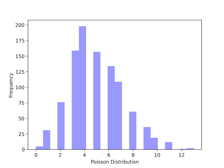
A Poisson distribution is a kind of probability distribution used in statistics to illustrate how many times an event is expected to happen over a certain amount of time. It’s also called count distribution. np.random.poisson function() is used to create data for poisson distribution. lam refers to The number of occurrences that are expected to occur in a given time frame. In this example, we can take the condition as “if a student studies for 5 hours a day, the probability that he’ll study 6 hours a day is?.
Python3
import seaborn as sns
import matplotlib.pyplot as plt
import numpy as np
poisson_data = np.random.poisson(lam=5, size=1000)
ax = sns.distplot(poisson_data,
kde=False,
color='blue')
ax.set(xlabel='Poisson Distribution', ylabel='Frequency')
plt.show()
|
Output:
Like Article
Suggest improvement
Share your thoughts in the comments
Please Login to comment...