How to dynamically update SCSS variables using ReactJS?
Last Updated :
10 Nov, 2023
In React sometimes we might need to dynamically update the styling due to user interaction and change in the DOM. In the case of SCSS variables, we can dynamically update SCSS variables using ReactJS.
Prerequisite:
Approach:
To dynamically update SCSS variables using React JS we need to install the sass npm package that compiles and translates the SCSS file to CSS styling. We will apply a dark theme to the page when the switch button is clicked.
Steps to Create React Application and Install Modules:
Step 1: Use this command in the terminal to Initialize the react application.
npx create-react-app react-scss
Step 2: Move to the project directory.
cd react-scss
Step 3: Install the dependencies required in this project by typing the given command in the terminal.
npm i sass
Project Structure:
The project structure will look like this.
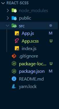
Folder structure
The updated dependencies after installing required packages.
{
    "dependencies": {
        "@testing-library/jest-dom": "^5.17.0",
        "@testing-library/react": "^13.4.0",
        "@testing-library/user-event": "^13.5.0",
        "react": "^18.2.0",
        "react-dom": "^18.2.0",
        "react-scripts": "5.0.1",
        "sass": "^1.69.5",
        "web-vitals": "^2.1.4"
    },
}
Example: This example implements dark and light theme based on the user interaction by updating the scss vaiables.
Javascript
import React, { useState, useEffect } from "react";
import "./App.scss";
export default function App() {
const [darkTheme, setDarkTheme] = useState(false);
useEffect(() => {
const root = document.documentElement;
root?.style.setProperty(
"--background-color",
darkTheme ? "#262833" : "#fff"
);
root?.style.setProperty(
"--text-color",
darkTheme ? "#fff" : "#262833"
);
}, [darkTheme]);
const URL =
"wp-content/uploads/20190918121833/geeksforgeeks-62.png";
return (
<>
<div className="card">
<img
className="image"
src={URL}
alt="geeksforgeeks"
/>
<div className="cardBody">
<h2>
Dynamically changing scss variable
using react{" "}
</h2>
<p>
According to Wikipedia sass is a
preprocessor scripting language that
is interpreted or compiled into
Cascading Style Sheets (CSS).
</p>
<button
onClick={() =>
setDarkTheme(!darkTheme)
}
>
{darkTheme
? "Switch to Light"
: "Switch to Dark"}
</button>
</div>
</div>
</>
);
}
|
CSS
#root {
// Scss variables which we gonna assign using
// useState and JavaScript in reactJS
$background-color: #fff;
$text-color: #262833;
display: grid;
grid-template-columns: repeat(auto-fit, minmax(350px, 1fr));
grid-template-rows: auto;
}
.card {
background-color: var(--background-color);
margin: 20px 10px;
padding: 10px;
img {
background-color: var(--background-color);
width: 100%;
height: 150px;
object-fit: scale-down;
}
.cardBody {
h2 {
font-size: 2rem;
color: var(--text-color);
}
p {
font-size: 1rem;
color: var(--text-color);
}
button {
font-weight: bolder;
border-radius: 50px;
color: var(--background-color);
border: none;
border-style: none;
padding: 10px 20px;
background-color: var(--text-color);
}
}
}
|
Step to Run Application: Run the application using the following command from the root directory of the project:
npm start
Output: Now open your browser and go to http://localhost:3000/, you will see the following output:

Like Article
Suggest improvement
Share your thoughts in the comments
Please Login to comment...