How to Drop fill color to change the image color using HTML and CSS ?
Last Updated :
15 May, 2023
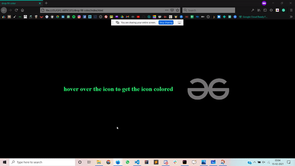
In this article, we are going to create a Drop fill color effect using HTML & CSS in which the image get colored when we hover over it. It appears when you hover over the image a drop of color falls over the image which changes the color of the image from gray to colored.
Approach: The following approach will be implemented to Drop fill color to change the image color:
- Create an HTML file in which we add the text and a div for the image.
- Then we have to use the hover property to make our image colored.
- We also use pseudo-classes like ::before and ::after in our project.
- Use of @keyframes for movement of our drop.
HTML Code:
- First, create a HTML file (index.html).
- Then link the CSS file that provides all the animation’s effect to our HTML. It is also placed in inside the <head> section.
- Coming to the body section of our HTML code:
- First, we have to create a main div.
- Then, we give the main div a class and create another div inside the present div to put an image into it.
HTML
<!DOCTYPE html>
<html lang="en">
<head>
<link rel="stylesheet" href="style.css">
</head>
<body>
<h1>
hover over the icon to
get the icon colored
</h1>
<div class="main_box">
<div class="img"></div>
</div>
</body>
</html>
|
CSS Code: CSS is used to give different types of animations and effect to our HTML page so that it looks interactive to all users.
In CSS we have to remind the following points –
- Restore all the browser effects.
- Use classes and ids to give effects to HTML elements.
- Use of :hover to use hover effects.
- Use of @keyframes for movement of our drop.
- Use of pseudo-classes.
CSS
*{
margin: 0;
padding: 0;
box-sizing: border-box;
}
body{
display: flex;
justify-content: center;
align-items: center;
background-color: #000;
height: 100vh;
}
h1{
color: rgb(0, 255, 115);
margin-right: 2em;
}
.main_box{
width: 15em;
height: 15em;
position: relative;
cursor: pointer;
}
.img,.main_box::before{
width: 100%;
height: 100%;
background-image: url(gfg.jpg);
background-size: cover;
background-position: center;
background-repeat: no-repeat;
}
.img{
filter: grayscale(100%);
}
.main_box::before{
content: '';
position: absolute;
top: 0;
left: 0;
clip-path: circle(0 at 50% 0);
transition: all .3s;
z-index: 1;
}
.main_box::after{
content: '';
position: absolute;
top: -6em;
left: 50%;
transform: translateX(-50%);
width: 1.25em;
height: 1.25em;
background-image: linear-gradient(#006800 , #014716);
border-radius: 0 10em 10em 10em;
opacity: 0;
transform: rotate(45deg);
}
.main_box:hover::after{
animation: neeche 0.5s cubic-bezier(1,0,1,.81);
}
.main_box:hover::before{
clip-path: circle(31em at 50% 0);
transition-delay: .5s;
}
@keyframes neeche{
from{
opacity: 1;
}
to{
opacity: 0;
top: 6em;
}
}
|
Complete Code: This is the complete code that describes the Drop fill color to change the image color using HTML and CSS.
HTML
<!DOCTYPE html>
<html lang="en">
<head>
<style>
/* Restoring the browser effects */
* {
margin: 0;
padding: 0;
box-sizing: border-box;
}
/* Applying all of the same
functionalities to the body */
body {
display: flex;
justify-content: center;
align-items: center;
background-color: #000;
height: 100vh;
}
h1 {
color: rgb(0, 255, 115);
margin-right: 2em;
}
.main_box {
width: 15em;
height: 15em;
position: relative;
cursor: pointer;
}
.img,
.main_box::before {
width: 100%;
height: 100%;
background-image: url(
background-size: cover;
background-position: center;
background-repeat: no-repeat;
}
/* Changing the image to gray color */
.img {
filter: grayscale(100%);
}
/* Code for drop of color */
.main_box::before {
content: '';
position: absolute;
top: 0;
left: 0;
clip-path: circle(0 at 50% 0);
transition: all .3s;
z-index: 1;
}
.main_box::after {
content: '';
position: absolute;
top: -6em;
left: 50%;
transform: translateX(-50%);
width: 1.25em;
height: 1.25em;
background-image: linear-gradient(
#006800, #014716);
border-radius: 0 10em 10em 10em;
opacity: 0;
transform: rotate(45deg);
}
.main_box:hover::after {
animation: neeche 0.5s
cubic-bezier(1, 0, 1, .81);
}
.main_box:hover::before {
clip-path: circle(31em at 50% 0);
transition-delay: .5s;
}
@keyframes neeche {
from {
opacity: 1;
}
to {
opacity: 0;
top: 6em;
}
}
</style>
</head>
<body>
<h1>
hover over the icon to
get the icon colored
</h1>
<div class="main_box">
<div class="img"></div>
</div>
</body>
</html>
|
Output:
Like Article
Suggest improvement
Share your thoughts in the comments
Please Login to comment...