How to display bar charts in Pandas dataframe on specified columns?
Last Updated :
02 Sep, 2020
In this article we will see how to display bar charts in dataframe on specified columns. For doing this task we are using DataFrame.style.bar() method of Pandas Dataframe.
Syntax: pandas.DataFrame.style.bar(columns_list, color)
Return: Dataframe with the given color bar strips on the positive definite values. The None value and the negative values are skipped in the process.
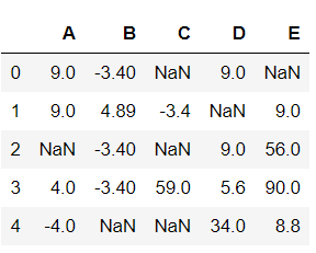
Now, Let’s create a Dataframe:
Python3
import pandas
import numpy
Nan = numpy.nan
df = pandas.DataFrame(data = numpy.array(
[[9, -3.4, Nan, 9, Nan],
[9, 4.89, -3.4, Nan, 9],
[Nan, -3.4, Nan, 9, 56],
[4, -3.4, 59.0, 5.6, 90],
[-4, Nan, Nan, 34, 8.8]]),
columns = list("ABCDE"))
df
|
Output:
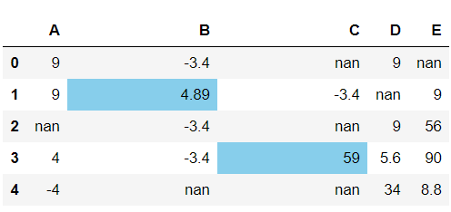
Example 1:
Python3
df.style.bar(subset = ['B', 'C'],
color = 'skyblue')
|
Output:
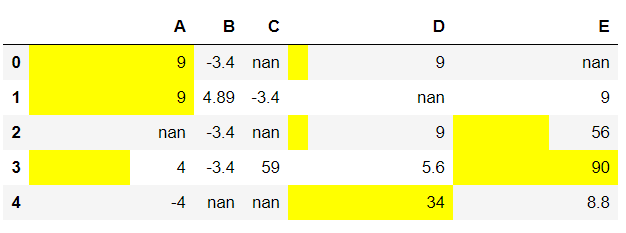
Example 2:
Python3
df.style.bar(subset = ['A', 'D', 'E'],
color = 'yellow')
|
Output:
Like Article
Suggest improvement
Share your thoughts in the comments
Please Login to comment...