How to detect device and swap the CSS file ?
Last Updated :
05 Jun, 2023
When creating a webpage, the most important thing is the user experience with the frontend, especially the designing part or CSS. For a smooth experience, a frontend developer needs to make the webpage responsive. As “one size doesn’t fit all”, a single design will not work on all devices. That’s why the “media query” was introduced. Media queries are very helpful when it comes to styling specific parts of the website on the basis of the screen width, height, bits/pixel, and many more.
But sometimes writing media queries can be confusing if a lot of them are to be written or if we have to completely change the styling of the webpage for different devices. So, we can use different CSS files for different screen sizes.
This can be done by adding media query in the <link rel=”stylesheet” href=”style.css”> section in the HTML file.
Media query can be added to the linking section of CSS like this, given below
<link rel="stylesheet" media="media query properties" href="stylesheet.css">
Media type that can be used
| all (default) |
Used for all media type devices |
| print |
Used for printers |
| screen |
Used for computer screens, tablets, smart-phones etc. |
| speech |
Used for screen readers that “reads” the page out loud |
Some commonly used media feature for making webpage responsive
| max-width |
Sets a maximum width till which CSS properties will be followed |
| min-width |
Sets a minimum width till which CSS properties will be followed |
| orientation |
Can be set to portrait/landscape |
Note: All features of media query can be used while linking CSS to the HTML.
HTML
<!DOCTYPE HTML>
<html lang="en" dir="ltr">
<head>
<title>GFG</title>
<link rel="stylesheet" href="master.css">
<link rel="stylesheet"
media="screen and (max-width: 360px)"
href="small-screen.css">
<link rel="stylesheet"
media="screen and (min-width: 360px) and (max-width: 550px)"
href="large-screen.css">
</head>
<body>
GeeksForGeeks
</body>
</html>
|
CSS Files:
1. master.css file
CSS
body {
display: flex;
align-items: center;
font-family: sans-serif;
}
|
2. small-screen.css file
CSS
// small-screen.css
body {
color: rgb(29, 176, 5);
background-color: white;
}
|
3. large-screen.css file
CSS
body {
color: rgb(67, 164, 55);
background-color: black;
}
|
Output:

When the width of the screen is less than 360px

When the width of the screen is more than 360px and less than 550px
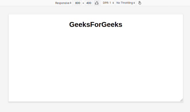
When the width of the screen is larger than 550px
Like Article
Suggest improvement
Share your thoughts in the comments
Please Login to comment...