How to create Tinder card swipe gesture using React and framer-motion ?
Last Updated :
07 Mar, 2024
In the world of modern dating, Tinder has become one of the most popular platforms for meeting new people. One of its defining features is the swipe gesture, where users can swipe left or right to indicate their interest or disinterest in a potential match. In this article, we’ll explore how to create a Tinder-like card swipe gesture using React and the Framer Motion library.
We can create a swipe gesture using the Framer module in ReactJS.
Prerequisites:
Framer hooks used in building this application are:
- Framer useMotionValue
- Framer useTransform
- Framer useAnimation
Steps to create the application:
Step 1: Create a React application using the following command.
npx create-react-app tinder-swipe
Step 2: After creating your project folder i.e. tinder-swipe, move to it using the following command.
cd tinder-swipe
Step 3: After creating the ReactJS application, Install the framer modules using the following command.
npm install framer
Project structure:
Project structure
Approach:
- We are using useMotionValue() to move the card as the user drags the cursor.
- We are using useTransform() hook to rotate the card as the card moves on drag.
- Also, we are using useTransform() hook to change the opacity of the card as it moves.
- useAnimation() is a utility hook and is used to create animation controls which can be used to manually start, stop and sequence animations on the card.
Example 1:
index.js
Javascript
import React from "react";
import ReactDOM from "react-dom";
import "./index.css";
import { Frame, useMotionValue, useTransform, useAnimation } from "framer";
const style = {
backgroundImage: "URL(
backgroundRepeat: "no-repeat",
backgroundSize: "contain",
backgroundColor: "#55ccff",
boxShadow: "5px 10px 18px #888888",
borderRadius: 10,
height: 300,
};
const App = () => {
const motionValue = useMotionValue(0);
const rotateValue = useTransform(motionValue, [-200, 200], [-50, 50]);
const opacityValue = useTransform(
motionValue,
[-200, -150, 0, 150, 200],
[0, 1, 1, 1, 0]
);
const animControls = useAnimation();
return (
<div className="App">
<Frame
center
drag="x"
x={motionValue}
rotate={rotateValue}
opacity={opacityValue}
dragConstraints={{ left: -1000, right: 1000 }}
style={style}
onDragEnd={(event, info) => {
if (Math.abs(info.point.x) <= 150) {
animControls.start({ x: 0 });
} else {
animControls.start({ x: info.point.x < 0 ? -200 : 200 });
}
}}
/>
</div>
);
};
ReactDOM.render(<App />, document.getElementById("root"));
|
index.css
body {
margin: 0;
font-family: -apple-system, BlinkMacSystemFont,
'Segoe UI', 'Roboto', 'Oxygen',
'Ubuntu', 'Cantarell', 'Fira Sans',
'Droid Sans', 'Helvetica Neue',
sans-serif;
-webkit-font-smoothing: antialiased;
-moz-osx-font-smoothing: grayscale;
}
.App {
text-align: center;
}
code {
font-family: source-code-pro, Menlo,
Monaco, Consolas, 'Courier New',
monospace;
}
|
index.css
Step to Run Application: Run the application using the following command from the root directory of the project.
npm start
Output: Now open your browser and go to http://localhost:3000/, you will see the following output:
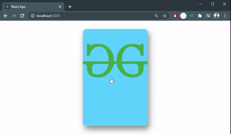
Tinder like card swipe gesture
Example 2: Creating a deck of cards in index.js file
Javascript
import React from 'react';
import ReactDOM from 'react-dom';
import './index.css';
import { Frame, useMotionValue, useTransform, useAnimation } from 'framer';
const Card = ({ image, color }) => {
const motionValue = useMotionValue(0);
const rotateValue = useTransform(motionValue, [-200, 200], [-50, 50]);
const opacityValue = useTransform(
motionValue,
[-200, -150, 0, 150, 200],
[0, 1, 1, 1, 0]
);
const animControls = useAnimation();
const style = {
backgroundImage: `url(${image})`,
backgroundRepeat: 'no-repeat',
backgroundSize: 'contain',
backgroundColor: color,
boxShadow: '5px 10px 18px #888888',
borderRadius: 10,
height: 300
};
return (
<div className='App'>
<Frame
center
drag='x'
x={motionValue}
rotate={rotateValue}
opacity={opacityValue}
dragConstraints={{ left: -1000, right: 1000 }}
style={style}
onDragEnd={(event, info) => {
if (Math.abs(info.point.x) <= 150) {
animControls.start({ x: 0 });
} else {
animControls.start({ x: info.point.x < 0 ? -200 : 200 });
}
}}
/>
</div>
);
};
const App = () => {
const cards = [
{
color: '#55ccff'
},
{
color: '#e8e8e8'
},
{
color: '#0a043c'
},
{
color: 'black'
}
];
return (
<div className='App'>
{
}
{cards.map((card) => (
<Card image={card.image} color={card.color} />
))}
</div>
);
};
ReactDOM.render(<App />, document.getElementById('root'));
|
Step to Run Application: Run the application using the following command from the root directory of the project:
npm start
Output: Now open your browser and go to http://localhost:3000/, you will see the following output:
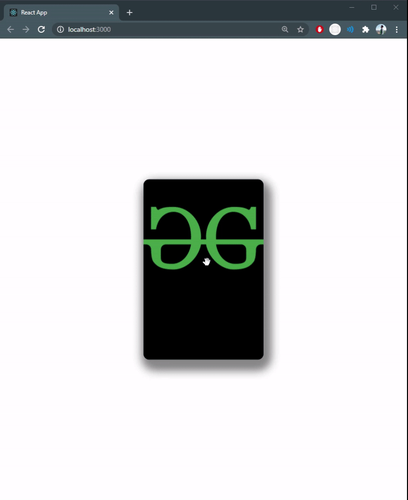
Swipeable deck of cards
Like Article
Suggest improvement
Share your thoughts in the comments
Please Login to comment...