How to Create State and County Maps Easily in R
Last Updated :
31 May, 2022
In this article, we will discuss how to create state and county maps in R Programming Language and how to plot such maps with varying color intensities and different use cases.
Maps of Countries and States in a 2D version are simpler and easier to visualize rather than using other conventional visualization methods. If we want to get insights such as which state has the highest population count or in which state the annual budget was the least, for such problem statements maps are the easiest visualization method.
Here we’ll use tidyverse package for utilizing map datasets and ggplot package to plot maps.
Installation
To install and load tidyverse type the below command in the terminal.
Install the Package – install.packages(“tidyverse”) ko
Load the Package – library(“tidyverse”)
Stepwise Implementation
Step 1: Load in-built map data
Using map_data( ) function we can load the map datasets that are in-built in tidyverse package.
Syntax: map_data(map, region = “.”, exact = FALSE, …)
Parameters:
- map – name of map provided by the maps package
- region – name of subregions to include
- exact – region as regular expression (FALSE) or as a fixed string (TRUE)
Example :
In this example, we will load data from state, country USA and rests, USA, world, and world2 datasets.
R
library("tidyverse")
states < - map_data("state")
countries < - map_data("county")
arrests < - USArrests
usa < -map_data("usa")
world < -map_data("world")
world2 < -map_data("world2")
|
Step 2: Plot map data
Here we’ll write a user-defined function in R to plot a map using the above-loaded datasets. We take the dataset, x, y, and column used to fill the map as arguments of the function. Using ggplot( ) function the map is plotted. guides( ) function is used to avoid legends on the map.
Syntax: ggplot(data = NULL, mapping = aes(), …)
Parameters:
- data – dataset
- mapping – aesthetic mappings to use for plot
Example :
Here, we are writing a function to plot maps using in-built map data
R
map <- function(x,y,dataset,fill_column){
p <- ggplot(data = dataset,
mapping = aes(x = x, y = y, group = group, fill = fill_column))
p + geom_polygon() + guides(fill = FALSE)
}
|
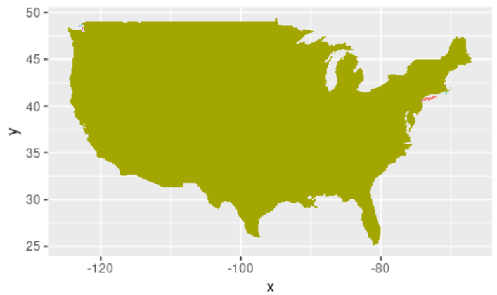
Example: Plotting USA by region on the map
Using the map( ) function created previously, let’s plot a map of the USA. Using the usa dataset and the user-defined function created above, let’s visualize via a plot. We also pass in the longitude , latitude, usa dataset and region column in usa as arguments to the map( ) function.
R
library(tidyverse)
states <- map_data("state")
coicountries <- map_data("country")
arrests <- USArrests
usa <-map_data("usa")
world <-map_data("world")
world2<-map_data("world2")
map <- function(x,y,dataset,fill_column){
p <- ggplot(data = dataset,
mapping = aes(x = x, y = y, group = group, fill = fill_column))
p + geom_polygon() + guides(fill = FALSE)
}
map(usa$long,usa$lat,usa,usa$region)
|
Output:
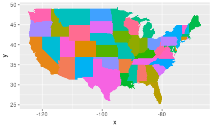
Example: Plotting US States by region on map
Here we’ll fill the USA map state wise which can be visualized with different colors. In the states dataset, using the column “region” we can visualize all of them inside the US map. We also pass in the longitude, latitude, states dataset, and region column in states as arguments to the map( ) function.
R
library(tidyverse)
states <- map_data("state")
countries <- map_data("county")
arrests <- USArrests
usa <-map_data("usa")
world <-map_data("world")
world2<-map_data("world2")
map <- function(x,y,dataset,fill_column){
p <- ggplot(data = dataset,
mapping = aes(x = x, y = y, group = group, fill = fill_column))
p + geom_polygon() + guides(fill = FALSE)
}
map(states$long,states$lat,states,states$region)
|
Output :
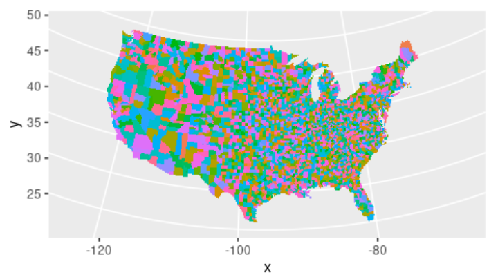
Example: Plotting US counties by subregion with latitude and longitude
Let’s see how to add coordinates to the above map using coord_map( ) function. This is added to give a globe effect to the map. We can further visualize each subregion inside the USA in each state.
Syntax: coord_map(projection = “mercator”, orientation = NULL,xlim = NULL,ylim = NULL …)
Parameters:
- projection – projection to use
- orientation – projection orientation
- xlim – x limits (in degrees of longitude/latitude)
- ylim – y limits (in degrees of longitude/latitude)
R
library(tidyverse)
states <- map_data("state")
counties <- map_data("county")
arrests <- USArrests
usa <-map_data("usa")
world <-map_data("world")
world2<-map_data("world2")
map <- function(x,y,dataset,fill_column){
p <- ggplot(data = dataset,
mapping = aes(x = x, y = y, group = group, fill = fill_column))
p + geom_polygon() + guides(fill = FALSE)
}
map(counties$long,counties$lat,counties,counties$subregion) +
coord_map("albers", lat0 = 45.5, lat1 = 29.5)
|
Output :
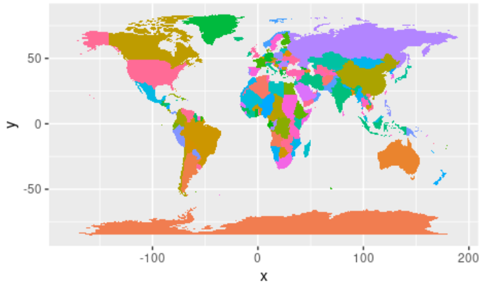
Example: Plotting World map
Here let’s see how to plot the world map using the map( ) function and world dataset. Using the world dataset and the user-defined function defined above, pass in the longitude, latitude, world dataset, and region column in the world as arguments to the map( ) function.
R
library(tidyverse)
states <- map_data("state")
counties <- map_data("county")
arrests <- USArrests
usa <-map_data("usa")
world <-map_data("world")
world2<-map_data("world2")
map <- function(x,y,dataset,fill_column){
p <- ggplot(data = dataset,
mapping = aes(x = x, y = y, group = group, fill = fill_column))
p + geom_polygon() + guides(fill = FALSE)
}
map(world$long,world$lat,world,world$region)
|
Output:
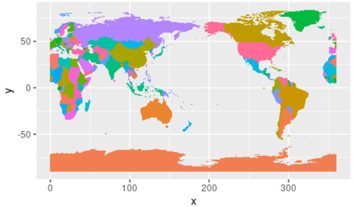
Example: World2 dataset, with a shift in latitude
This is another world map using world2 dataset, with a shift in latitude. Using the map( ) function and world2 dataset, pass in the longitude, latitude, world2 dataset, and region column in world2 as arguments to the map( ) function.
R
library(tidyverse)
states <- map_data("state")
counties <- map_data("county")
arrests <- USArrests
usa <-map_data("usa")
world <-map_data("world")
world2<-map_data("world2")
map <- function(x,y,dataset,fill_column){
p <- ggplot(data = dataset,
mapping = aes(x = x, y = y, group = group, fill = fill_column))
p + geom_polygon() + guides(fill = FALSE)
}
map(world2$long,world2$lat,world2,world2$region)
|
Output:
Like Article
Suggest improvement
Share your thoughts in the comments
Please Login to comment...