How to create Stacked bar chart in Python-Plotly?
Last Updated :
29 Oct, 2020
Plotly is a Python library which is used to design graphs, especially interactive graphs. It can plot various graphs and charts like histogram, barplot, boxplot, spreadplot and many more. It is mainly used in data analysis as well as financial analysis. plotly is an interactive visualization library.
Stack bar chart
A stacked bar chart or graph is a chart that uses bars to demonstrate comparisons between categories of data, but with ability to impart and compare parts of a whole. Each bar in the chart represents a whole and segments which represent different parts or categories of that whole.
Example 1: Using iris dataset
Python3
import plotly.express as px
df = px.data.iris()
fig = px.bar(df, x="sepal_width", y="sepal_length", color="species",
hover_data=['petal_width'], barmode = 'stack')
fig.show()
|
Output:

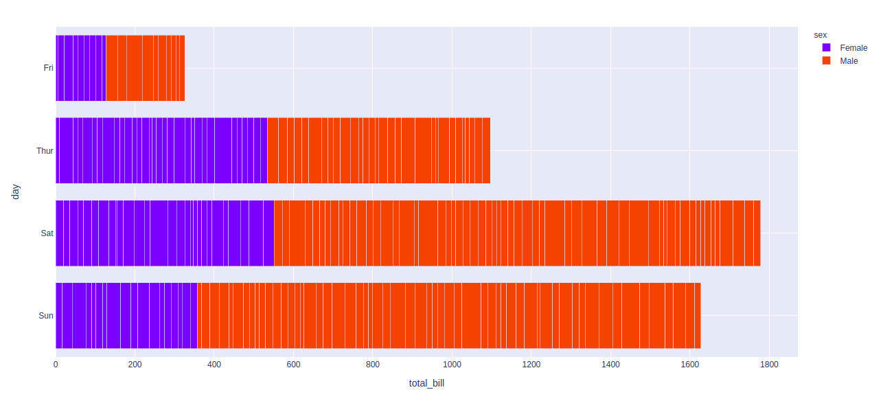
Example 2: Using tips dataset
Python3
import plotly.express as px
df = px.data.tips()
fig = px.bar(df, x="total_bill", y="day",
color="sex", barmode = 'stack')
fig.show()
|
Output:
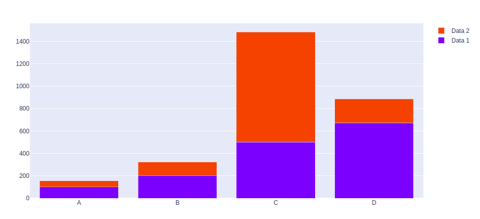
Example 3: Using graph_objects class
Python3
import plotly.graph_objects as px
import numpy as np
np.random.seed(42)
random_x= np.random.randint(1,101,100)
random_y= np.random.randint(1,101,100)
x = ['A', 'B', 'C', 'D']
plot = px.Figure(data=[go.Bar(
name = 'Data 1',
x = x,
y = [100, 200, 500, 673]
),
go.Bar(
name = 'Data 2',
x = x,
y = [56, 123, 982, 213]
)
])
plot.update_layout(barmode='stack')
plot.show()
|
Output:
Like Article
Suggest improvement
Share your thoughts in the comments
Please Login to comment...