How to Create Stacked area plot using Plotly in Python?
Last Updated :
10 Jul, 2020
Plotly is a Python library that is used to design graphs, especially interactive graphs. It can plot various graphs and charts like histogram, barplot, boxplot, spreadplot, and many more. It is mainly used in data analysis as well as financial analysis. plotly is an interactive visualization library.
Stacked Area plot
A stacked area chart is the amplification of a basic area chart to display the enlargement of the value of several groups on the same graphic. The values of each group are displayed on top of each other. This is the best chart to be used to show the distribution of categories as parts of a whole area where the cumulative total is unnecessary. It can be created by passing the stackgroup parameter in the scatter() method of graph_objects class
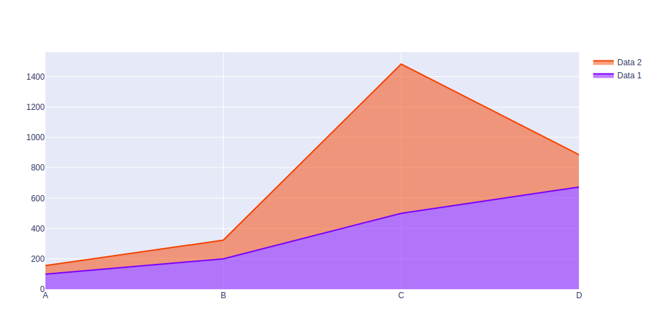
Example 1:
Python3
import plotly.graph_objects as px
import numpy
np.random.seed(42)
random_x= np.random.randint(1,101,100)
random_y= np.random.randint(1,101,100)
x = ['A', 'B', 'C', 'D']
plot = px.Figure()
plot.add_trace(go.Scatter(
name = 'Data 1',
x = x,
y = [100, 200, 500, 673],
stackgroup='one'
))
plot.add_trace(go.Scatter(
name = 'Data 2',
x = x,
y = [56, 123, 982, 213],
stackgroup='one'
)
)
plot.show()
|
Output:
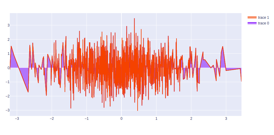
Example 2:
Python3
import plotly.graph_objects as go
import numpy
plot = go.Figure(data=[go.Scatter(
x = np.random.randn(1000),
y = np.random.randn(1000),
stackgroup='one'),
go.Scatter(
x = np.random.randn(10),
y = np.random.randn(50),
stackgroup='one')
])
plot.show()
|
Output:
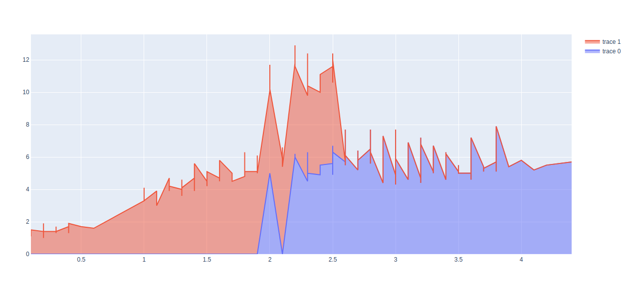
Example 3:
Python3
import plotly.graph_objects as go
import plotly.express as px
import numpy
df = px.data.iris()
plot = go.Figure(data=[go.Scatter(
x = df['sepal_width'],
y = df['sepal_length'],
stackgroup='one'),
go.Scatter(
x = df['petal_width'],
y = df['petal_length'],
stackgroup='one')
])
plot.show()
|
Output:
Like Article
Suggest improvement
Share your thoughts in the comments
Please Login to comment...