How to Create Section Counter using HTML and CSS ?
Last Updated :
12 Jul, 2023
Section counter is like a card and is useful for webpage footer. It contains details about the company. In this article, we will introduce some predicted data about some companies. We divide this article into two sections, in the first section we will create the normal structure then we will work on the design.
Creating the Structure: In this section, we will use simple HTML code to create three section to display few details about the company. We will use fontawesome icon to represent the functions more specifically for the user.
- CDN link for the Icons from the Font Awesome:
<link rel=”stylesheet” href=”https://cdnjs.cloudflare.com/ajax/libs/font-awesome/4.7.0/css/font-awesome.min.css”>
html
<!DOCTYPE html>
<html>
<head>
<meta name="viewport"
content="width=device-width, initial-scale=1">
<link rel="stylesheet"
href=
</head>
<body>
<h1>GeeksforGeeks</h1>
<strong>Section Counter</strong>
<br><br>
<div class="row">
<div class="column">
<div class="card">
<p>
<i class="fa fa-user"></i>
</p>
<h3>759+</h3>
<p>Contributor</p>
</div>
</div>
<div class="column">
<div class="card">
<p>
<i class="fa fa-book"></i>
</p>
<h3>60k+</h3>
<p>Article</p>
</div>
</div>
<div class="column">
<div class="card">
<p>
<i class="fa fa-smile-o">
</i>
</p>
<h3>70+</h3>
<p>Employees</p>
</div>
</div>
</div>
</body>
</html>
|
Designing the Structure: We have already created the structure and here we will design the structure by using simple CSS. Also, we will add some animation to it.
CSS
<style>
h1 {
color: green;
}
* {
box-sizing: border-box;
}
body {
text-align: center;
}
.column {
float: left;
width: 33%;
padding: 0 5px;
}
.row {
margin: 0 -5px;
}
.row:after {
content: "";
display: table;
}
.card {
padding: 10px;
text-align: center;
background-color: gray;
color: white;
}
.card:hover {
transform: scale(1.1);
background-color: black;
transition-duration: 2s;
color: white;
}
.fa {
font-size: 50px;
}
</style>
|
Final Solution: In this section, we will combine the above two sections in a single file then we will get the complete solution.
html
<!DOCTYPE html>
<html>
<head>
<meta name="viewport"
content="width=device-width, initial-scale=1">
<link rel="stylesheet"
href=
<style>
h1 {
color: green;
}
* {
box-sizing: border-box;
}
body {
text-align: center;
}
/* Float three columns */
.column {
float: left;
width: 33%;
padding: 0 5px;
}
.row {
margin: 0 -5px;
}
/* Clear floats after the columns */
.row:after {
content: "";
display: table;
}
/* Style the cards */
.card {
padding: 10px;
text-align: center;
background-color: gray;
color: white;
}
.card:hover {
transform: scale(1.1);
background-color: black;
transition-duration: 2s;
color: white;
}
.fa {
font-size: 50px;
}
</style>
</head>
<body>
<h1>GeeksforGeeks</h1>
<strong>Section Counter</strong>
<br><br>
<div class="row">
<div class="column">
<div class="card">
<p>
<i class="fa fa-user"></i>
</p>
<h3>759+</h3>
<p>Contributor</p>
</div>
</div>
<div class="column">
<div class="card">
<p>
<i class="fa fa-book"></i>
</p>
<h3>60k+</h3>
<p>Article</p>
</div>
</div>
<div class="column">
<div class="card">
<p>
<i class="fa fa-smile-o"></i>
</p>
<h3>70+</h3>
<p>Employees</p>
</div>
</div>
</div>
</body>
</html>
|
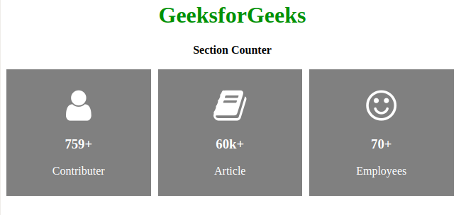
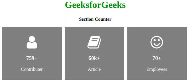
Output:
Like Article
Suggest improvement
Share your thoughts in the comments
Please Login to comment...