How to Create Radar Charts in R?
Last Updated :
28 Feb, 2023
In this article, we are going to see how to create Radar Charts in R Programming Language.
Radar charts are also known as Spider or Web or Polar charts. It is a graphical graph to display multivariate data in form of 2D charts of three or more quantitative variables which are represented on axes starting from the same point
Dataset in use:
Mumbai Tamil Noida Kerala Patna Assam Ranchi Bhopal Delhi Indore
1 39 39 39 39 39 39 39 39 39 39
2 0 0 0 0 0 0 0 0 0 0
3 2 7 5 5 9 18 7 7 10 19
fmsb package is Several utility functions and it has radarchar() methods to create radar chart in R.
To install the package:
install.packages( fmsb )
Creating a Basic Radar chart in R
Here we will display the basic radar chart using radarchart() methods. For this, we will pass the created dataframe.
Syntax: radarchart(df, cglty, cglcol, cglwd, pcol, plwd)
Parameters:
- df is a dataframe
- pcol attributes is used to change the color of the Polygon line.
- plwd attributes is used to increase or decrease the line width of the Polygon.
- cglcol is used to draw color of the net
- cglwd is for net width
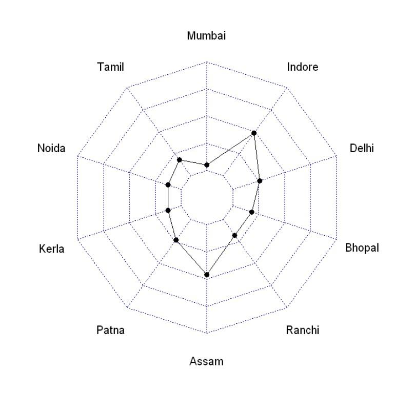
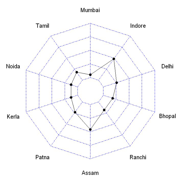
Example: Basic Radar Chart
R
data <- as.data.frame(matrix( sample( 2:20 , 10 ,
replace=T) ,
ncol=10))
colnames(data) <- c("Mumbai" , "Tamil" , "Noida" ,
"Kerala" , "Patna", "Assam" ,
"Ranchi" , "Bhopal", "Delhi",
"Indore" )
data <- rbind(rep(39,10) , rep(0,10) , data)
library(fmsb)
radarchart(data)
|
Output:
Line Color Customization
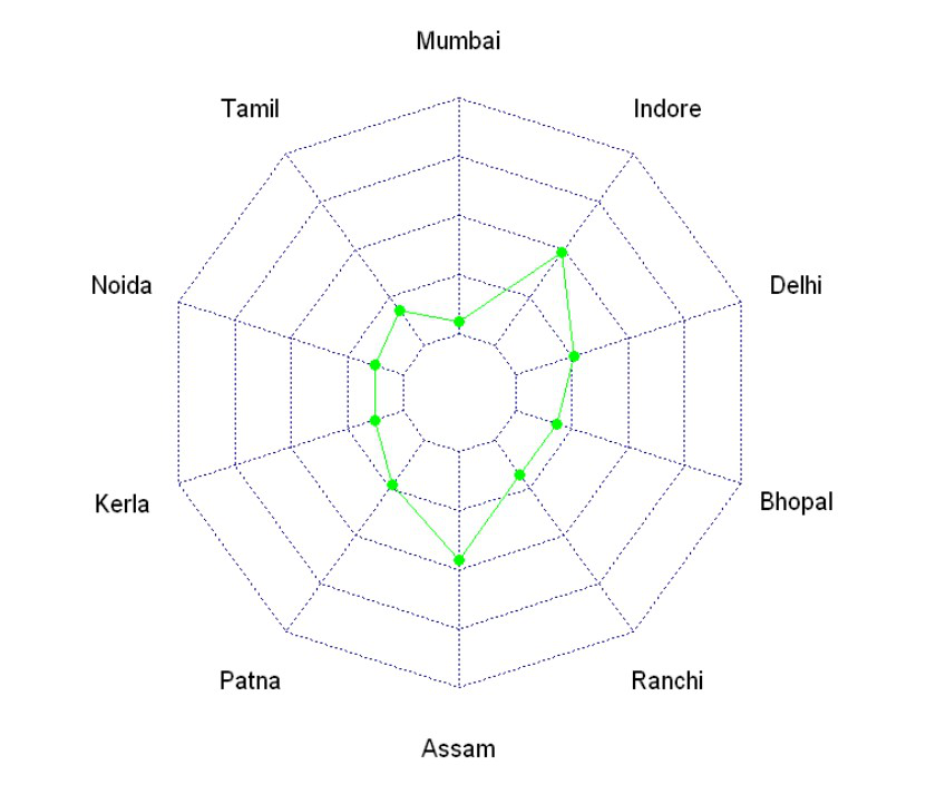
pcol attributes are used to change the color of the Polygon line.
Example: Line color customization
R
data <- as.data.frame(matrix( sample( 2:20 , 10 ,
replace=T) ,
ncol=10))
colnames(data) <- c("Mumbai" , "Tamil" , "Noida" ,
"Kerala" , "Patna", "Assam" ,
"Ranchi" , "Bhopal", "Delhi",
"Indore" )
data <- rbind(rep(39,10) , rep(0,10) , data)
radarchart(data, pcol = "Green")
|
Output:
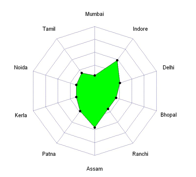
Fill Color into Polygon
pfcol attributes is used to fill the color of the Polygon.
Example: Fill color
R
data <- as.data.frame(matrix( sample( 2:20 , 10 ,
replace=T) ,
ncol=10))
colnames(data) <- c("Mumbai" , "Tamil" , "Noida" ,
"Kerala" , "Patna", "Assam" ,
"Ranchi" , "Bhopal", "Delhi",
"Indore" )
data <- rbind(rep(39,10) , rep(0,10) , data)
library(fmsb)
radarchart(data, pfcol = "Green")
|
Output:
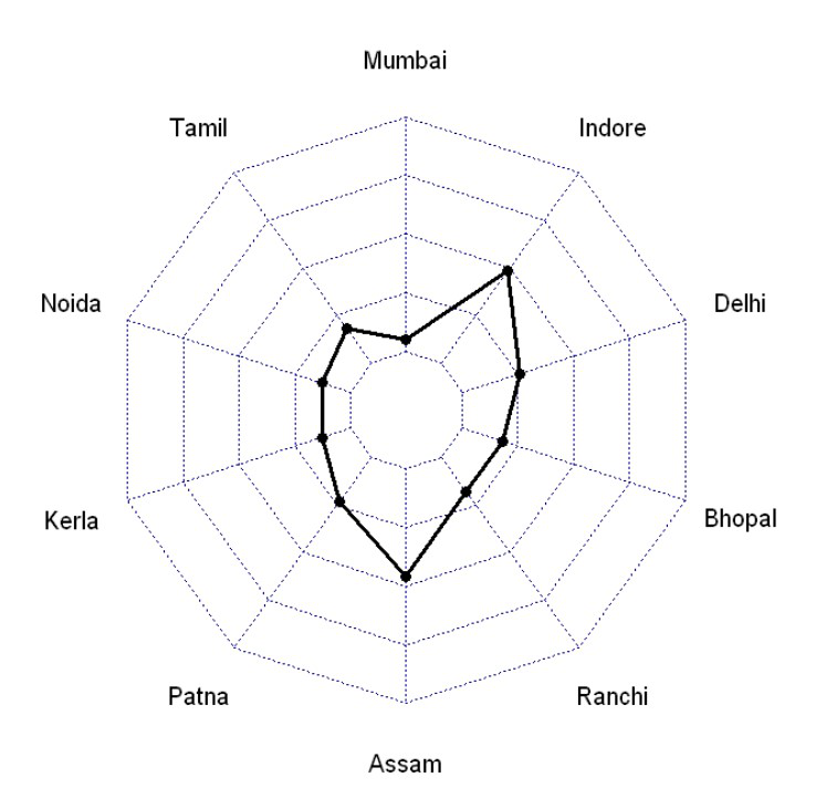
Change the line width
plwd attributes is used to increase or decrease the line width of the Polygon.
Example: Change line width
R
data <- as.data.frame(matrix( sample( 2:20 , 10 ,
replace=T) ,
ncol=10))
colnames(data) <- c("Mumbai" , "Tamil" , "Noida" ,
"Kerala" , "Patna", "Assam" ,
"Ranchi" , "Bhopal", "Delhi",
"Indore" )
data <- rbind(rep(39,10) , rep(0,10) , data)
library(fmsb)
radarchart(data, plwd = 3)
|
Output:
Grid Features in radarchart
Following attributes are used for Grids:
- cglcol is used to draw the color of the net
- cglty is for get net line type
- axislabcol is for the color of axis labels
- caxislabels is for the vector of axis labels to display
- cglwd is for net width
Example: Grid features
R
data <- as.data.frame(matrix( sample( 2:20 , 10 ,
replace=T) ,
ncol=10))
colnames(data) <- c("Mumbai" , "Tamil" , "Noida" ,
"Kerala" , "Patna", "Assam" ,
"Ranchi" , "Bhopal", "Delhi",
"Indore" )
data <- rbind(rep(39,10) , rep(0,10) , data)
library(fmsb)
radarchart(data,
cglcol="Blue", cglty=10, axislabcol="grey",
caxislabels=seq(0,20,5), cglwd=0.8)
|
Output:
Like Article
Suggest improvement
Share your thoughts in the comments
Please Login to comment...