How to Create Pie Chart from Pandas DataFrame?
Last Updated :
19 Dec, 2021
In this article, we will discuss how to create a Pie chart from Pandas dataframe using Python.
The data in a circular graph is represented by a pie chart, which is a form of a graph. In research, engineering, and business, it is frequently utilized. The segments of the pie depict the data’s relative strength and are a sort of graphical representation of data. A list of categories and numerical variables is required for a pie chart. The phrase “pie” refers to the entire, whereas “slices” refers to the individual components of the pie. It is divided into segments and sectors, with each segment and sector representing a piece of the whole pie chart (percentage). All of the data adds up to 360 degrees. The pie’s entire worth is always 100 percent.
Let us first create a simple Pie chart.
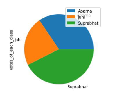
Simple Pie chart
For this first, all required modules are imported and a dataframe is initialized. To plot a pie chart plot() function is used and the kind attribute is set to pie.
Syntax:
plot(kind='pie')
Example: A simple pie chart
Python3
import pandas as pd
dataframe = pd.DataFrame({'Name': ['Aparna', 'Aparna', 'Aparna',
'Aparna', 'Aparna', 'Juhi',
'Juhi', 'Juhi', 'Juhi', 'Juhi',
'Suprabhat', 'Suprabhat', 'Suprabhat',
'Suprabhat', 'Suprabhat'],
'votes_of_each_class': [12, 9, 17, 19, 20,
11, 15, 12, 9, 4,
22, 19, 17, 19, 18]})
dataframe.groupby(['Name']).sum().plot(kind='pie', y='votes_of_each_class')
|
Output:
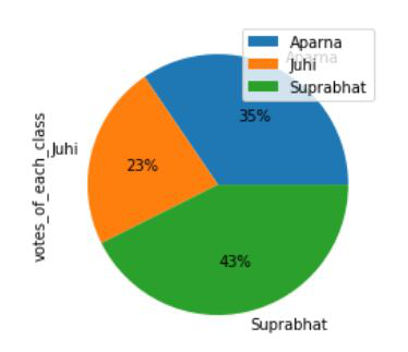
Pie Chart as Percentage
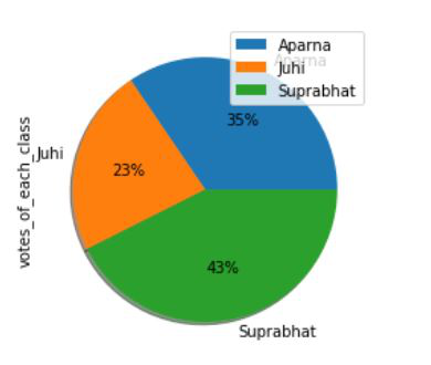
To add percentage autopct attribute is set to an appropriate value, this automatically adds percentages to each section.
Syntax:
plot(kind='pie', autopct)
Example: Adding percentages to pie chart
Python3
import pandas as pd
dataframe = pd.DataFrame({'Name': ['Aparna', 'Aparna', 'Aparna',
'Aparna', 'Aparna', 'Juhi',
'Juhi', 'Juhi', 'Juhi', 'Juhi',
'Suprabhat', 'Suprabhat',
'Suprabhat', 'Suprabhat',
'Suprabhat'],
'votes_of_each_class': [12, 9, 17, 19,
20, 11, 15, 12,
9, 4, 22, 19, 17,
19, 18]})
dataframe.groupby(['Name']).sum().plot(
kind='pie', y='votes_of_each_class', autopct='%1.0f%%')
|
Output:
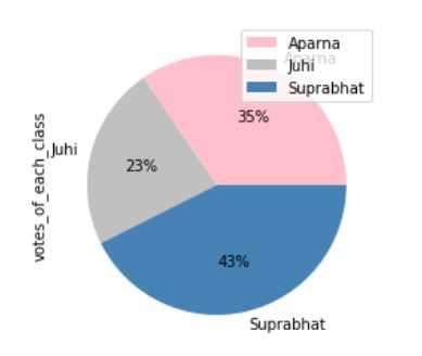
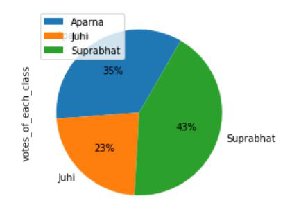
Defining Colors in a Pie Chart
To add colors to a pie chart, the colors attribute is set to an appropriate list of colors.
Syntax:
plot(kind='pie', colors)
Example: Adding colors to pie chart
Python3
import pandas as pd
dataframe = pd.DataFrame({'Name': ['Aparna', 'Aparna', 'Aparna',
'Aparna', 'Aparna', 'Juhi',
'Juhi', 'Juhi', 'Juhi', 'Juhi',
'Suprabhat', 'Suprabhat',
'Suprabhat', 'Suprabhat',
'Suprabhat'],
'votes_of_each_class': [12, 9, 17, 19,
20, 11, 15, 12,
9, 4, 22, 19, 17,
19, 18]})
colors = ['pink', 'silver', 'steelblue']
dataframe.groupby(['Name']).sum().plot(
kind='pie', y='votes_of_each_class',
autopct='%1.0f%%', colors=colors)
|
Output:
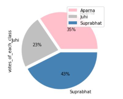
Explode effect in Pie Chart
Exploding a pie chart means breaking it into its segments. For this, we use explode attribute and set it to an appropriate value.
Syntax:
plot(kind='pie', explode)
Example: Exploding a pie chart
Python3
import pandas as pd
dataframe = pd.DataFrame({'Name': ['Aparna', 'Aparna', 'Aparna',
'Aparna', 'Aparna', 'Juhi',
'Juhi', 'Juhi', 'Juhi', 'Juhi',
'Suprabhat', 'Suprabhat',
'Suprabhat', 'Suprabhat',
'Suprabhat'],
'votes_of_each_class': [12, 9, 17, 19,
20, 11, 15, 12,
9, 4, 22, 19, 17,
19, 18]})
colors = ['pink', 'silver', 'steelblue']
explode = (0.05, 0.05, 0.05)
dataframe.groupby(['Name']).sum().plot(
kind='pie', y='votes_of_each_class', autopct='%1.0f%%',
colors=colors, explode=explode)
|
Output :
Shadow effect in Pie Chart
Shadow adds an extra dimension to our pie chart, for this just set the shadow attribute to True.
Syntax:
plot(kind='pie', shadow=True)
Example: Shadow effect in pie chart
Python3
import pandas as pd
dataframe = pd.DataFrame({'Name': ['Aparna', 'Aparna', 'Aparna',
'Aparna', 'Aparna', 'Juhi',
'Juhi', 'Juhi', 'Juhi', 'Juhi',
'Suprabhat', 'Suprabhat',
'Suprabhat', 'Suprabhat',
'Suprabhat'],
'votes_of_each_class': [12, 9, 17, 19,
20, 11, 15, 12,
9, 4, 22, 19, 17,
19, 18]})
dataframe.groupby(['Name']).sum().plot(
kind='pie', y='votes_of_each_class', autopct='%1.0f%%', shadow=True)
|
Output:
Setting Start Angle in Pie Chart
The start Angle implies that we can rotate the pie chart according to the degree angle we specified. For this startangle attribute is set to the appropriate value.
Syntax:
plot(kind='pie', startangle)
Example: Setting a start angle in Pie chart
Python3
import pandas as pd
dataframe = pd.DataFrame({'Name': ['Aparna', 'Aparna', 'Aparna',
'Aparna', 'Aparna', 'Juhi',
'Juhi', 'Juhi', 'Juhi', 'Juhi',
'Suprabhat', 'Suprabhat',
'Suprabhat', 'Suprabhat',
'Suprabhat'],
'votes_of_each_class': [12, 9, 17, 19,
20, 11, 15, 12,
9, 4, 22, 19, 17,
19, 18]})
dataframe.groupby(['Name']).sum().plot(
kind='pie', y='votes_of_each_class', autopct='%1.0f%%', startangle=60)
|
Output :
Like Article
Suggest improvement
Share your thoughts in the comments
Please Login to comment...