How to create Pareto Chart
Last Updated :
12 Oct, 2020
Defect Pareto chart generally represents frequency of occurrence of different types of defects or categories of problem. Using this, one can determine defects that have highest frequency of occurrence and then assign priority according to their frequency. In simply states that 20% reason mainly contributes to 80% of problems or issues. It simply helps to determine types of defects that have been found in system so far. It also provides an effective and significant way i.e. graphical representation of showing problems and their causes that are present in process.
The steps include :
- Collect information or data regarding defect or problem :
Explain and understand problem very clearly. Collecting data is one of the major tasks that should be done in a very appropriate manner with full focus. One needs to concentrate on each and every point that is related to defect, and then collect information from all those points. After then only, decision can be made regarding defect. You should not just collect data from one point then make a decision regarding defect. One can make a separate chart of each point to compare defects that are important.
- Tally Collected Data :
Gather enough amount of information and data or either use historical data that is available. One should tally collected data for each item, how it occurred or total time took by it, or cost.
- Mark X-axis and Y-axis :
One should list items in decreasing order that is highest to lowest on Y-axis of graph and numbers like frequency, time, or cost on X-axis. Manage data that is being collected by sorting in descending order of their occurrence or frequency of cause and their characteristics.
- Draw Bars :
Keeping width same of each bar, one should draw bars for various categories that correspond to their particular count. Draw a bar chart according to data being sorted. X-axis represents main cause or characteristic of defect whereas Y-axis represents frequency or number of occurrences of defect. Calculate cumulative percentage also.
- Identification :
With help of Pareto chart, identify main critical causes of defect, and these defect types must be given greater priority and should be firstly addressed.
Example :
Let us take an example of diagnosis categories for hospital admissions as shown below :
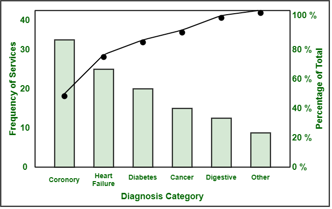
Pareto chart consists of one x-axis and 2 y-axes. X-axis on left-hand side represents number of time i.e. frequency a cause category has occurred. Y-axis on right-hand side represents cumulative percentage of causes. First bar represents causes with greater frequency. In above diagram, bar chart basically represents major causes in descending order whereas line graph basically represents cumulative percentage in ascending order.
Like Article
Suggest improvement
Share your thoughts in the comments
Please Login to comment...