How to Create Paradoxical Effect using CSS ?
Last Updated :
14 Feb, 2020
Paradoxical effect is the effect where the divs or the elements are placed in circular form top of each other. This type of effect is useful when you want to design a circular button that opens up when you hover and each button assigns some task and place like the top of each other.
In the below example, we will use z-index. Placing like this is needed to be expert on position property and top, left, right, and bottom property. Then you can easily design paradoxical effects.
Below examples illustrate the approach to create paradoxical effect:
Example 1:
<!DOCTYPE html>
<html>
<head>
<title>Paradoxical effect by HTML and CSS</title>
<style>
h1 {
color: green;
}
div {
height: 200px;
width: 200px;
line-height: 200px;
color: white;
font-size: 24px;
font-weight: bold;
}
.box1 {
position: relative;
background-color: green;
z-index: 3;
}
.box2 {
position: relative;
left: 140px;
top: -60px;
background-color: blue;
z-index: 3;
}
.box2:before {
content: '';
position: absolute;
bottom: -2px;
left: -2px;
width: 62px;
height: 60px;
z-index: 14;
background-color: red;
}
.box3 {
position: relative;
left: 0;
top: -120px;
background-color: red;
z-index: 1;
}
.box4 {
position: relative;
left: -140px;
top: -465px;
background-color: yellow;
z-index: 2;
}
</style>
</head>
<body>
<center>
<h1>GeeksforGeeks</h1>
<h3>A Computer Science Portal for Geeks</h3>
<div class="box1">Box1</div>
<div class="box2">Box2</div>
<div class="box3">Box3</div>
<div class="box4">Box4</div>
</center>
</body>
</html>
|
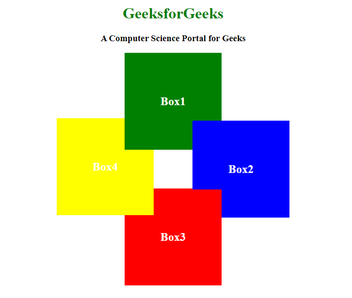
Output:
Example 2:
<!DOCTYPE html>
<html>
<head>
<title>
Paradoxical effect
by HTML and CSS
</title>
<style>
h1 {
color: green;
}
div {
height: 100px;
width: 100px;
border: solid 1px;
border-radius: 50%;
}
.Circle1 {
position: relative;
left: 0px;
background-color: green;
z-index: 1;
}
.Circle2 {
position: relative;
left: 70px;
top: -70px;
background-color: purple;
z-index: 2;
}
.Circle3 {
position: relative;
left: 40px;
top: -90px;
background-color: brown;
z-index: 3;
}
.Circle3:before {
content: '';
position: absolute;
bottom: 15px;
left: -5px;
width: 22px;
height: 62.9px;
border-right: 1px solid black;
z-index: 20;
background-color: pink;
border-radius: 50%;
}
.Circle4 {
position: relative;
left: -70px;
top: -270px;
background-color: yellow;
z-index: -1;
}
.Circle5 {
position: relative;
left: -40px;
top: -290px;
background-color: pink;
z-index: -2;
}
div {
text-align: center;
}
</style>
</head>
<body>
<center>
<h1>GeeksforGeeks</h1>
<h3>
A Computer Science Portal for Geeks
</h3>
<div class="Circle1"></div>
<div class="Circle2"></div>
<div class="Circle3"></div>
<div class="Circle4"></div>
<div class="Circle5"></div>
</center>
</body>
</html>
|
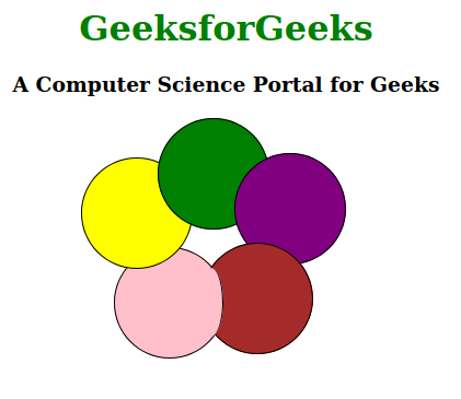
Output:
Like Article
Suggest improvement
Share your thoughts in the comments
Please Login to comment...