How To Create Interactive Charts in Excel?
Last Updated :
23 May, 2022
In MS Excel, we can draw various charts, but among them today, we will see the interactive chart. By name, we can analyze that the chart, which is made up of interactive features, is known as an interactive chart. In general, this chart makes the representation in a better and more user-friendly way. For example, we want to show the selling of books in 5 consecutive years, so, for that we will make a chart for getting a better understanding. We will make 5 different charts for the same purpose as there are 5 years to show, but by using the interactive chart, we can represent all the 5 year’s data in one chart with good space complexity.
Creating An Interactive Chart in Excel
Interactive charts are drawn with the help of a dropdown list, scroll bar, options button, pivot table, and slicers. The steps to make an interactive chart via dropdown lists’ are,
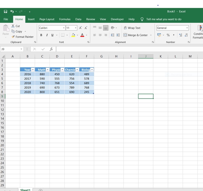
- Firstly, we will create a five rows and five columns table starting from cell B3 to F8.
- After writing the data on the cells, we can make the table attractive by the following steps,
Go to the Home tab -> click on format as table and select your choice -> then click to cell styles and select your choice. [Here, “cell styles” is used for the different types of themes for cells including its title and headings. “Format as table” is used for selecting the background color of the table.]
Table
- We have to select the cells [C3, D3, E3, F3] and then press “ctrl + c” for copying the headings of the table, which we have to paste on any of the empty cells like (here, cell J4).
- Immediately after copying, keep your cursor on cell J4, and then we have to click “alt + H + V + T,” and then a dialog box will appear on the screen. In the dialog box, we have to select the ‘transpose’ option and then click on the “OK” button. ‘Transpose’ means converting rows into columns and vice-versa. Here, we have done transpose because to make a dropdown list for an interactive chart, the data should be in vertical columns and not in horizontal rows. Since the options (i.e., Mathematics, Physics, Chemistry, Biology) were in horizontal rows in the table so we performed the transpose process.
- Now, we will see the headings in a vertical way which is required for the dropdown list on cells J4 to J7.
- We will check whether we have the developer tab in excel or not. If we don’t have, so, we can get it the following way, click
On file->options->customize ribbon->developer tab->ok button. Then, the developer tab will appear in excel.
- Now, in an empty cell-like at cell B11, write ‘SelectSubj.’ and besides that, we will drop a combo box for the options to be selected.
- For dropping the combo box on cell C11, we will,
Go to the developer tab -> insert -> combo box (here, it is used for making the dropdown list). Drag that selected combo box on cell C11.
- After dragging, make a right-click on the combo box and select the ‘format control’ option because now we have to fill with the options inside the combo box for the dropdown list. A dialog box will appear on the screen, and in that, two columns will be there, i.e., ‘cell link’ and ‘input range’.
- In this step, first, we have to click on the empty box in front of ‘cell link’ and then click on cell B12, so, the cell address of B12 will come in that empty space. Similarly, for the input range, we will first click on the empty box in front of the input range and then select the cells from J4 to J7 and then on the “OK” button.
- We can see the options in the combo box in the following way. If we click ‘Physics’ so it will display number ‘2’ in cell B12 which indicates that ‘Physics’ has been considered as the second item in the list.
- We will create another small table separately with the headings, ‘Year’ and ‘Column’ in the cells D15 and E15. In the table, we will write just the years from 2016 to 2020, and the respective values of the selected subjects will be shown under the column section with the help of the ‘VLOOKUP’ command.
- ‘VLOOKUP’ is a function that helps to search across columns. Its syntax is,
“=VLOOKUP(lookup_value, table_array, col_index_num ,[range_lookup]). In cell E16, we will type this syntax and its respective values, then click on Enter.
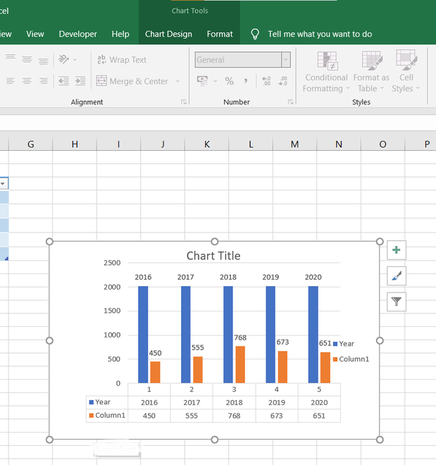
- Now we can see that when we click ‘Physics’ in the combo box, then, all the values of the respective years will be shown in the cells E16 to E20.
- For making a chart, we will go to the insert tab and click on whatever types of the chart we required, here, we will show our data in the form of a bar chart.
- We can see three symbols on the right side of the bar chart, i.e., chart elements, chart filters, and chart styles. According to our requirements, we can use these 3 symbols for better readability and better appearance of the chart.
In the end, an interactive chart is created via a dropdown list. This chart gets varied as per the changes in the combo box. Now, we will see how to create an interactive chart using ‘Pivot Table’. A ‘pivot table’ is one of the ways to interact with a large number of data and later summarize it for better use. Through this, we can analyze huge data, and many questions about data are being answered in a short interval of time. ‘Pivot Charts’ is that graphical representation of data that is associated with their respective pivot tables. Here, the changes which we will make in the layout and the data of the pivot table will immediately reflect the change in the pivot chart. Therefore, ‘pivot charts’ are also the ‘interactive charts.’ The steps for creating an interactive chart using a pivot table,
- Firstly, create a table with data on it. After creating, for modifying the table, we can go to the home tab and then click on ‘format as table’ for the requirements.
- Put the cursor in any of the cells of the table and go to insert tab->pivot table. Instead, we can press ‘Alt+N+V’ if we can’t find the pivot table option. A pivot table box appears on the screen.
- This pivot table box has three columns, that is, ‘select the table/range’ in which the address of the table is already given, ‘where we want to put the table and its address location’ in which whatever you want you can click among these two, ‘ new worksheet’ and ‘existing worksheet’ and then put the cursor in the cell in which you want to put pivot table, which will automatically take that cell’s address and then click on ‘OK’ button.
- A layout of the pivot table appears on the screen. Click on any header of the table (like, we will click on header ‘agent’) then on the layout of the pivot table; so doing this, on the right-hand side of the page, pivot table fields appear.
Now, we will see how to create an interactive chart using ‘Slicers‘. It is used to represent the data visually. It will be in interactive as well as attractive form. The steps to create an interactive chart using slicers are,
- Drag the fields whatever you want to show in the below sections. Like, we drag the ‘agent’ on ‘row labels’, ‘branch’ on ‘columns’, and ‘amount’ on ‘values’ (by default, the values section will provide the sum of the amount).
- Go to insert tab->charts (here, we will choose bar chart). We can see the interactive chart, which is made by using a pivot table.
- Here, we can click on ‘branch’ in the chart to select according to the given requirements to observe the particular information in such a huge data.
Now, we will see how to create an interactive chart using ‘Slicers’. It is used to represent the data visually. It will be in interactive as well as attractive form. The steps for creating an interactive chart using slicers are:-
- Create a table with data on it. If you want to make the table attractive, click on the home tab -> format as a table.
- Click on any of the cells of the table and then go to insert tab -> slicer. A dialog box appears on the screen. Click on those options which you want to show in the further slicers (here, we select, ‘agent’ and ‘branch’) and then on the ‘OK’ button.
- We will see that 2 different slicers named ‘agent’ and ‘branch’ appear on the screen.
- To make Slicers look attractive, click on any one of the slicers first and then go to the options tab. There we will get to see various filters related to slicers which include, changing the height and width, color, converting the data into ‘n’ columns, and many more.
- When we click on any of the branches (here, we select ‘westside’) in the branch slicer, then immediately changes occur in our table. The table will only show the data whose branch is ‘westside’.
- Click on insert tab -> pivot chart because slicers are used after the process of doing pivot chart. Like previously, we will drag the headers in the respective sections (given below), that is, to their respective axis and legends column.
- Click on the insert tab -> whatever chart we want (here, we have selected a bar chart), then, we will see the interactive chart on the screen.
Like Article
Suggest improvement
Share your thoughts in the comments
Please Login to comment...