How to Create Interaction Plot in R?
Last Updated :
26 Jan, 2022
In this article, we will discuss how to create an interaction plot in the R Programming Language.
The interaction plot shows the relationship between a continuous variable and a categorical variable in relation to another categorical variable. It lets us know whether two categorical variables have any interaction in response to a common continuous variable. If there are two parallel lines in the interaction plot, it means those two categorical variables have no interaction. Otherwise, if both lines intersect at a point that means there is an interaction between those two categorical variables.
Create a basic Interaction Plot:
To create a basic interaction plot in the R language, we use interaction.plot() function. The interaction.plot() function helps us visualize the mean/median of the response for two-way combinations of factors. This helps us in illustrating the possible interaction. The interaction.plot() function takes x.factor, trace.factor, response, and fun as arguments and returns an interaction plot layer.
Syntax:
interaction.plot( x.factor, trace.factor, response, fun )
Parameters:
- x.factor: determines the variable whose levels will form the x-axis.
- trace.factor: determines another factor whose levels will form the traces.
- response: determines a numeric variable giving the response.
- fun: determines the statistical summary element according to which trace will be made.
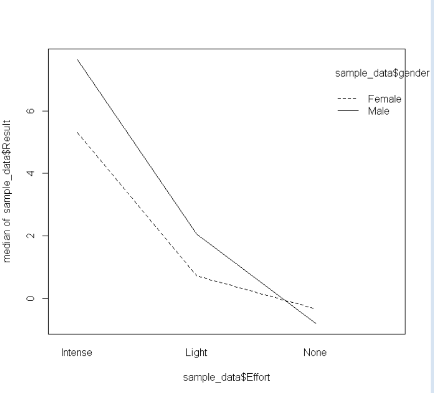
Example 1: Basic interaction plot
Here, is a basic interaction plot. The CSV file used in the example can be downloaded here.
R
sample_data <- read.csv("Sample_interaction.CSV")
interaction.plot(x.factor = sample_data$Effort,
trace.factor = sample_data$gender,
response = sample_data$Result, fun = median)
|
Output:
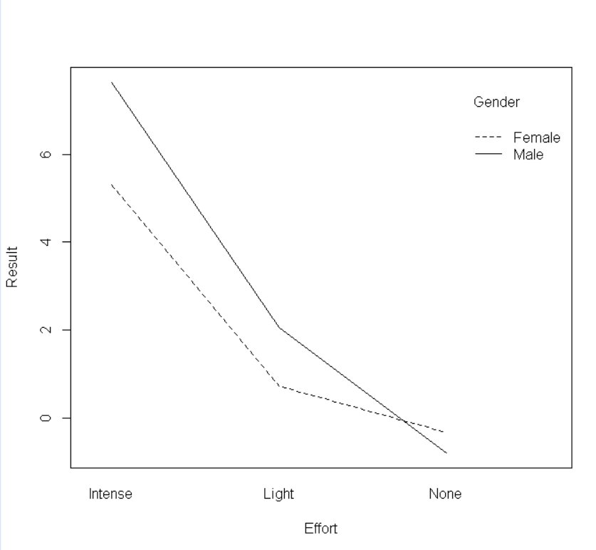
Example 2: Label Customization
To customize the x-axis and y-axis labels in the interaction plot, we use the xlab and ylab arguments of the interaction.plot() function in the R Language. To change the label of the variable in the legend of the plot, we use the trace.label argument of the interaction.plot() function in the R Language.
Syntax: interaction.plot( x.factor, trace.factor, response, fun, xlab, ylab, trace.label )
Parameters:
- xlab: determines the label for the x-axis variable.
- ylab: determines the label for the y-axis variable.
- trace.label: determines the label for the trace factor variable in legend.
Here, is a basic interaction plot with custom labels.
R
sample_data <- read.csv("Sample_interaction.CSV")
interaction.plot(x.factor = sample_data$Effort,
trace.factor = sample_data$gender,
response = sample_data$Result,
fun = median, xlab="Effort",
ylab="Result", trace.label="Gender")
|
Output:
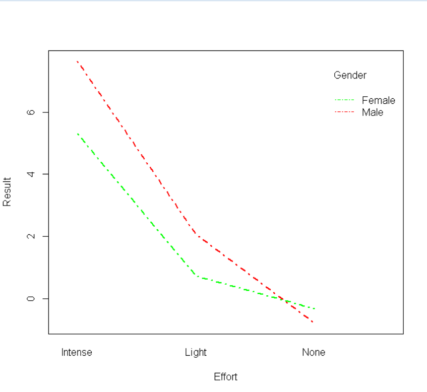
Example 3: Color and Shape Customization
To customize the color of the lines, we use the col parameter of the interaction.plot() function which takes a color vector as an argument. To customize the width and shape of the line, we use the lwd and lty parameters of the interaction.plot() function.
Syntax: interaction.plot( x.factor, trace.factor, response, fun, col, lwd, lty )
Parameters:
- col: determines the colors of the lines in the plot.
- lty: determines the type of line for example dashed, wedged,etc.
- lwd: determines the width of the plotline.
Here, is a basic interaction plot with custom labels, color, and shape.
R
sample_data <- read.csv("Sample_interaction.CSV")
interaction.plot(x.factor = sample_data$Effort,
trace.factor = sample_data$gender,
response = sample_data$Result,
fun = median, xlab="Effort",
ylab="Result", trace.label="Gender",
col=c("green","red"),
lty=4, lwd=2.5 )
|
Output:
Like Article
Suggest improvement
Share your thoughts in the comments
Please Login to comment...