How to Create Good Responsive Design?
Last Updated :
18 Jan, 2021
First, one should know what exactly responsive design means. In simple words, responsive design is a way that simply allows website design and code to adjust itself or respond according to the size of the device’s screen. The main goal of responsive design is to increase positive user experience across all types of devices such as desktop, laptop, mobile phones, tablets, etc. In today’s world, if one wants to increase the growth of their business and get ahead of their other competitors, then they should go for responsive web design. The website should not only look good on desktop or laptop screen, but it should also look good on mobile phones or tablets. It is the best way to attract more audience or users to your product. Today’s generation surf websites mostly from mobile devices therefore it is very important to make websites responsive.
Tips to create Good Responsive Design
Now, everyone knows what does responsive design means and why it is important for the business. One should know how to create or build a responsive website. Below are given some tips that will help you to create the good responsive design:
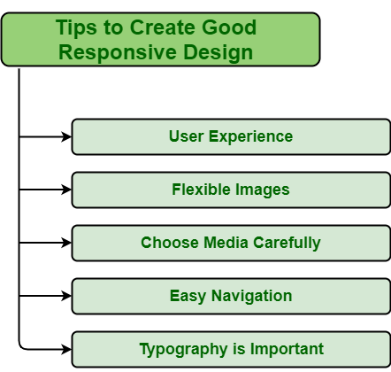
1. User experience
User experience is very important as it simply tries to meet user requirements. Good user experience generally goes long way for any business and also keep user loyal to product or brand. User experience will determine how long customers will stay on your website and how it is related to business success. Therefore, while designing a responsive website, one should keep in mind user experience, their interaction, what content they are looking for on your website, the type of device they are using to view the website, etc. A responsive website is the best way to increase and improve the user experience for users that mostly visit a website.
For example, Wired is a good example of a responsive website that ensures that users have access to information and articles that they want quickly.
2. Flexible Images
Flexible images are also known as adaptive images. Flexible images are really important for a good responsive design. Flexible images allow one to provide image solutions without any restrictions to fit on screen size on which it is viewed. While designing a website, one should keep in mind the mobile screen and how the website is going to look on the mobile screen. The main element is images and content. One needs to check whether images are looking great as necessary or not. Using CSS, one can handle how images will look on different device’s screens. Use the % unit instead of pixels to best fit on screen.
For example, Dropbox is a good example of a responsive website that includes flexible images and increases user experience across devices.
3. Choose the media carefully
A good responsive website also includes page speed and performance I.e., how fast content of the page loads when users visit a website. If website speed and performance are poor, then it will increase the chances of losing users or customers. Web page speed and performance are generally influenced by various factors. Medial files are one of the most important factors that affect the speed and performance of the responsive website. Sometimes, high-resolution images and videos are included in web pages that cover more disk space and ultimately slow down page loading time and reduce performance. Therefore, the best way to page loading speed is to compress media file sizes. By reducing size, one can reduce their weight that in turn increase the speed of loading page. Even though visuals are important to attract customers, there should be a balance between quality and speed.
For example Sasquatch! Music Festival, New York City Battle, etc. are good examples of a responsive website that includes videos, dynamic effects, fantastic graphics, etc.
4. Easy Navigation
Website navigation is very important as not only tells what content is included but also tells where to find information. People mostly visit websites through mobile devices. If website navigation is not good and poorly designed, then users might decide not to continue visiting and exploring a website. So, while designing a responsive website, make sure it is easy to navigate even when viewed on small size screens.
For example, British Heart Foundation, New York City Battle, etc. are good examples of a responsive website that includes effective mobile navigation and makes the overall layer tidier.
5. Typography is important
Typography is very important and is the best way to use text as a visual hierarchy and adjusting text within the design. It simply provides graphic balance to the website, conveys a brand message by creating visuals for brands, and plays a very important role in the presentation process. Therefore, while designing a responsive website, one should pay attention to typography. It includes font type, font size, color contrast, content, line length, etc.
For example, Paper tiger is a good example of a responsive website that includes effective typography and shows the use of typography with optimal use of space along with bold visuals and dynamic animation.
Like Article
Suggest improvement
Share your thoughts in the comments
Please Login to comment...