Chart formatting in Excel is used to easily add a certain set of styles such as colors, patterns for data representation, legends, axis titles, chart titles, etc. We add these formatting styles to enhance the visualization of charts and also, it will help for data analysis.
One of the best ways to format the charts is to use built-in formatting tools provided by Excel.
The advanced chart is also useful as it helps build more complex charts than Excel’s default one.
What is an advanced Excel Chart?
When a user wants to compare more than one set of data on the same chart then it can be done with the help of an Advanced Excel chart.
For example: When the user create a basic chart with one set of data then add more dataset to it & apply other items i.e., formatting to the chart.
How to Create an Advance Chart in Excel
In this example, we will create a column chart and format its various chart elements. We will use random sales data for different courses for this.
Step 1: Create a Dataset in a workbook
In this step, we will be creating the dataset using the following random sales data for different courses.

Fig 1 – Dataset
Step 2: Insert Chart
Now, we will be inserting the chart for our dataset. To do this, we need to Select Data and then navigate to Insert. Then click on Charts and then select Column Chart there.

Fig 2 – Insert Chart
By doing this, Excel will automatically insert a column chart for our dataset.

Fig 3 – Column Chart
The Format Pane is introduced in Excel 2013 which provides a chart formatting option for various chart elements. To access the formatting pane, we need to Select Chart Element > Right-Click > Format<chart_element> Excel will open a Format Pane for that particular chart element on the right side of the spreadsheet.
Step 3: Format Axis
In this step, we will format the chart axis. First, Select Axis, then Right-Click on it, and then select Format Axis.

Fig 4 – Format Axis
Once we click on the Format Axis option, Excel will automatically open a Format Axis Pane.

Fig 5 – Format Axis
Using the format axis pane, we can format our chart axis according to our requirements. Here, we are going to change units to display in Hundreds and Tick Mark as Inside for Minor Type.

Fig 6 – Format Axis
Similarly, we will also change the Tick Marks for Minor Type to Inside for Horizontal-Axis and we will get the following output.
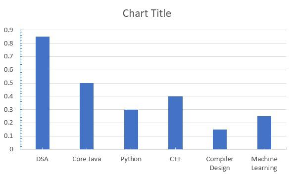
Fig 7 – Formatted Axis Output
Step 4: Format Chart Area
In this step, we will format the Chart Area. To make the chart look more enhanced and cleaner. For this Select Chart Area and then Right Click on it and select Format Chart Area. Please, make sure to click on Chart Area, not the Plot Area.
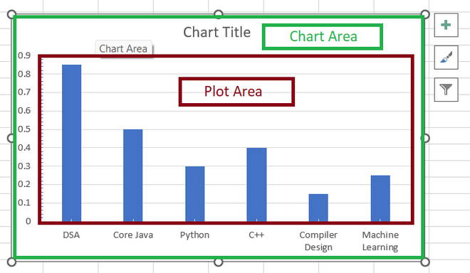
Fig 8 – Chart Area & Plot Area
Once we select the chart area and perform the above operation, excel will open the Format Chart Area pane.
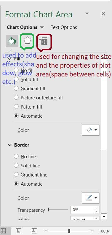
Fig 9 – Format Char Area Options
To format the chart area pane, we are adding gradient color to our chart. Go to Format Chart Area, click on Fill & Line, and select Gradient Fill.

Fig 10 – Gradient Fill
Once we choose the Gradient fill option, excel will automatically fill the gradient color to our Chart Area. Similarly, we will also add the Gradient Fill to our Plot Area, and we will get the following output.
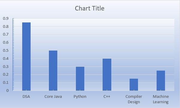
Fig 11 – Formatted Chart & Plot Area Output
Step 5: Format Chart Title
In this step, we will format the Chart Title.
To make the chart look more enhanced and cleaner. For this Select Chart Title and then Right Click on it and select Format Chart Title. This will open the Format Chart Title pane on the right side of the spreadsheet.
Using Format Chart Title, we are choosing the Gradient Fill option to fill gradient color to our chart title. Also, we will change the title to Sales Chart. After adding these changes, we will get the following output.
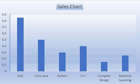
Fig 13 – Formatted Chart Title
Step 6: Format Data Series
In this step, we will format the Chart Data Series. To make the chart look more enhanced and cleaner. For this Select Chart Data Series and then Right Click on it and select Format Data Series.
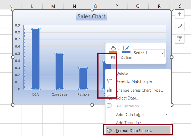
Fig 14 – Format Data Series
This will open the Format Data Series pane on the right side of the Excel spreadsheet. Using the Format Data Series, we will add a 3-D effect to our data series.
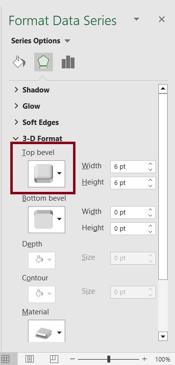
Fig 15 – Format Data Series
Once we add the 3-D effect to our data series we will get the following final output.
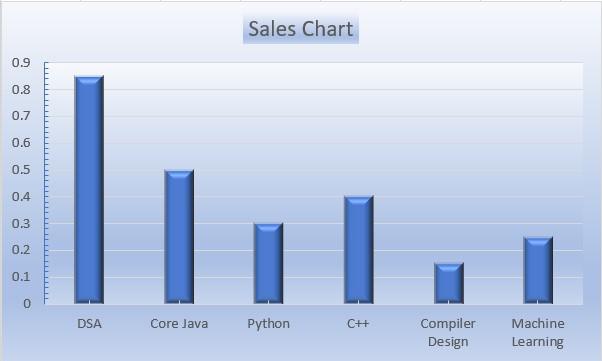
Fig 16 – Output
FAQs on Chart Formatting
What is the need of formatting a chart?
Formatting the chart makes the chart easier to read and also qualifies you to explain the data in detail.
What are the best-advanced Graphs in Excel?
- Sankey diagram
- Likert Scale chart
- Comparison Bar Chart
- Gauge Chart
- Multi-Axis Line Chart
- Sunburst Chart
- Radar Chart
- Radial Bar Chart
- Box and Whisker Chart
- Dot Plot Chart
What are the different formatting options in Excel?
Number, Alignment, Font, Border, Patterns, and Protection are the formatting options in Excel.
Like Article
Suggest improvement
Share your thoughts in the comments
Please Login to comment...