How to create five-column grid in jQuery Mobile ?
Last Updated :
16 Jun, 2023
Grids in jQuery Mobile are elements that have 100% width and are completely invisible having no borders, backgrounds, padding, or margins. Inside the grid container, the elements are assigned the classes with the names ui-block-a/b/c/d/e. This makes each “block” element appear in the form of a grid by floating next to each other.
Creating a five-column grid: We can create a five-column grid by using the container classes as ui-block-a/b/c/d. All the column widths will be 20% each and occupy the full width of the screen. The below example will demonstrate this approach.
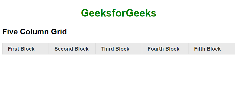
Example: In this example, we will create a five-column grid in jQuery.
HTML
<!DOCTYPE html>
<html>
<head>
<link rel="stylesheet"
href=
<script src=
</script>
</head>
<body>
<center>
<h1 style="color:green">
GeeksforGeeks
</h1>
</center>
<h2>Five Column Grid </h2>
<div class="ui-grid-d">
<div class="ui-block-a">
<div class="ui-bar ui-bar-a">
First Block
</div>
</div>
<div class="ui-block-b">
<div class="ui-bar ui-bar-a">
Second Block
</div>
</div>
<div class="ui-block-c">
<div class="ui-bar ui-bar-a">
Third Block
</div>
</div>
<div class="ui-block-d">
<div class="ui-bar ui-bar-a">
Fourth Block
</div>
</div>
<div class="ui-block-e">
<div class="ui-bar ui-bar-a">
Fifth Block
</div>
</div>
</div>
</body>
</html>
|
Output:
Supported Browser:
- Google Chrome
- Microsoft Edge
- Firefox
- Opera
- Safari
Like Article
Suggest improvement
Share your thoughts in the comments
Please Login to comment...