The charts or graphs are the visual representation of data in both rows and columns. They are used to analyze the trends and patterns in the datasets.
For example, If we want to analyze the sales of different courses for a specific period we can easily do this with the help of charts and get the result of queries such as months having a maximum number of sales etc.

What is a Chart or Graph in Excel
Charts or Graphs in Excel are Visual representations of data that allow users to present and analyze information graphically. They are essential tools for data visualization and provide a clear, concise way to communicate trends, patterns, and comparisons in datasets.
Uses of Charts/Graphs in Excel
These are some of the uses of graphs in Excel:
- Allows visualizing the data graphically.
- It is easy to compare and interpret the data in datasets.
- Provide easier and more convenient analysis for trends and patterns in data over a period.
How to Create Charts in Excel
Plotting a Graph in Excel is an easy process. Below is a step-by-step process explaining how to make a chart or graph in Excel:
Step 1: Create a Dataset
In your excel sheet enter the dataset for which you want to make chart or graph. We are using the following random sales data for different courses for Jan – Mar period.

Create a Dataset
Step 2: Select the Dataset
Select the entered dataset by drag and drop or by CTRL + A.

Select the Dataset
Step 3: Go to Insert and Select Recommended Charts
Go the Insert Tab and in the dropdown select chart of your choice from the Recommended Charts. You can click on All charts option if can not find your desired chart.

Go to Insert and Select Recommended Charts
There are various types of charts recommended by Excel. You can preview the chart before applying it. Select the chart or graph that you desire and click on OK. These types of charts are discussed below.

Recommended Charts
Type of Charts in MS Excel
Excel provides several charts or graphs that we can use to visualize and analyze the data in different scenarios. Usually, we are required to choose the chart type depending on the data we are required to analyze.
To give you insights of how to create charts or graphs in excel we are using Surface chart as an example showing you the step by step procedure.
How to Create Surface Graph in MS Excel
Step 1: Highlight the Dataset
Select the dataset for which you want to draw the graph.
Step 2: Go to Insert and Select All Charts
Access the Insert tab and from the drop down click on All Charts option.

Go to Insert and Select All Charts
Step 3: Click on Surface Chart
Select the option of surface chart from the given graph options and click on OK.

Click on Surface Chart
How to Create Histogram in Excel
Step 1: Highlight the Dataset
Select the dataset for which you want to draw the graph.
Highlight the Dataset
Step 2: Go to Insert and Select All Charts
Access the Insert tab and from the drop down click on All Charts option.
Go to Insert and Select All Charts
Step 3: Click on Histogram
Select the option of surface chart from the given graph options and click on OK.

Click on Histogram
After we insert the chart, Excel will automatically prepare the chart according to the dataset and insert it into the sheet. In the similar fashion you can easily insert any graph of your choice.
How to Format the Chart
Formating the chart will enhance our chart or graph and also provide information that will help to analyze the chart easily. You can format or customise chart by adding titles, axis, labels, etc.
Here we are showing process of adding title and axis.
1. Adding Chart Title
Step 1: Select the Inserted Chart
Step 2: Add title to the chart by double-clicking on the Chart Title view and, add whatever title you want.

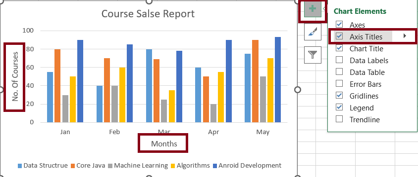
2. Adding Axis
Step 1: Select the Inserted Chart.
Step 2: Click on the plus(+) button beside the chart.
Step 3: Check the axis titles checkbox, and add the axis name.
3. Switching Row/Column
To rearrange the data presentation, you can switch the row and column layout of your chart. This can be particularly useful when you want to display data series or categories differently.
.png)
4. Legend Position
The legend position provides valuable information about the data series in your chart. You can customize the legend’s position to enhance chart clarity and presentation.
To move the legend to the right side of the chart, click the “+” button on the right side of the chart, choose “Legend“, and then select “Right“.
.png)
5. Data Labels
Data labels draw attention to specific data points or series on your chart. By adding data labels, you can provide context and emphasize crucial data points.
To add data labels, select the chart, click on the data series or point you want to label, and then click the “+” button. Check the “Data Labels” option to display the labels.
.png)
How to Change Chart Type
Excel gives you the feature to change the type of chart or graph after creating. Follow the below steps to change the chart type in Excel:
Step 1: Select the chart
Click on the chart or graph you want to modify to select it. When the chart is selected, you will see handles or bounding boxes around it, indicating that it’s active.
Step 2: Select the “Change Chart Type” Option
Navigate to the “Chart Design” tab in the Excel ribbon. In the “Type” group, click the “Change Chart Type” button to open a gallery of available chart types.
.png)
Step 3: Choose a new Chart type
Browse through the chart-type options in the gallery and select the one that suits your needs. For example, if you want to switch to pie chart, click on Pie chart.
.png)
Step 4: Confirm the Change
After selecting the change you require, click “OK” to apply the change. Your chart will be instantly updated with the new chart type, providing useful when you want to display that series or categories differently.
Conclusion
Excel offers a range of customization options for your charts, enabling you to tailor data visualization to suit your needs effectively, By following these steps and utilizing the various chart features, you can create compelling and informative charts that effectively communicate your data insights.
How to Draw Graph in Excel – FAQs
How can I use Excel to draw a graph?
To draw a graph in Excel:
- Select your data
- Click on the “Insert” tab
- Choose your graph type from the “Charts” group, and click to insert.
- Customize the graph using the Chart tools for design and format.
How do you make an XY graph in Excel?
To make an XY (Scatter) graph in Excel:
- Select your data,
- Go to the “Insert” tab
- Click the “Scatter” icon in the “Charts” group
- Choose your preferred scatter plot type.
How to quickly create Charts or Graphs in Excel?
Follow the below steps to creat Chart in Excel:
- Step 1: Select the data you want to visualize.
- Step 2: Go to the “Insert” Tab, Click on the desired chart type and Excle will generate the Chart based on the Selected data.
How to change the type of chart after creating it?
Follow the below steps to change the type of chart or graph after creating it:
- Step 1: Select the chart, go to the “Design” tab, click “Change Chart Type“
- Step 2: Select a new Chart style form the options.
How to customize my Chart’s appearance?
Excel offers various customization options. You can format the chart elements. add titles, data labels. legends, adjust colors, and modify axis labels to enhance the chart’s appearance and readability.
How to create interactive charts in Excel?
You can use features like data filters, slicers, and dynamic range names to create interactive chart. These allows users to interact with the chart and change data views dynamically.
Like Article
Suggest improvement
Share your thoughts in the comments
Please Login to comment...